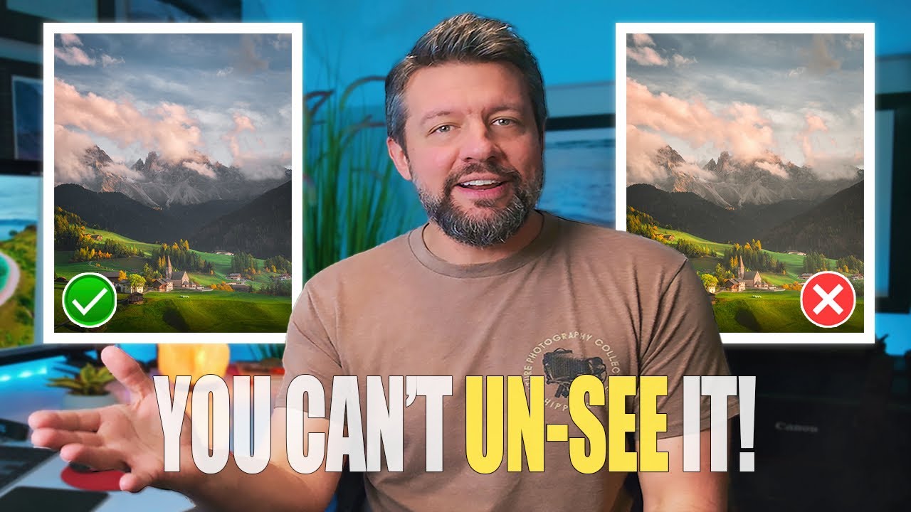
Every few months I’ll open a photo I edited a year ago and cringe at something I thought was clever at the time. The vignette is almost always the culprit. Too heavy, too symmetrical, darkening a sky that didn’t need any help looking dramatic. I kept reaching for the Effects panel out of habit, the same way you autopilot your coffee order at 7am, and getting the same mediocre results.
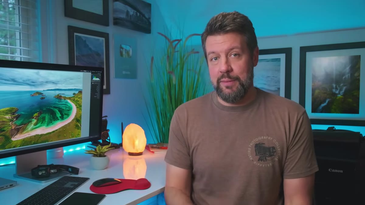
That changed when I worked through Watch the full tutorial on YouTube this breakdown from Mark Denney, where he walks through five persistent Lightroom mistakes that even experienced editors keep making. The vignette section stopped me cold. Not because it was complicated. Because it was obvious once he said it, and I’d never thought about it.
The core issue is control. Or rather, the total lack of it inside the standard vignette tool. Here’s how to fix that using a technique that takes about 90 extra seconds and produces results that are genuinely better in every case I’ve tested.
Step 1: Ignore the Effects Panel Vignette Entirely
 Lightroom Effects panel with Vignette slider at zero
Open your image and resist the urge to scroll down to the Effects panel. That slider has been sitting there since the early days of Lightroom, and it does exactly one thing: darken all four corners by the same amount. That uniformity is the problem. Real light doesn’t respect symmetry. A bright sky in the upper-left corner of your frame doesn’t need the same treatment as a shadowy lower-right corner. The tool doesn’t know that. You do.
Lightroom Effects panel with Vignette slider at zero
Open your image and resist the urge to scroll down to the Effects panel. That slider has been sitting there since the early days of Lightroom, and it does exactly one thing: darken all four corners by the same amount. That uniformity is the problem. Real light doesn’t respect symmetry. A bright sky in the upper-left corner of your frame doesn’t need the same treatment as a shadowy lower-right corner. The tool doesn’t know that. You do.
Leave the Effects vignette at zero. We’re going somewhere better.
Step 2: Open the Masking Panel and Add a Radio Gradient
 Masking panel open with plus menu visible
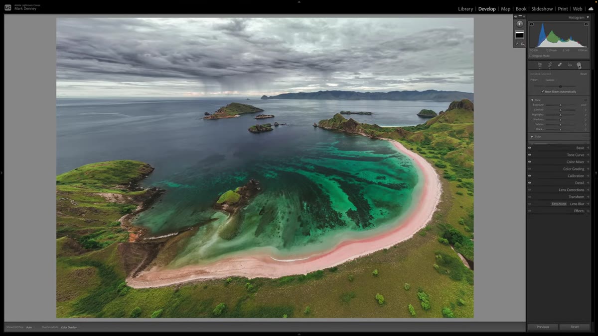
Click the Masking icon at the top of the right panel. It looks like a dotted circle and lives just above the Basic panel. Hit the plus button to add a new mask, then select “Radio Gradient” from the list. This is the same tool landscape photographers use for sky-to-ground exposure blends, and it turns out it’s also the most precise vignetting tool Lightroom has.
Masking panel open with plus menu visible
Click the Masking icon at the top of the right panel. It looks like a dotted circle and lives just above the Basic panel. Hit the plus button to add a new mask, then select “Radio Gradient” from the list. This is the same tool landscape photographers use for sky-to-ground exposure blends, and it turns out it’s also the most precise vignetting tool Lightroom has.
Once you’ve selected it, your cursor will become a crosshair. You’re about to draw an oval across your image, and the size of that oval matters a lot for getting a natural edge to your vignette.
Step 3: Draw the Gradient Across the Entire Frame
 Radio Gradient drawn large across the whole image
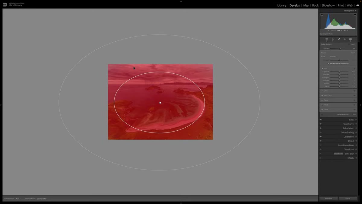
Click somewhere near the center of your image and drag outward to create a large oval that extends close to all four edges of the frame. You want this gradient big, nearly the full size of your photo. Think of it as a spotlight covering almost everything. The effect will live in the space between the edge of your oval and the edge of your image, which is exactly where a vignette belongs.
Radio Gradient drawn large across the whole image
Click somewhere near the center of your image and drag outward to create a large oval that extends close to all four edges of the frame. You want this gradient big, nearly the full size of your photo. Think of it as a spotlight covering almost everything. The effect will live in the space between the edge of your oval and the edge of your image, which is exactly where a vignette belongs.
Don’t worry about precision here. You can reposition and resize it after drawing by clicking and dragging the center pin or pulling on the edge handles.
Step 4: Hit Invert - This Is the Critical Step
 Invert checkbox checked, overlay showing outside of gradient
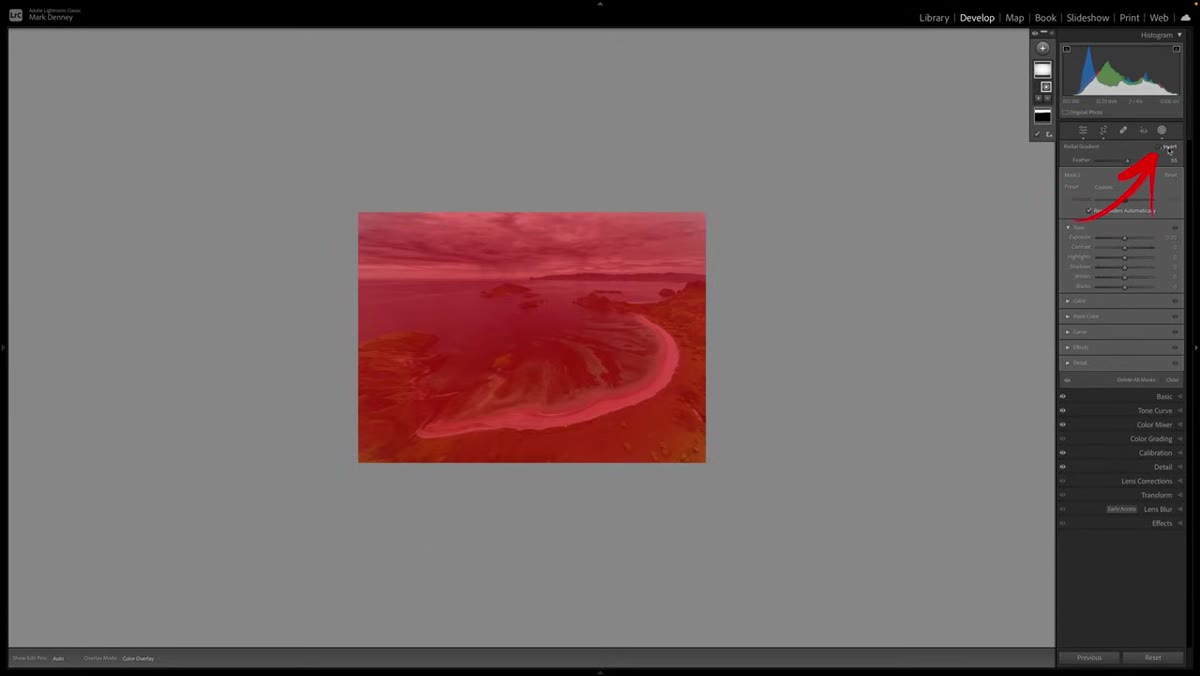
Look for the “Invert” checkbox at the bottom of the mask options. Check it. This single click flips the entire logic of the mask. Without it, Lightroom targets the inside of your oval, meaning your exposure adjustments would hit the center of your image rather than the corners. With Invert checked, you’re now targeting the outer ring, the corners and edges, which is where the darkening needs to happen.
Invert checkbox checked, overlay showing outside of gradient
Look for the “Invert” checkbox at the bottom of the mask options. Check it. This single click flips the entire logic of the mask. Without it, Lightroom targets the inside of your oval, meaning your exposure adjustments would hit the center of your image rather than the corners. With Invert checked, you’re now targeting the outer ring, the corners and edges, which is where the darkening needs to happen.
Toggle it on and off once to confirm you understand which area is selected. The red or white overlay (depending on your mask overlay settings) should show the corners and edges as the active zone.
Step 5: Bring Down Exposure to Create the Vignette Effect
 Exposure slider being pulled down in mask settings
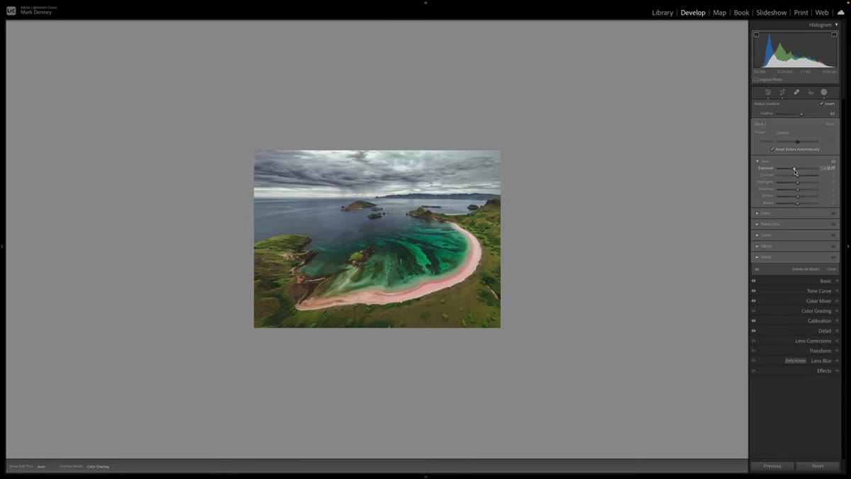
With the correct area selected, pull the Exposure slider to the left. How far depends on your image, but Mark suggests starting around -0.5 to -0.8 for a natural look. You can also increase the Feather value inside the Radio Gradient settings to soften the transition between the vignetted area and the center of the frame. A feather somewhere around 80-90 usually feels organic rather than stamped-on.
Exposure slider being pulled down in mask settings
With the correct area selected, pull the Exposure slider to the left. How far depends on your image, but Mark suggests starting around -0.5 to -0.8 for a natural look. You can also increase the Feather value inside the Radio Gradient settings to soften the transition between the vignetted area and the center of the frame. A feather somewhere around 80-90 usually feels organic rather than stamped-on.
Toggle the mask on and off using the switch at the top of the mask panel to judge the effect in context. If it looks like a darkroom mistake, ease back on the exposure. If you can barely see it, that’s often correct.
Step 6: Subtract the Effect from Any Corners That Don’t Need It
 Subtract brush being painted over the upper sky area
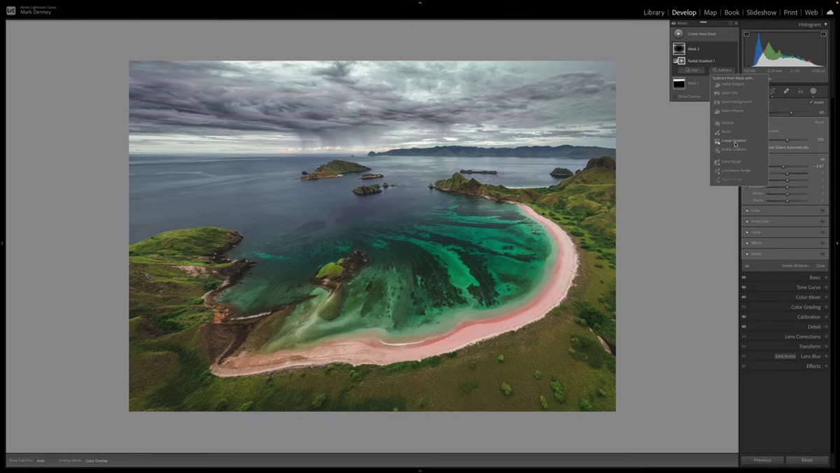
Here’s where this method pulls completely away from the Effects panel vignette. Click “Subtract” inside your mask, then choose Brush. This lets you paint the vignette effect away from specific areas. Mark demonstrates this by removing the darkening from the sky in the upper portion of a beach image, since that area was already holding its own tonally and didn’t need any help.
Subtract brush being painted over the upper sky area
Here’s where this method pulls completely away from the Effects panel vignette. Click “Subtract” inside your mask, then choose Brush. This lets you paint the vignette effect away from specific areas. Mark demonstrates this by removing the darkening from the sky in the upper portion of a beach image, since that area was already holding its own tonally and didn’t need any help.
Bump your Flow to 100 for areas you want completely free of the effect, or lower it to around 30-50 to gently taper the transition at the corners. A few loose brush strokes at the edge of the sky, with a healthy feather on the brush, creates a fade that looks like it was always part of the image rather than something applied afterward.
One Thing I’d Add from My Own Workflow
Mark stops at exposure, which covers most cases. But I’ve started adding a very slight Highlights reduction (-10 to -15) and a small Saturation bump (+5) inside the same Radio Gradient mask, targeting those outer corners. The saturation lift keeps the corners from looking gray and lifeless after you darken them, which is a subtle issue that becomes obvious when you print. The highlights reduction helps bring detail back into bright corners without needing a separate adjustment.
I have a preset saved with just these Radio Gradient values roughed in. I named it after a Wilco song because that’s how I organize my presets. It goes on almost every landscape I edit now, the same way Mark says he applies a vignette to 99% of his photos.
The single most important shift this technique creates is moving vignettes from something you do to a photo to something you sculpt for a specific photo. Uniform darkening is a shortcut. Masked, subtracted, selectively applied darkening is a decision.
Watch the full tutorial on YouTube to see all five mistakes Mark covers. The vignette section starts around the one-minute mark, but the rest of the video is worth your time if any part of your Lightroom workflow still feels like guesswork.
Comments (2)
I've watched a dozen tutorials on this and yours is the clearest by far.
I keep coming back to this article. It's that useful.
Leave a Comment