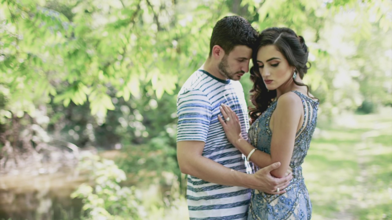
There’s a specific kind of envy that hits when you scroll through the portfolios of West Coast wedding photographers. Everything is warm and luminous, the greens look like velvet, and the shadows feel like they’re made of something softer than shadow. Meanwhile, I’m sitting in Nashville editing a gallery where the ambient light could generously be described as “overcast parking garage.” I’ve spent years chasing that look, trying to reverse-engineer it from Instagram grids and vague forum posts. So when I found this Jessica Kobeissi tutorial on editing raw wedding and engagement photos, I actually pulled up Lightroom and followed along in real time. That doesn’t happen often. Watch the full tutorial on YouTube
What makes Jessica’s approach worth your time is that she’s not hiding anything behind a preset paywall or being coy about her settings. She shows you values, she explains why, and she’s honest about how long certain things took her to figure out. The workflow she walks through is built around a single goal: making a photo feel like it was taken somewhere with more vitamin D than your zip code allows. The techniques transfer across all kinds of natural-light shooting, not just weddings.
I’m breaking down each step below so you can follow along without pausing and rewinding every thirty seconds. All of this applies in Lightroom Classic, though the panels translate to Lightroom desktop as well.
Step 1: Reset and Assess Your Raw File
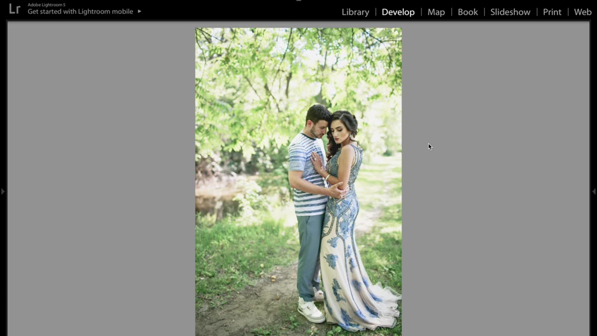 Raw image reset to straight-out-of-camera original colors
Before you do anything, reset the image to its original state. On Mac, that’s Command + Shift + R. This strips away any auto-corrections Lightroom applied on import and gives you an honest look at what you’re actually working with. Resist the urge to panic at how flat or dull the raw file looks. That’s normal, and it’s exactly the reason this workflow exists.
Step 2: Adjust Basic Panel Exposure and Shadows
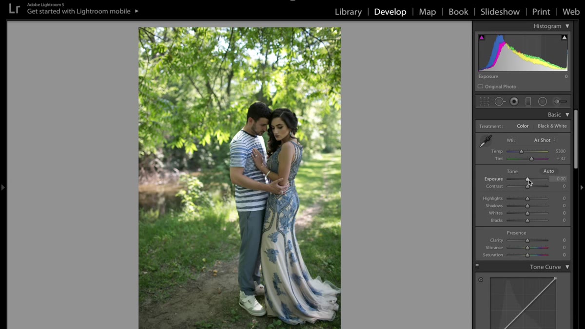 Basic panel sliders with exposure and shadows being adjusted
The light, airy signature of California-style wedding photography starts here, in the most unsexy panel in Lightroom. Bump exposure up slightly, nothing dramatic, maybe +0.3 to +0.5 depending on your original capture. Add a touch of contrast to keep the image from going completely flat. Then drop highlights just a hair, something like -10 to -20, because you actually want a little gentle blowout in the brightest areas. It shouldn’t feel clinical.
The move that makes the biggest difference here is lifting the shadows. Push them up meaningfully, somewhere in the +40 to +60 range, and watch how the image opens up. That shadow lift is what separates “properly exposed” from “light and airy.” It fills in the dark areas with soft gray instead of leaving them heavy and dense. Finally, pull vibrance down to around -10. This keeps the colors from screaming at you and gives you a neutral, workable base before you start shaping the palette.
Step 3: Shape the Tone Curve for a Matte, Faded Look
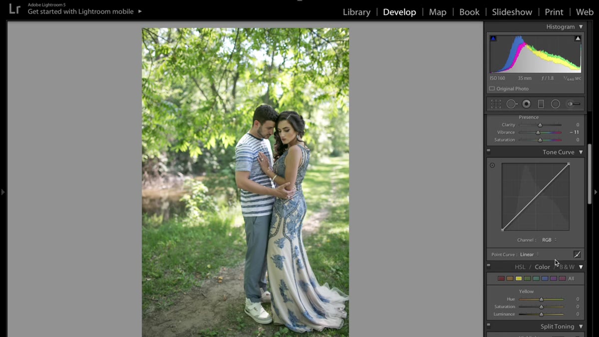 Tone curve panel with lifted blacks and pulled-down highlights
The tone curve is where this edit starts to look intentional rather than just brightened. Click into the Point Curve in the tone curve panel so you can move individual points manually. The goal is to eliminate pure blacks and pure whites, which gives the image that slightly faded, film-adjacent quality that shows up everywhere in modern wedding photography.
Grab the bottom-left anchor point (the blacks) and drag it upward. You’re introducing gray into the shadows, lifting them off absolute black. Then grab the top-right point (the whites) and pull it down slightly. You’re compressing the tonal range from both ends, which creates a soft, matte quality in the highlights. Keep the adjustments subtle. Jessica is right to warn against overdoing the curve. A little goes a long way, and you can always come back after the HSL panel to reassess.
Step 4: Shift the Greens in the HSL Panel
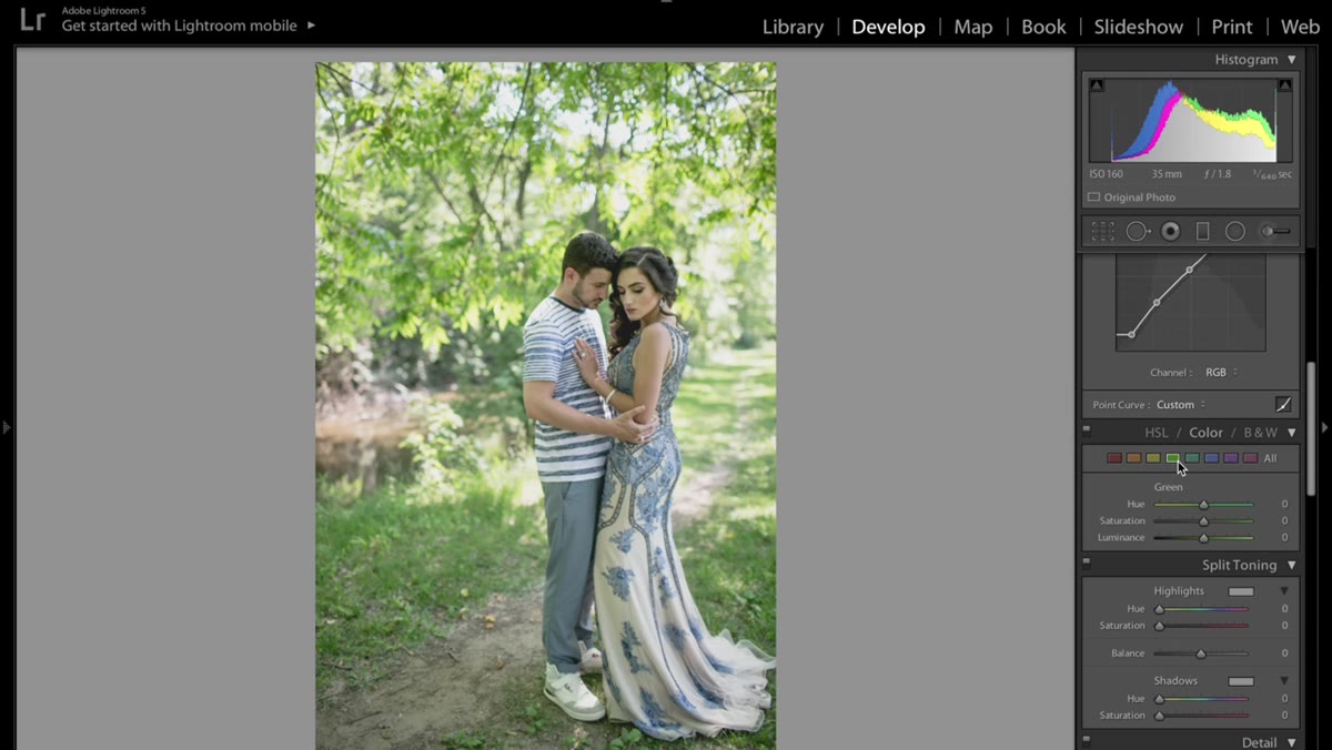 HSL panel with green hue slider being adjusted
This is the step that actually delivers the California feel, and it’s the one most people skip or don’t know to try. Open the HSL panel and go to Hue. Find the Green slider and move it. Shifting the green hue changes the character of all the foliage, grass, and natural greenery in the frame. You’re not just making greens more or less green, you’re changing which green they are. Jessica lands on a warmer, yellowy-green that reads as lush and summery rather than cool and botanical. Dial in what looks right for your specific image.
Once you’ve set the hue, drop into the Saturation tab and bring the green saturation down to around -25. Oversaturated greens look fake and aggressive. You want them soft. Then go to the Luminance tab and bring the green luminance up. This brightens the greens so they feel light rather than heavy, which is what creates that sense of subjects floating in a soft, glowing environment. The whole process takes thirty seconds and completely transforms outdoor shots.
Step 5: Explore Camera Profile Options
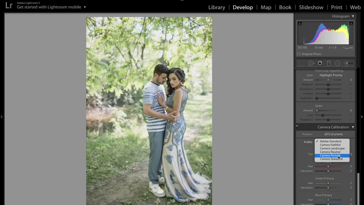 Camera Calibration or Profile panel showing Adobe Standard selected
At the bottom of the right panel stack, or under the Profile section in the Basic panel depending on your version of Lightroom, you’ll find the camera profile setting. It’s often sitting on “Adobe Standard” and most photographers never touch it. Jessica points out that switching this profile can dramatically shift the base rendering of the image before you’ve done anything else. Different profiles interpret color, contrast, and tonality differently, and swapping from Adobe Standard to a camera-matched profile or one of Adobe’s creative profiles can either solve a problem for you or create a useful starting point that requires less manual correction downstream.
It’s worth clicking through a few options on your own raw files just to see which profiles your camera responds to well. Some cameras look significantly better on “Camera Neutral” or “Camera Faithful” as a starting point for bright, clean edits.
My Addition: Don’t Apply This Edit Blindly
The one thing I’d add from my own experience is that this workflow is built around a specific lighting condition, outdoor natural light with open sky, and it needs to be adjusted when your starting point is different. I’ve tried lifting shadows this aggressively on indoor reception shots and ended up with muddy gray noise in the dark areas of the frame. If you’re working with mixed artificial light, you’ll want to be more conservative with the shadow lift and lean harder on the white balance and HSL corrections to do the heavy lifting.
Also, once you’ve dialed in settings you like, save them as a preset immediately. I know it sounds obvious but I can’t count the number of times I’ve loved a result, closed Lightroom, and lost the thread entirely. Name it something you’ll remember. I name mine after songs, but that’s a habit I won’t try to explain here.
The single most important thing this tutorial taught me is that the “California look” is really a tonal compression technique first and a color technique second. The faded blacks and softened highlights come before the green shifts and saturation work. Get the curve right, and everything else falls into place more naturally. Get the curve wrong, and no amount of HSL tweaking will save it.
Watch the full tutorial on YouTube and follow along with Jessica’s own images. Seeing the before-and-after on her specific photo makes the shadow and curve work much easier to calibrate when you try it on yours.
Comments (1)
Quality content like this is rare. Keep it up.
Leave a Comment