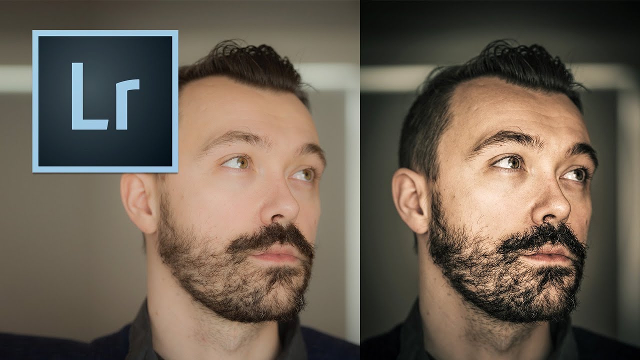
Every photographer hits a wall at some point where their images look technically correct but emotionally flat. Sharp, well-exposed, properly white-balanced – and somehow completely lifeless. That gap between a clean photo and a cinematic photo is something I spent a long time trying to close before I started really pulling apart tutorials from people who had already solved the problem.
In this Kelvin Designs tutorial, Kelvin walks through how to build the cinema look from scratch in Lightroom, working through both a portrait and a landscape. Watch the full tutorial on YouTube – it’s worth a watch alongside this breakdown. What I want to do here is pull out the actual mechanics: why each adjustment works, what numbers to aim for, and where people tend to go wrong. Because the cinema look isn’t one magic slider. It’s a specific sequence of decisions that stack on top of each other, and the order matters.
The look itself is rooted in how film stocks render color differently than a digital sensor. Film desaturates slightly in a way that feels warm and textured, not washed out. It compresses the dynamic range without flattening it. Shadows get a coolness to them while highlights hold a bit of warmth. Once you understand what you’re building toward, the steps click into place.
Step 1: Create a Virtual Copy
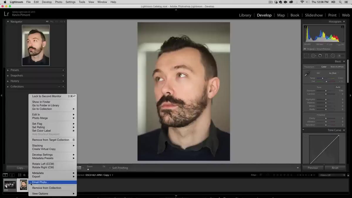 Creating a virtual copy in Lightroom’s filmstrip
Before touching anything, right-click your image and create a virtual copy. This keeps your original untouched and lets you flip back and forth between the before and after without any destructive changes. It sounds like housekeeping, but it’s actually how you build good editing instincts – you can always see exactly how far you’ve traveled from the raw file.
Creating a virtual copy in Lightroom’s filmstrip
Before touching anything, right-click your image and create a virtual copy. This keeps your original untouched and lets you flip back and forth between the before and after without any destructive changes. It sounds like housekeeping, but it’s actually how you build good editing instincts – you can always see exactly how far you’ve traveled from the raw file.
Step 2: Adjust Highlights and Shadows in Basic Panel
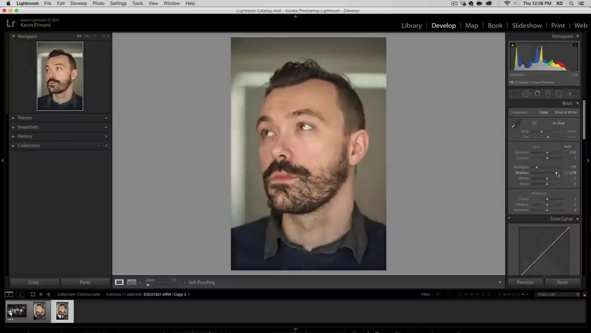 Highlights and Shadows sliders in the Basic panel
Bring the highlights down a moderate amount to recover some of the brighter areas and pull the shadows up slightly to open the image without making it feel overlit. You’re not trying to balance the exposure here – you’re compressing the dynamic range to mimic how a film stock holds detail differently than a sensor does. Keep the shadow lift subtle. Overdoing it early is the most common mistake, and it makes the later color grading look muddy.
Highlights and Shadows sliders in the Basic panel
Bring the highlights down a moderate amount to recover some of the brighter areas and pull the shadows up slightly to open the image without making it feel overlit. You’re not trying to balance the exposure here – you’re compressing the dynamic range to mimic how a film stock holds detail differently than a sensor does. Keep the shadow lift subtle. Overdoing it early is the most common mistake, and it makes the later color grading look muddy.
If you’re working on a portrait of a man, this is a good moment to add a small amount of clarity – somewhere in the low-to-mid range. On a female portrait, skip it or keep it very low. Clarity pulls texture forward aggressively, and on skin that often reads as unflattering rather than cinematic.
Step 3: Reduce Vibrance and Shift White Balance
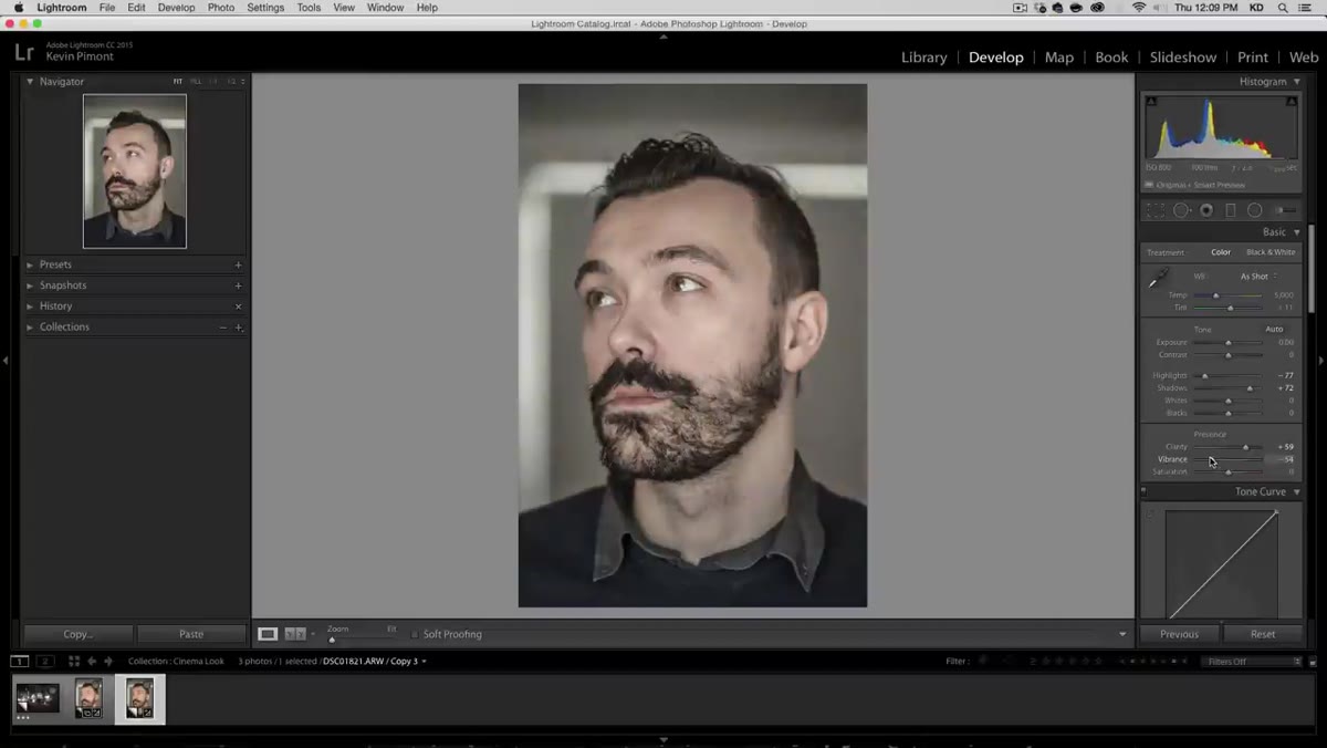 Vibrance slider pulled down in the HSL/Color panel
This is the single biggest move in the whole edit. Pull vibrance down by roughly 40 points. The image will look a little pale and washed out at this stage – that’s expected. You’re removing the digital oversaturation that makes photos look like they came out of a phone’s portrait mode. Cinema doesn’t look like that.
Vibrance slider pulled down in the HSL/Color panel
This is the single biggest move in the whole edit. Pull vibrance down by roughly 40 points. The image will look a little pale and washed out at this stage – that’s expected. You’re removing the digital oversaturation that makes photos look like they came out of a phone’s portrait mode. Cinema doesn’t look like that.
Once vibrance is down, nudge the temperature slightly warmer and push the tint a touch toward magenta. The warmth counteracts the paleness from the vibrance reduction, and the magenta tint adds a subtle depth to skin tones. After this adjustment you can often drop the vibrance a few more points because the warmth is doing some of the work now. The image should start feeling like something shot on a film stock rather than a mirrorless camera.
Step 4: Apply a Split Tone in the Color Grading Panel
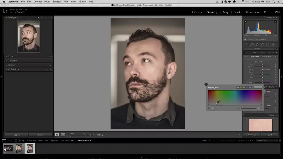 Color grading panel showing shadows and highlights adjustments
Move into the color grading panel and add a cool blue to the shadows while warming the highlights slightly. This is the adjustment that gives the image that dimensional, almost three-dimensional quality that makes cinematic photos feel like they have weight. Cool shadows and warm highlights create contrast not just in brightness but in temperature – your eye reads that as depth.
Color grading panel showing shadows and highlights adjustments
Move into the color grading panel and add a cool blue to the shadows while warming the highlights slightly. This is the adjustment that gives the image that dimensional, almost three-dimensional quality that makes cinematic photos feel like they have weight. Cool shadows and warm highlights create contrast not just in brightness but in temperature – your eye reads that as depth.
Keep these moves small. You’re seasoning, not dumping the whole spice rack in. A subtle hue shift in the shadows makes the darks feel rich and grounded. An overcorrected version just looks like an Instagram filter from 2012.
Step 5: Build Depth of Field with a Radial Filter
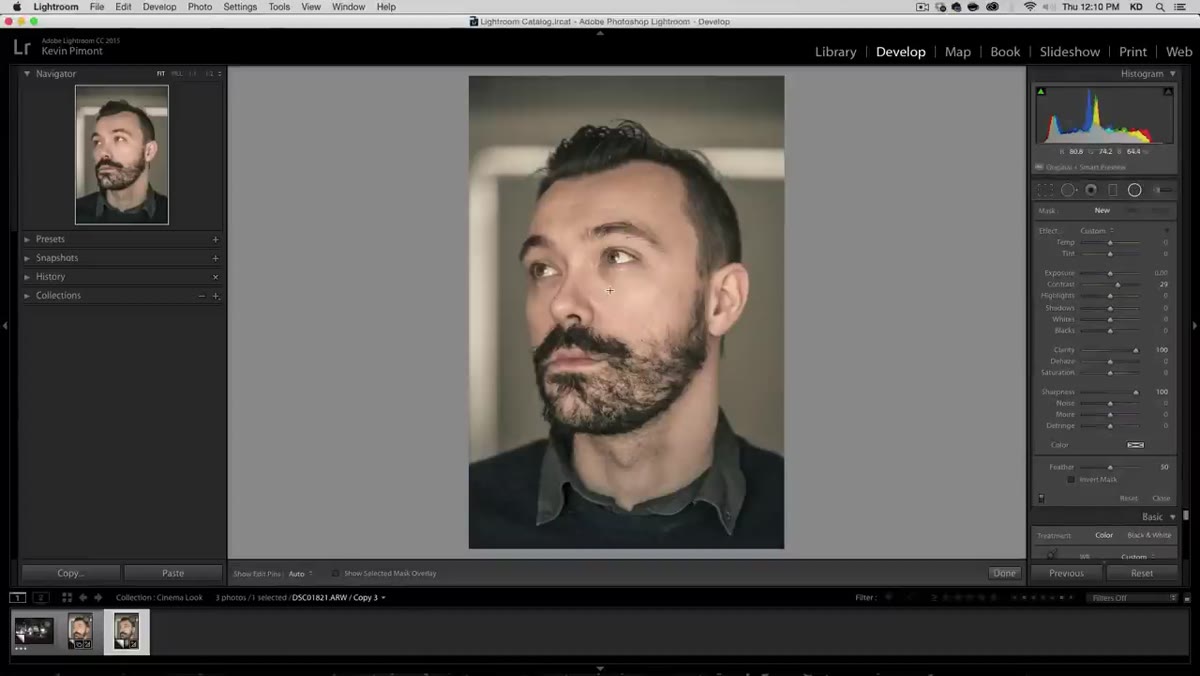 Radial filter drawn as oval around the subject
Go to the radial filter tool and draw an oval around your subject. Make sure “invert” is turned off – you want to affect everything outside the oval, not inside it. The goal is to simulate the shallow depth of field that a cinema lens creates. Lower the clarity and sharpness on the outer selection, and bring the contrast down slightly. Add just a touch of darkening to the edges.
Radial filter drawn as oval around the subject
Go to the radial filter tool and draw an oval around your subject. Make sure “invert” is turned off – you want to affect everything outside the oval, not inside it. The goal is to simulate the shallow depth of field that a cinema lens creates. Lower the clarity and sharpness on the outer selection, and bring the contrast down slightly. Add just a touch of darkening to the edges.
The result won’t look like actual lens blur, but it doesn’t need to. What it does is make the background feel slightly softer and less demanding on the eye, which pulls attention naturally to your subject. Before and after the radial filter, you can feel the difference more than see it – which is exactly where you want to be.
Step 6: Duplicate and Layer the Radial Filter
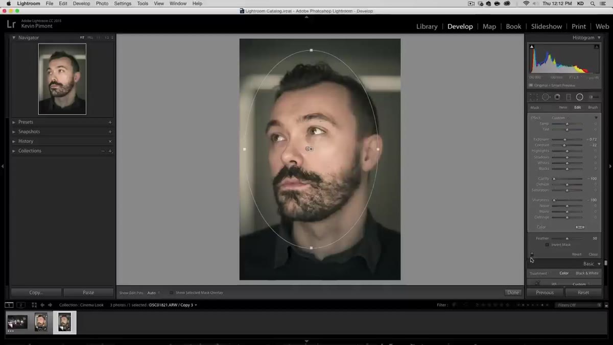 Duplicate radial filter layers stacked in the filter panel
Duplicate the radial filter and reposition it to cover additional parts of the background. This doubles the softening effect without pushing any individual slider into obvious territory. Then duplicate again, but this time invert the selection so it’s targeting the subject rather than the background. Use this inverted filter to add a small amount of sharpness and clarity back to the subject, making them snap forward against the softened background.
Duplicate radial filter layers stacked in the filter panel
Duplicate the radial filter and reposition it to cover additional parts of the background. This doubles the softening effect without pushing any individual slider into obvious territory. Then duplicate again, but this time invert the selection so it’s targeting the subject rather than the background. Use this inverted filter to add a small amount of sharpness and clarity back to the subject, making them snap forward against the softened background.
This layering approach is what separates a cinema-look edit from a simple preset. The depth isn’t coming from one big adjustment – it’s built from several small ones that work in the same direction.
What I’d Add to This Workflow
Once I have the base look dialed in, I usually go into the HSL panel and desaturate the greens and cyans a few points. Real cinema color grading tends to pull environmental colors toward neutrality so nothing in the background competes with the subject’s skin tone or the primary color story of the frame. It’s a minor tweak but it makes the overall palette feel more intentional, more like a film and less like a edited photo. I’ve started baking this into most of my cinematic presets – the one I’m currently calling “Slow Burn” after a great Kacey Musgraves track has it baked right in.
The most important thing this tutorial drives home is that the cinema look is about restraint stacked in the right sequence. Vibrance down, warmth up, cool shadows, soft background, sharp subject. None of these are large moves on their own. Together they shift a photo into something that feels considered and cinematic rather than processed.
Watch the full tutorial on YouTube to see Kelvin work through both the portrait and the landscape version – watching the before and after comparisons in real time is genuinely useful for calibrating your eye before you sit down to do this yourself.
Comments
Leave a Comment