
Contrast is one of those editing decisions that feels deceptively simple until you’re forty minutes into a session wondering why your image looks either muddy or crunchy and you’re not sure which slider made it worse. I’ve been editing in Lightroom long enough to have strong opinions about most things in this software, but contrast has always been the one area where I kept second-guessing myself. Too much and the photo looks like it was processed by someone who just discovered the Dehaze slider for the first time. Too little and you’re left with something flat that no amount of color grading will fully rescue.
That’s exactly why this Mark Denney tutorial landed so well for me. Watch the full tutorial on YouTube – it’s worth the full runtime. Denney works through landscape images from a Bali coastline shoot and methodically covers every contrast method available inside Lightroom, then lands on a newer approach that pulls everything together in a way that’s genuinely more controlled than what most of us are doing by default. What follows is my breakdown of that tutorial, rewritten for anyone who wants the technique without having to pause and rewind.
Step 1: Start With the White and Black Points
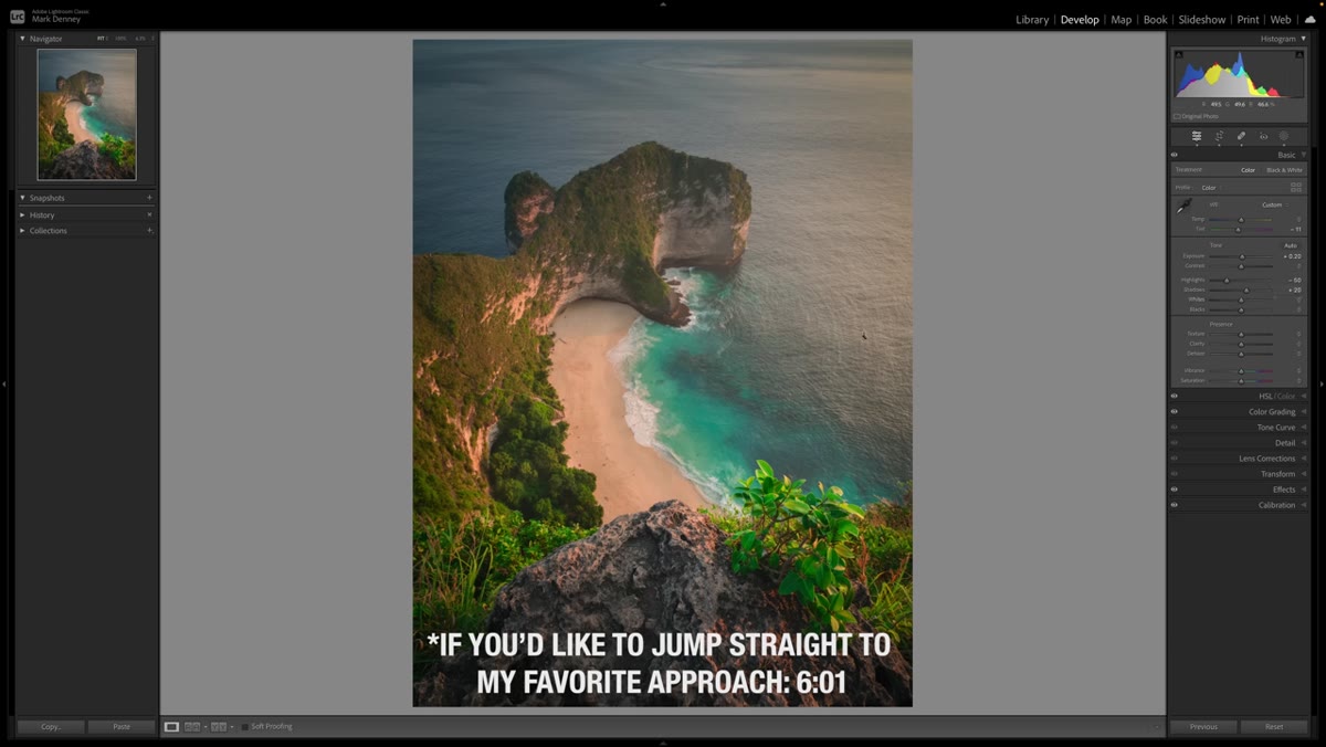 Histogram shifting right as Whites slider moves
Most people reach for the Contrast slider first. Denney’s first move is more precise: adjust the Whites and Blacks sliders independently instead. Pulling the Whites slider to the right pushes tonal data toward the bright end of the histogram, while nudging the Blacks slider down anchors the shadows. The result is contrast that’s built from the edges of the tonal range rather than applied uniformly across the midtones. Toggle both sliders off and back on and you’ll feel the difference immediately.
Histogram shifting right as Whites slider moves
Most people reach for the Contrast slider first. Denney’s first move is more precise: adjust the Whites and Blacks sliders independently instead. Pulling the Whites slider to the right pushes tonal data toward the bright end of the histogram, while nudging the Blacks slider down anchors the shadows. The result is contrast that’s built from the edges of the tonal range rather than applied uniformly across the midtones. Toggle both sliders off and back on and you’ll feel the difference immediately.
This approach gives you control over how far each end of the range stretches. The standard Contrast slider is essentially doing a version of this under the hood, but in a way you can’t steer. Doing it manually means you can protect your highlights from blowing out while still getting genuine depth in the shadows.
Step 2: Use Clarity for Midtone Contrast
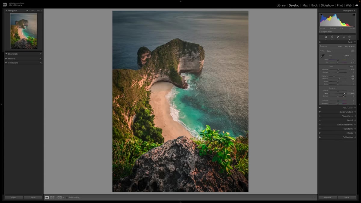 Clarity slider being rocked back and forth on cliff detail
Clarity works on midtone contrast specifically, and when you zoom into a detailed area of your image while pushing this slider, the effect becomes impossible to ignore. The darker regions of an edge get darker; the brighter regions get brighter. It’s localized contrast rather than global, which makes it feel more three-dimensional than a flat Contrast boost.
Clarity slider being rocked back and forth on cliff detail
Clarity works on midtone contrast specifically, and when you zoom into a detailed area of your image while pushing this slider, the effect becomes impossible to ignore. The darker regions of an edge get darker; the brighter regions get brighter. It’s localized contrast rather than global, which makes it feel more three-dimensional than a flat Contrast boost.
The caveat here is that Clarity can get heavy fast. Denney demonstrates this on cliff textures in his Bali image, and you can see the effect become aggressive at even moderate values. I’d treat it like hot sauce – a small amount improves the dish, and too much becomes the only thing you can taste. For landscape work, I rarely push Clarity past 20 without masking it to specific areas.
Step 3: Try Texture for a Subtler Version
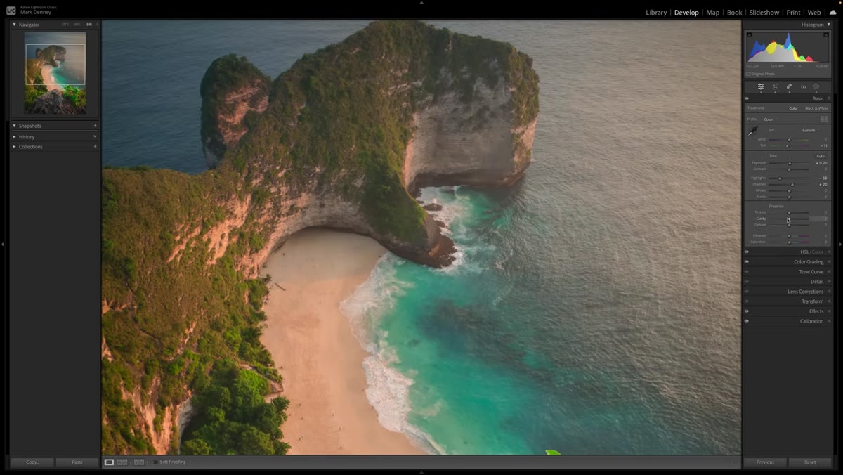 Texture slider at zero then adjusted, showing subtle edge response
Texture operates in a similar range to Clarity but with noticeably less luminance impact. Where Clarity punches highlights and crushes shadows, Texture does its work more quietly on fine surface detail. Denney rocks the Texture slider back and forth over the same area he used for Clarity comparison, and the difference is easy to see – you get definition without the light-and-dark drama.
Texture slider at zero then adjusted, showing subtle edge response
Texture operates in a similar range to Clarity but with noticeably less luminance impact. Where Clarity punches highlights and crushes shadows, Texture does its work more quietly on fine surface detail. Denney rocks the Texture slider back and forth over the same area he used for Clarity comparison, and the difference is easy to see – you get definition without the light-and-dark drama.
For portraits this matters a lot, but even in landscape work, Texture can be the better tool when you want to add crispness to foliage or rock detail without making the whole tonal structure feel heavier. Think of Clarity as the contrast hammer and Texture as the fine-tip pen.
Step 4: Understand What Dehaze Is Actually Doing
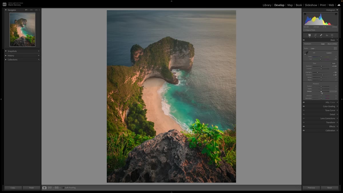
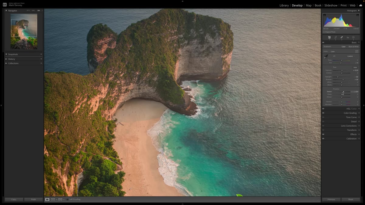 Dehaze slider applied to hazy coastal scene
Dehaze was designed to cut through atmospheric haze, but what it’s mechanically doing is adding contrast with a heavy bias toward the darker tones. This makes it extremely powerful and equally easy to overdo. Denney flags this clearly: Dehaze can quickly push an image into territory that looks more like an Instagram filter from 2013 than a considered edit.
Dehaze slider applied to hazy coastal scene
Dehaze was designed to cut through atmospheric haze, but what it’s mechanically doing is adding contrast with a heavy bias toward the darker tones. This makes it extremely powerful and equally easy to overdo. Denney flags this clearly: Dehaze can quickly push an image into territory that looks more like an Instagram filter from 2013 than a considered edit.
Used sparingly, though, it can restore definition to a scene that genuinely had atmospheric interference, or it can add punch to a flat raw file before you’ve touched anything else. The key is treating it as a surgical tool rather than a global adjustment – a small amount goes a long way, and anything past 30 usually needs a reason.
Step 5: Apply Contrast With Tone Curves for Real Precision
 Tone Curve panel open with S-curve being shaped manually
The Tone Curve is where contrast work gets precise. An S-curve – pulling the shadows down and the highlights up in roughly equal measure – is the classic contrast move, and Lightroom’s Point Curve gives you full control over how steep or gentle that S actually is. This is the approach Denney builds toward as his preferred method for landscape work, because it lets you decide exactly which tonal regions get pushed and by how much.
Tone Curve panel open with S-curve being shaped manually
The Tone Curve is where contrast work gets precise. An S-curve – pulling the shadows down and the highlights up in roughly equal measure – is the classic contrast move, and Lightroom’s Point Curve gives you full control over how steep or gentle that S actually is. This is the approach Denney builds toward as his preferred method for landscape work, because it lets you decide exactly which tonal regions get pushed and by how much.
Unlike the Contrast slider, which applies a fixed curve shape you can’t adjust, the manual Tone Curve is fully steerable. You can make shadows fall off gently while giving the highlights a sharper lift, or vice versa. For anyone who’s used Curves in Photoshop, this will feel immediately familiar. For anyone who hasn’t, spending time here pays off faster than almost anything else in Lightroom.
A Note From My Own Editing Bench
The thing Denney’s tutorial clarified for me is that contrast isn’t one decision – it’s several smaller ones layered on top of each other. In my own workflow I often use the White/Black point adjustment as a foundation, then shape the Tone Curve to control where the contrast actually lives in the image. Texture gets added only if I want surface detail to pop without changing the overall feel. Clarity I’ve moved largely into masked local adjustments rather than applying it globally, which solved the “crunchy sky” problem I was running into constantly.
One thing I’d add that the video doesn’t cover: the order matters. If you build your White/Black points first, the Tone Curve has a more defined starting position to work from. Going in the opposite direction can lead to stacking adjustments that individually look fine but compound into something harder to undo cleanly. Build the foundation, then sculpt.
Contrast in Lightroom is not a slider – it’s a system. The most useful thing Denney’s tutorial offers is a framework for thinking about that system methodically rather than grabbing the nearest tool and hoping the image responds the way you want. The Tone Curve is the anchor. Everything else fills in around it.
Watch the full tutorial on YouTube – Denney works through a real image start to finish, and seeing the before/after on that Bali coastline makes the cumulative effect of these adjustments far more concrete than any written breakdown can.
Comments (1)
Solid advice. Especially the part about taking your time with it.
Leave a Comment