
For the longest time, I treated the Profile field in Lightroom’s Basic panel like the terms and conditions on a software update. I knew it was there. I scrolled past it every single time. My photos came out fine, my clients were happy, and I told myself the default was good enough. Then I started digging into how other editors actually approach the beginning of their workflow, and I realized I had been skipping one of the most powerful starting points in the entire develop module.
Watch the full tutorial on YouTube
In this Mark Denney tutorial on RAW color profiles, he lays out something I genuinely wish someone had walked me through earlier: your profile is not just a cosmetic choice, it is the foundation your entire edit sits on. Every slider adjustment you make afterward is being applied on top of whatever tone and color rendering the profile establishes. Getting that foundation right can mean less work later, better skin tones, richer landscapes, or more latitude when an image is tricky. The difference between profiles can be subtle or dramatic depending on the photo, but understanding what each one actually does changes the way you approach an edit.
Step 1: Open the Profile Browser Instead of the Dropdown
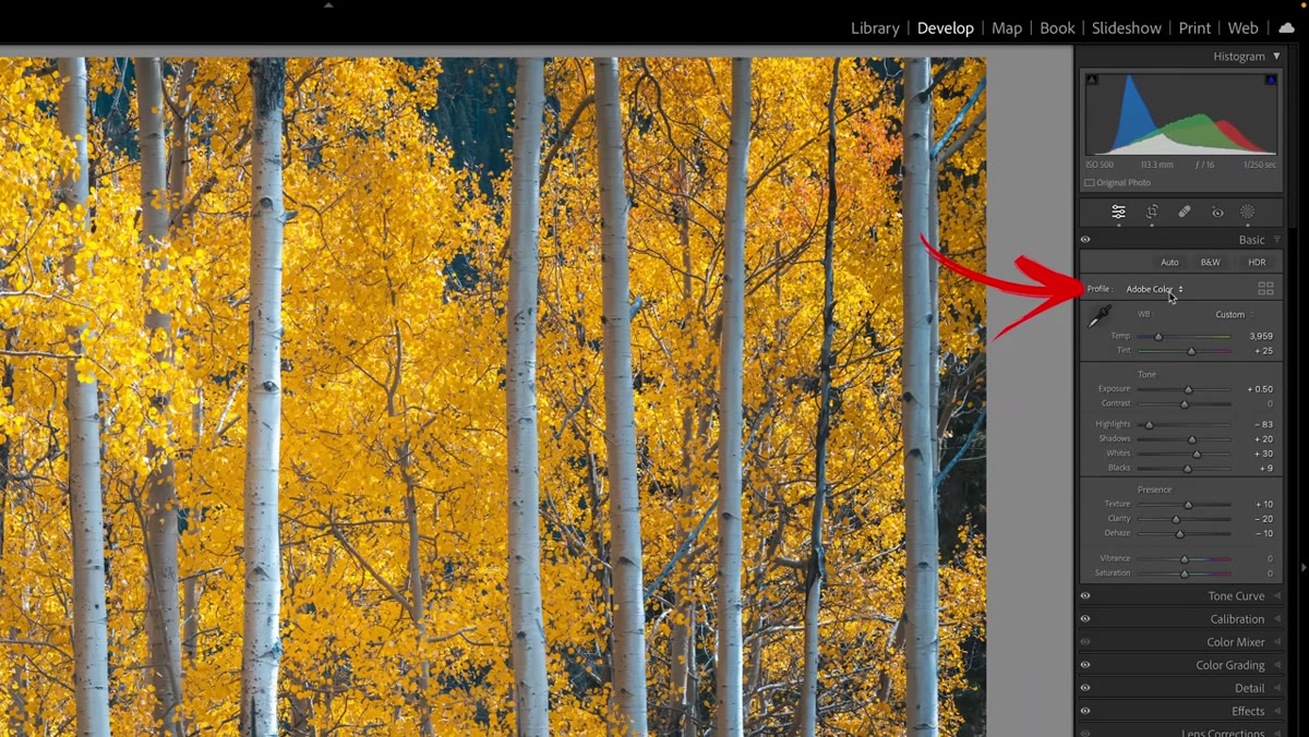 Profile browser grid view open in Lightroom’s Basic panel
Most people interact with the Profile field by clicking the dropdown and selecting something without much context. Denney recommends a better approach: click the four-square grid icon next to the profile name. This opens the full Profile Browser, which lets you hover over each profile and see a live preview applied to your photo in real time. It is a side-by-side comparison tool built right into Lightroom, and once you use it this way, going back to the dropdown feels like shopping for paint colors in the dark.
Profile browser grid view open in Lightroom’s Basic panel
Most people interact with the Profile field by clicking the dropdown and selecting something without much context. Denney recommends a better approach: click the four-square grid icon next to the profile name. This opens the full Profile Browser, which lets you hover over each profile and see a live preview applied to your photo in real time. It is a side-by-side comparison tool built right into Lightroom, and once you use it this way, going back to the dropdown feels like shopping for paint colors in the dark.
One important note before you get excited: this entire section only works with RAW files. If you are working with a JPEG or a PNG, the Adobe Raw profiles will not appear. The camera has already baked the color rendering into those file types. You need the raw data for Lightroom to have anything to interpret.
Step 2: Start With Adobe Color and Know What You Are Looking At
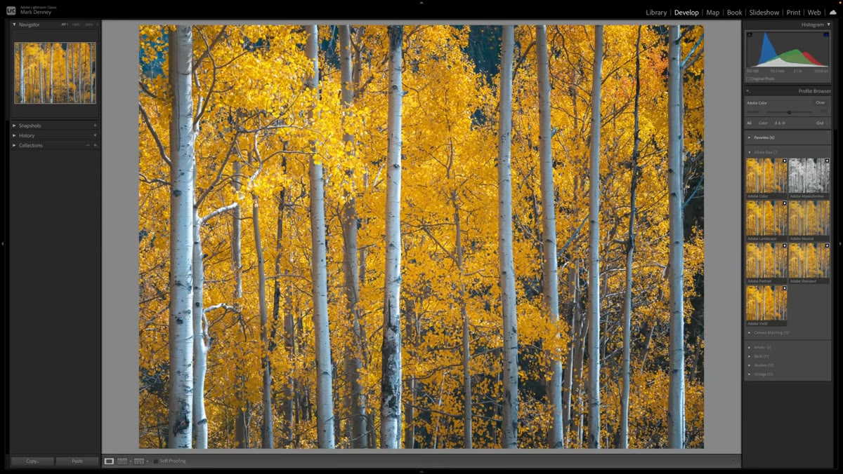 Adobe Color profile selected, shown as default in upper left of browser
When the Profile Browser opens, Adobe Color appears highlighted in the upper left. This is the current default for raw files in modern versions of Lightroom, and it earns that spot. It renders a balanced relationship between color saturation and tonal contrast, nothing pushed too hard in either direction. Think of it as a solid neutral ground that works across most subjects and lighting situations.
Adobe Color profile selected, shown as default in upper left of browser
When the Profile Browser opens, Adobe Color appears highlighted in the upper left. This is the current default for raw files in modern versions of Lightroom, and it earns that spot. It renders a balanced relationship between color saturation and tonal contrast, nothing pushed too hard in either direction. Think of it as a solid neutral ground that works across most subjects and lighting situations.
Before you start hopping between options, take a moment to really study your image at this setting. Get familiar with how your specific photo looks here, because every other profile is going to make sense only relative to this baseline. The differences between some profiles are subtle enough that if you do not know what you are comparing against, you will just be clicking randomly.
Step 3: Understand What Adobe Landscape Actually Does to Your Colors
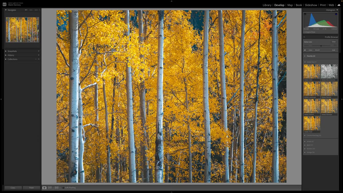 Adobe Landscape profile previewing on landscape photo, blues and greens intensified
Adobe Landscape pushes saturation across the board, but it is not a uniform boost. It specifically targets blues and greens, which makes it a strong choice for any image where sky, water, or foliage is a major element. Switching between Adobe Color and Adobe Landscape on a landscape image shows a shift that Denney describes as subtle but real, and I would agree. It is not the dramatic pop you might get from cranking the Vibrance slider, but it is a cleaner, more tonally integrated version of that effect.
Adobe Landscape profile previewing on landscape photo, blues and greens intensified
Adobe Landscape pushes saturation across the board, but it is not a uniform boost. It specifically targets blues and greens, which makes it a strong choice for any image where sky, water, or foliage is a major element. Switching between Adobe Color and Adobe Landscape on a landscape image shows a shift that Denney describes as subtle but real, and I would agree. It is not the dramatic pop you might get from cranking the Vibrance slider, but it is a cleaner, more tonally integrated version of that effect.
If your landscape photos consistently feel a little flat at the start of an edit, try Adobe Landscape as your baseline before touching anything else. You might find you need less saturation and HSL work afterward, which means a cleaner, more natural-looking result.
Step 4: Use Adobe Neutral When Your Image Needs Room to Breathe
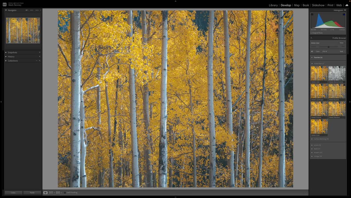 Adobe Neutral profile applied, visibly flatter and lower contrast than Adobe Color
Adobe Neutral is the profile that photographers who love flat picture styles will recognize immediately. It reduces both saturation and contrast intentionally, giving you a more compressed starting point that looks a little lifeless on its own but behaves much better under heavy editing pressure. If you are working with an image that has an extreme dynamic range, or one where you know you are going to be pushing the shadows hard or pulling back blown highlights, starting with Adobe Neutral preserves more of that latitude throughout your edit.
Adobe Neutral profile applied, visibly flatter and lower contrast than Adobe Color
Adobe Neutral is the profile that photographers who love flat picture styles will recognize immediately. It reduces both saturation and contrast intentionally, giving you a more compressed starting point that looks a little lifeless on its own but behaves much better under heavy editing pressure. If you are working with an image that has an extreme dynamic range, or one where you know you are going to be pushing the shadows hard or pulling back blown highlights, starting with Adobe Neutral preserves more of that latitude throughout your edit.
I think of it like recording audio at a lower gain level before compression. You trade immediate excitement for more control in the processing stage. For most casual landscape shots it is overkill, but for a sunset that is fighting you from both ends of the histogram, it can be genuinely useful.
Step 5: Match the Profile to Your Subject With Adobe Portrait
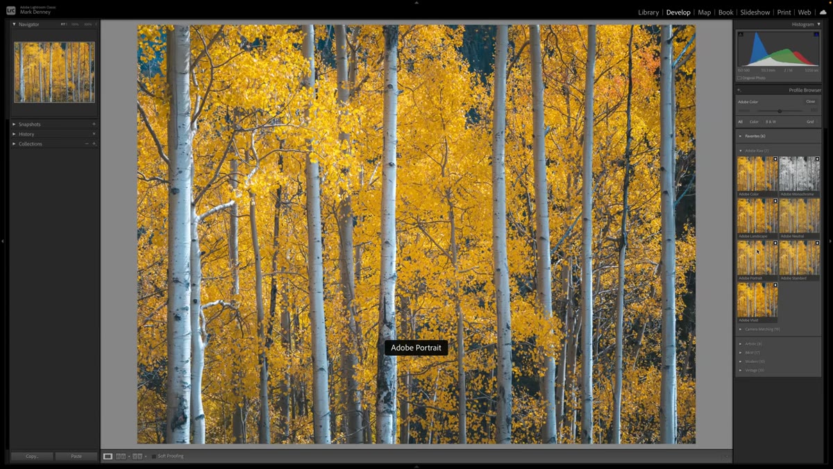 Adobe Portrait profile selected, subtle tone curve visible in effect on skin tones
Adobe Portrait applies a gentle tone curve and is optimized specifically for skin tone rendering. The saturation behavior is tuned to keep complexions looking natural rather than oversaturated. Denney notes that it handles skin tones very well, and in practice it is the kind of profile that makes a portrait look finished faster because you are not fighting orange or red casts in your baseline.
Adobe Portrait profile selected, subtle tone curve visible in effect on skin tones
Adobe Portrait applies a gentle tone curve and is optimized specifically for skin tone rendering. The saturation behavior is tuned to keep complexions looking natural rather than oversaturated. Denney notes that it handles skin tones very well, and in practice it is the kind of profile that makes a portrait look finished faster because you are not fighting orange or red casts in your baseline.
If you shoot a mix of landscapes and people, the habit worth building is simply asking yourself which of your main subjects this image is actually about before you pick your profile. One click at the start of the edit can save you several minutes of corrective HSL work at the end.
My Take: Build a Profile Default for Each Shoot Type
After watching this tutorial and experimenting with profiles across several sessions, the workflow change that actually stuck for me was setting camera-specific defaults. Lightroom lets you save a profile as part of your import default settings for a given camera. So now, anything I shoot outdoors for landscapes loads with Adobe Landscape already applied. Portrait sessions come in with Adobe Portrait. It sounds like a small thing, but removing that decision from my editing brain for routine work means I spend more focus on the images that actually need individual attention.
The other thing worth knowing: profiles work beautifully alongside presets. Several of my presets, all named after songs because that is just how my brain is organized, now have a specific profile baked in as their first instruction. It is not something I would have thought to do before understanding what profiles actually control.
The single most important thing Mark Denney makes clear in this tutorial is that a color profile is not a filter applied on top of your edit. It is the ground your edit is built on. Choosing intentionally at that stage, rather than defaulting to whatever Lightroom opens with, is one of the lowest-effort, highest-return habits you can build into your raw workflow.
Watch the full tutorial on YouTube to see all seven profile sections covered, including the camera-specific manufacturer profiles that can make a significant difference depending on what body you shoot with.
Comments (2)
I've watched a dozen tutorials on this and yours is the clearest by far.
Just used this on a wedding shoot edit. Client was thrilled.
Leave a Comment