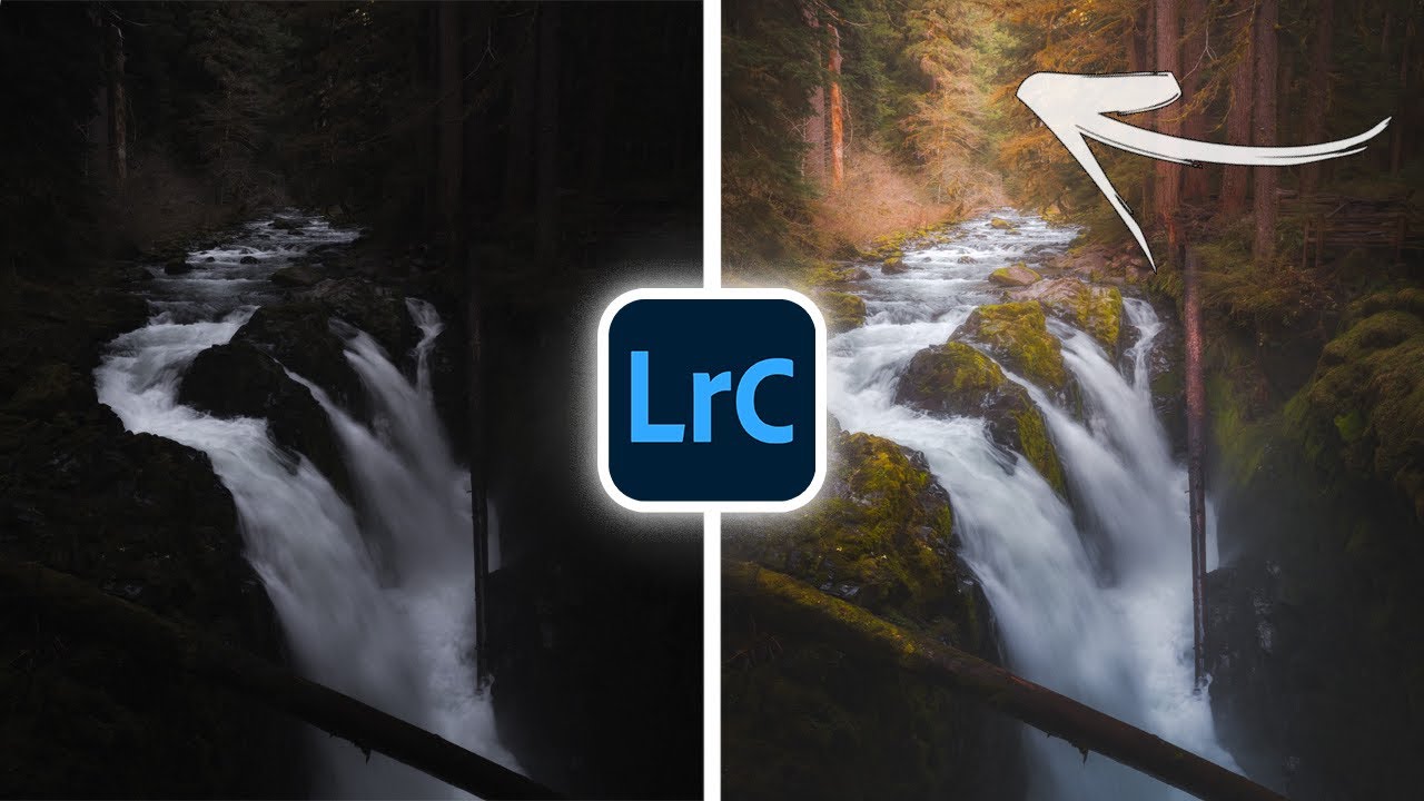
Every flat photo I’ve ever hated had the same problem. Not bad light, not bad composition. The image just looked like a photograph of a scene instead of a window into one. That two-dimensional wall between the viewer and the subject is one of the most frustrating things to diagnose when you’re learning to edit, because the fix isn’t obvious. You can push sliders all day and still miss it.
In this Mark Denney tutorial, Watch the full tutorial on YouTube, he works through a waterfall shot from Olympic National Park and demonstrates something I wish someone had spelled out to me years ago: depth in a photograph isn’t something you capture, it’s something you build in post. The entire edit is designed around restoring dimension to a flat, two-dimensional image. That framing alone changed how I think about the editing process.
What follows is a step-by-step breakdown of his exact workflow. I’ve added context from my own experience where it helps, but the core technique is his. Follow along in Lightroom Classic with your own raw file open.
Step 1: Start with a Balanced Exposure Before You Do Anything Else
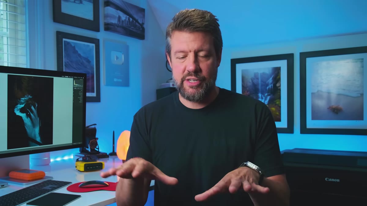 Raw file open in Lightroom Basics panel, underexposed
Mark’s first move isn’t creative, it’s diagnostic. He brings the image up to a workable brightness before making any intentional choices. His raw file is deliberately underexposed to protect highlights, which is a solid capture habit, but it means the starting point looks rough. Don’t let that bother you. The goal here is just to get the image to a place where you can actually see what you’re editing.
Raw file open in Lightroom Basics panel, underexposed
Mark’s first move isn’t creative, it’s diagnostic. He brings the image up to a workable brightness before making any intentional choices. His raw file is deliberately underexposed to protect highlights, which is a solid capture habit, but it means the starting point looks rough. Don’t let that bother you. The goal here is just to get the image to a place where you can actually see what you’re editing.
Bring your Exposure slider up until the image looks roughly neutral, not bright, just visible. Then use Highlights down and Shadows up to even out the tonal range. Bring your Blacks up slightly and nudge Whites up a small amount. You’re not done editing. You’re clearing the fog so you can work. Think of it like stretching before a run.
Step 2: Add Global Contrast as a Foundation
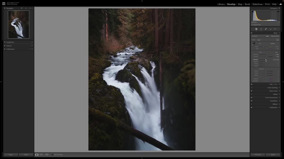 Contrast slider being adjusted in the Basics panel
Once exposure is balanced, Mark adds a moderate amount of global contrast through the Contrast slider in the Basics panel. This is the part a lot of intermediate editors skip because it feels blunt. And it is blunt. But it creates the underlying structure that makes everything else feel intentional instead of muddy.
Contrast slider being adjusted in the Basics panel
Once exposure is balanced, Mark adds a moderate amount of global contrast through the Contrast slider in the Basics panel. This is the part a lot of intermediate editors skip because it feels blunt. And it is blunt. But it creates the underlying structure that makes everything else feel intentional instead of muddy.
Don’t chase a specific number here. Move the slider until the image has some backbone without going crunchy. For most landscape shots, something in the low-to-mid positive range gives you enough contrast to build on. You can always pull it back later once the rest of the edit takes shape.
Step 3: Use the Midtone Luminance Slider in Color Grading
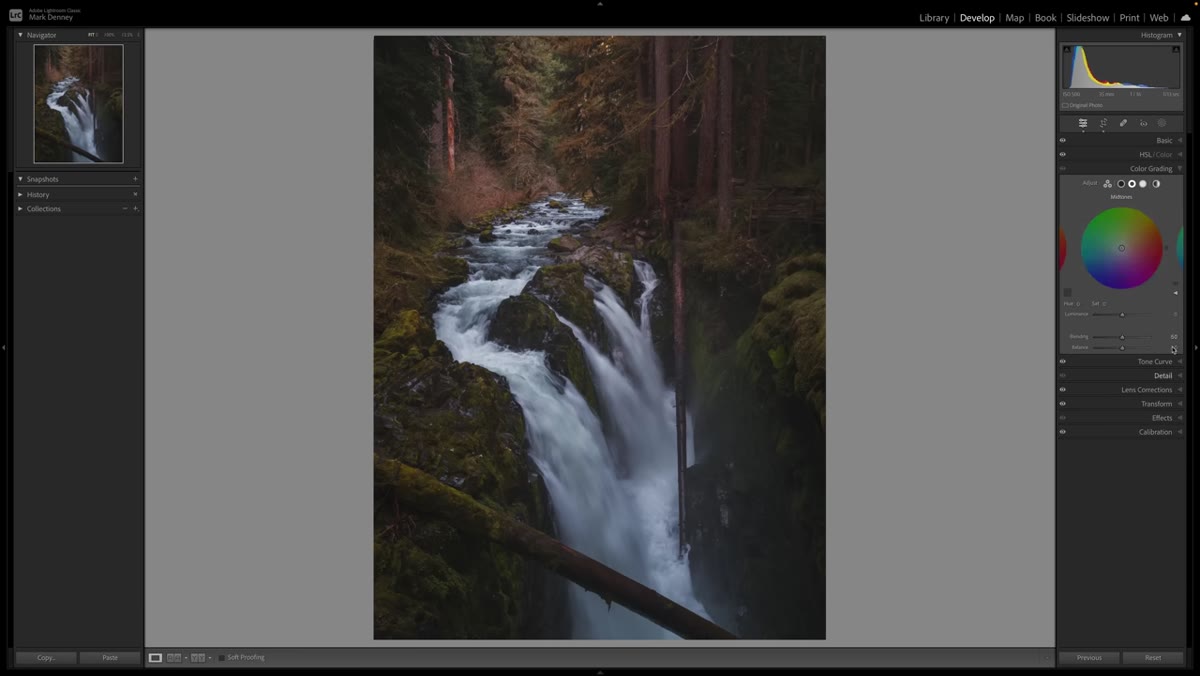 Color Grading panel open with Midtones selected
This is the step that most people miss entirely, and it’s the heart of the whole technique. Lightroom doesn’t have a dedicated midtone brightness slider in the Basics panel. But Mark points out that the Luminance slider inside the Color Grading section, when set to the Midtones wheel, functions almost exactly like one.
Color Grading panel open with Midtones selected
This is the step that most people miss entirely, and it’s the heart of the whole technique. Lightroom doesn’t have a dedicated midtone brightness slider in the Basics panel. But Mark points out that the Luminance slider inside the Color Grading section, when set to the Midtones wheel, functions almost exactly like one.
Open the Color Grading panel and make sure you’ve selected the Midtones section, not Highlights or Shadows. Then look at your histogram while you drag the Luminance slider. You’ll see the middle section of the tonal range shift while the ends stay relatively stable. Bring it up until the midtones of your image feel open and present. This is where the three-dimensional quality starts to emerge. Highlights and shadows hold their place, and the midtones lift into the space between them.
Step 4: Soften the Image with Clarity and Dehaze
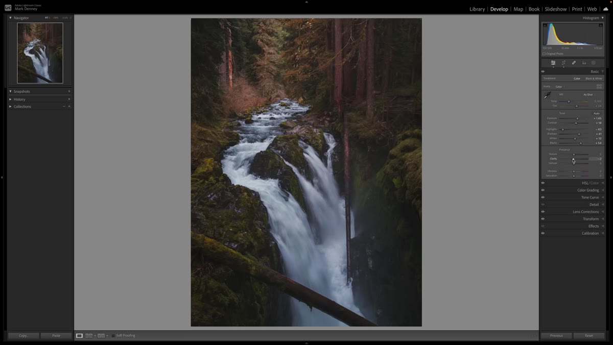 Clarity and Dehaze sliders being pulled into negative values
Once the tonal structure is in place, Mark does something counterintuitive. He pulls Clarity and Dehaze into negative territory to soften the overall image. Most tutorials tell you to push Clarity up for impact. Mark goes the other direction, and it works, especially on scenes with natural atmospheric elements like water, mist, or haze.
Clarity and Dehaze sliders being pulled into negative values
Once the tonal structure is in place, Mark does something counterintuitive. He pulls Clarity and Dehaze into negative territory to soften the overall image. Most tutorials tell you to push Clarity up for impact. Mark goes the other direction, and it works, especially on scenes with natural atmospheric elements like water, mist, or haze.
Negative Clarity softens midtone contrast and gives the image a more organic, less processed feel. Negative Dehaze reintroduces a slight haze that, in the case of a waterfall, mimics the natural spray in the air. These aren’t heavy adjustments. A small pull in either direction makes a real difference. Watch how your subject interacts with the background as you move the slider. When the depth between the two increases, you’ve found the right spot.
Step 5: Read the Histogram, Not Just the Image
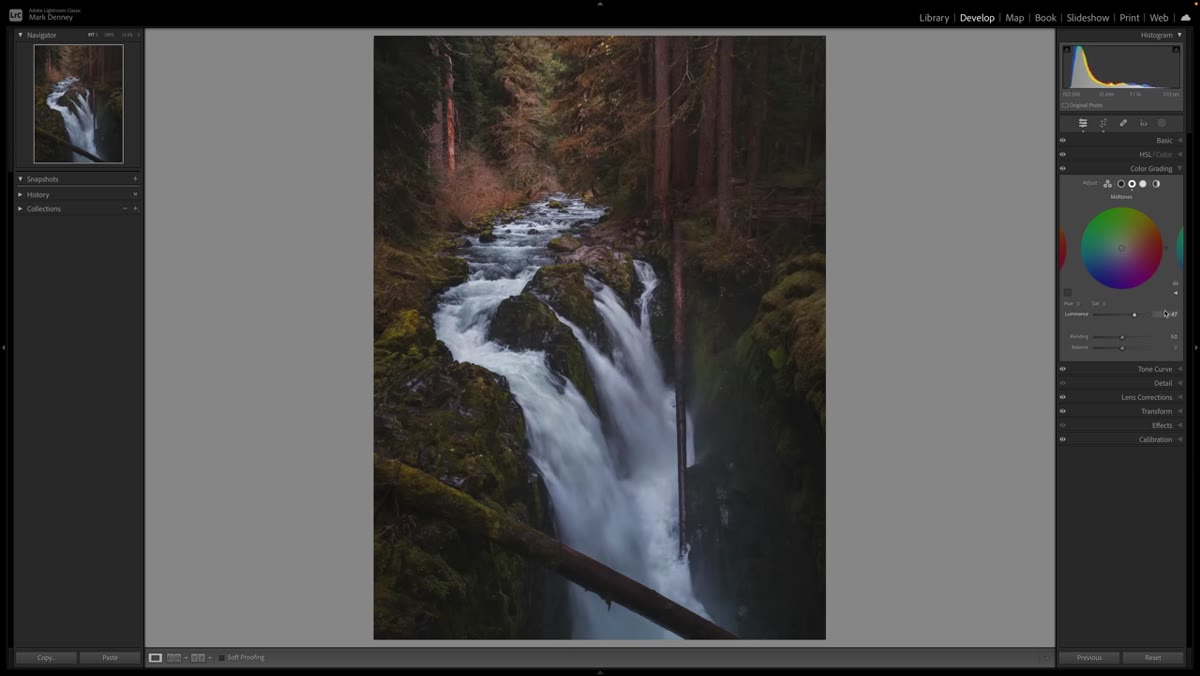 Histogram panel showing midtone area responding to edits
Mark keeps returning to the histogram during this edit, and it’s worth calling out as its own step. He specifically watches how the midtone region of the histogram responds when he adjusts the Color Grading Luminance slider. That habit, checking the histogram alongside the image, is what separates edits that hold up on different screens from edits that only look good on your monitor.
Histogram panel showing midtone area responding to edits
Mark keeps returning to the histogram during this edit, and it’s worth calling out as its own step. He specifically watches how the midtone region of the histogram responds when he adjusts the Color Grading Luminance slider. That habit, checking the histogram alongside the image, is what separates edits that hold up on different screens from edits that only look good on your monitor.
Your histogram shows you tonal distribution across the full range. When midtones are “squished” as Mark describes, you’ll see a compressed cluster in the center of the graph with not much separation. After lifting the midtone luminance, that region spreads out, and you get more visible detail in the middle of the image. Use the histogram to confirm what your eyes are telling you, especially when editing in a room that isn’t perfectly color-controlled.
A Note from My Own Editing Desk
I’ve been applying some version of this workflow for about two years now, and the biggest thing I’d add is this: the midtone luminance adjustment in Color Grading is far more useful than people think, but it interacts with your Exposure slider in ways that can sneak up on you. If your overall image starts feeling washed out after lifting the midtones, go back and drop your Exposure by a small amount rather than pulling the Luminance back down. That way you keep the openness in the mids without losing the darker register of the image.
I also find this approach works better on raw files than on JPEGs, for the obvious reason that raws have more tonal information to work with in that midtone zone. If you’re shooting JPEG and the midtones feel stubbornly flat after this edit, that’s not a technique problem. That’s a file format limitation.
The core takeaway here is something Mark frames perfectly: photographs are flat by default, and adding depth is an active choice you have to make during the edit. The combination of careful exposure balancing, a lifted midtone luminance, and intentional softening through Clarity and Dehaze gives a photo the feeling of having real space in it. It’s not a trick so much as a structural approach to building an image from the ground up.
If you want to see the full before-and-after and watch Mark walk through his exact slider positions in real time, Watch the full tutorial on YouTube. It’s worth the watch even if you only take the Color Grading midtone tip and run with it.
Comments (3)
Been doing this wrong for years apparently. Thanks for the wake-up call.
I've watched a dozen tutorials on this and yours is the clearest by far.
Excellent tutorial. I'd add that from a photography standpoint, this technique is incredibly versatile.
Leave a Comment