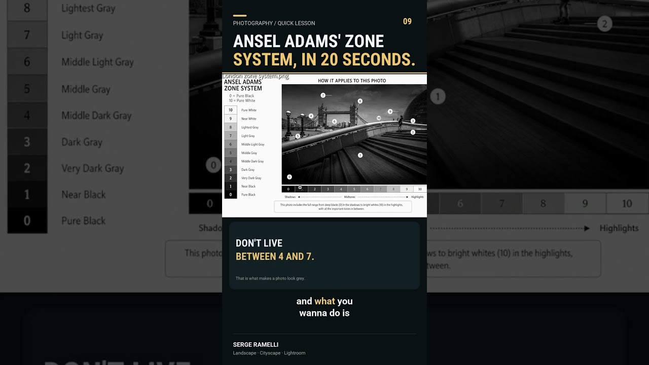
I had a client last month ask me why her black and white edits looked “kind of flat, like a photocopy.” She wasn’t wrong. I pulled up her files and every single tone was sitting in the same compressed band, dark grey to medium grey, like the histogram had stage fright and refused to move. I knew exactly what the problem was because I’d spent years making the same mistake myself before I actually understood what a full tonal range meant in practice.
If this sounds familiar, Watch the full tutorial on YouTube from Serge Ramelli, who breaks it down in a way that finally made it click for me.
The Grey Zone: Why “Safe” Edits Kill Black and White Photos
Most people editing black and white for the first time are afraid of extremes. They pull the blacks up a little so they don’t clip. They bring the whites down a little so highlights don’t blow out. The result is an image where every tone lives somewhere between 20 and 70 on a 0-to-100 scale. Safe. Boring. Grey.
The problem is psychological more than technical. We’re trained to protect information in our files, so we hover in the middle where nothing gets “damaged.” But black and white photography isn’t about preserving information. It’s about creating drama, depth, and contrast with light and shadow. When everything is medium grey, there’s no story.
What Ansel Adams Actually Understood About Tones
In this Serge Ramelli tutorial, the core concept comes straight from Ansel Adams’ Zone System, one of the most influential frameworks in the history of photography. The zone system divides the tonal range of a photograph into zones from pure black at zero to pure white at ten. Adams’ whole argument was that a great black and white image uses the full range, not just the comfortable middle.
Ramelli frames this in a way that’s immediately useful: if your tones are all sitting between four and seven on that scale, your photo is going to look muddy and grey no matter how much time you spend tweaking sliders. The fix isn’t subtle adjustments. The fix is committing to the full range, pushing your darkest tones toward true black and letting your brightest tones actually breathe near white.
Think of it like a band with no bass and no treble. You can turn the volume up all you want, but it still sounds thin.
The Lightroom Workflow: Stretching the Tonal Range
Here’s how to apply this in Lightroom, translated from what Ramelli demonstrates visually in the video.
Start in the Basic panel. First, grab your Blacks slider and pull it left until your deepest shadows actually reach near-zero on the histogram. You want that left edge of the histogram just kissing the wall, not crashing into it, but not hovering an inch away either. If you hold the Option key (Alt on Windows) while dragging, Lightroom shows you a threshold view that turns black where clipping starts. Use that.
Then move to your Whites slider and pull it right until your brightest highlights push toward the high end, again without hard clipping on specular highlights you care about. Shoot for the right edge of the histogram to approach but not slam the right wall.
Now check your Exposure and Contrast. If you’ve spread the tones out at both ends, you may need to bring exposure down slightly to keep midtones from going grey again. Add contrast in the Tone Curve rather than the Basic panel slider for more surgical control. A gentle S-curve, raising the upper quarter slightly and dipping the lower quarter slightly, reinforces that full tonal spread without making everything look like HDR gone wrong.
The goal is a histogram that looks more like a mountain range and less like a speed bump. Peaks and valleys. Blacks at zero, detail in the shadows, some midtone presence, clean highlights, near-white at the top.
Where I’d Push This Further (and Where It Falls Down)
The zone system is a foundation, not a formula. Where I find Ramelli’s approach most useful is as a starting diagnostic: if your histogram is a small blob in the middle, that’s your problem right there. Fix that first before touching anything else.
Where I’d extend it is in selective tonal work using the HSL panel converted to luminance values. If you’re shooting landscapes or portraits and you’ve converted to black and white, the Luminance sliders under B&W Mix let you control how specific colors translate to grey tones. A blue sky can be pushed darker to create drama without affecting skin tones. This is essentially the zone system applied by color channel rather than globally, and it gives you far more intentional control over where specific tones land after conversion.
The place this approach falls short is with intentionally low-key or high-key images. A foggy morning scene or a soft portrait against a white backdrop isn’t supposed to have deep blacks. Forcing the full zone range onto those images kills the mood entirely. The zone system is a tool for punchy, dramatic black and white work. Know when the aesthetic calls for restraint.
The One Thing to Take Away
If your black and white photos look grey, your tones are probably bunched in the middle. Stretch them out, commit to real blacks and near-whites, and use the histogram as your guide, not your fear. Everything else is refinement.
Watch Ramelli walk through this visually, with before-and-after comparisons that make the difference impossible to miss: Watch the full tutorial on YouTube
Comments (5)
This should be required reading for anyone starting out.
Excellent tutorial. I'd add that from a retouching standpoint, this technique is incredibly versatile.
This is exactly what I needed today. Been struggling with this for weeks.
Finally someone explains this in a way that actually makes sense.
Great article! I actually covered something related on my site — the business angle is really complementary to this.
Leave a Comment