Split Toning in Lightroom: How Two Colors Can Make or Break the Whole Mood of a Photo

Split Toning in Lightroom: How Two Colors Can Make or Break the Whole Mood of a Photo

I have a preset I built about three years ago called “Rumours.” Warm golden shadows, slightly cool highlights, the kind of look that makes a portrait feel like it was shot in a California living room in 1977. I named it after the Fleetwood Mac album because that’s the mood I was chasing when I built it. I’ve used it on maybe two dozen client galleries since then, and people consistently ask me how I got “that color.

Lightroom's Lens Blur Tool: Finally Getting That Bokeh Right in Post-Production

Lightroom's Lens Blur Tool: Finally Getting That Bokeh Right in Post-Production

Lightroom’s Lens Blur Tool: Finally Getting That Bokeh Right in Post-Production I’ve spent enough time in Lightroom to know which tools actually deliver and which ones are just taking up panel real estate. When Adobe introduced the Lens Blur feature to Lightroom Classic, I’ll admit I was skeptical. Can software really fake what a fast lens and proper aperture do in-camera? Turns out, the answer is more nuanced than a simple yes or no.

Stop Manually Dragging Sliders Back to Zero — There's a Much Faster Way

Stop Manually Dragging Sliders Back to Zero — There's a Much Faster Way

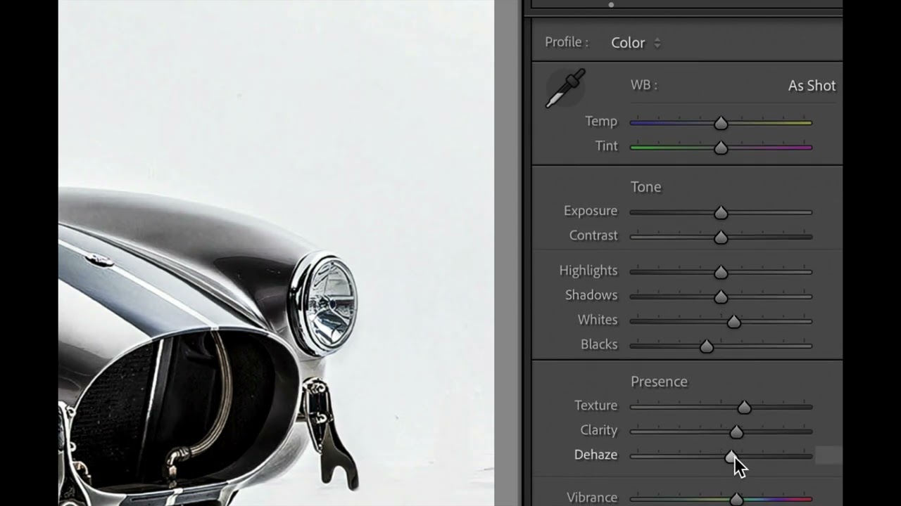
There’s a particular kind of frustration that hits when you’re deep in an edit and you realize a whole section of adjustments has gone sideways. The Presence panel is a mess, your Tone sliders look like a seismograph readout, and you need to back everything out and start fresh. For a long time, my solution was to drag each slider back to zero by hand, one at a time, like some kind of monk doing penance.

Split Toning Is the Difference Between a Good Edit and a Memorable One

Split Toning Is the Difference Between a Good Edit and a Memorable One

I had a folder of band press shots sitting on my desktop for three days before I figured out what was wrong with them. The exposure was right. The white balance was dialed. The skin tones looked natural. And the photos were completely, aggressively boring. They looked like stock photos of musicians rather than actual musicians. It wasn’t until I added a warm amber to the shadows and a faint blue to the highlights that the whole thing clicked.

When the Sky Blows Out: A Practical Guide to Recovering Highlights in Lightroom

When the Sky Blows Out: A Practical Guide to Recovering Highlights in Lightroom

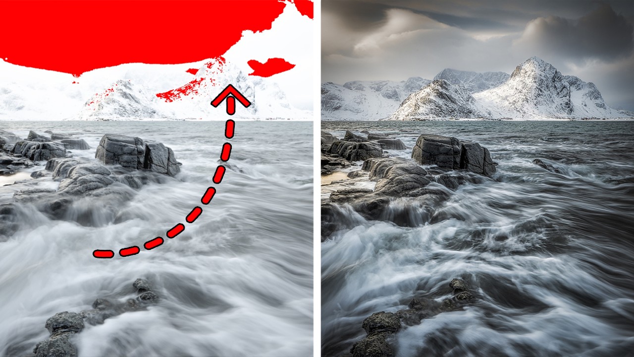
There’s a particular kind of heartbreak that happens when you come home from a shoot, pull up your RAW files, and realize the best frame of the day has a chunk of pure white where the sky used to be. No detail. No texture. Just a blank spot where your highlights burned straight through the sensor’s ceiling. I’ve been there more times than I want to admit, and for a long time my instinct was the same as everyone else’s: drag it to the trash and hope lightning strikes twice.

HSL in Lightroom: The Color Control Most Editors Treat Like a Mystery Box

HSL in Lightroom: The Color Control Most Editors Treat Like a Mystery Box

I was editing a set of golden hour portraits last spring, and the skin tones looked like the subject had been standing inside a traffic cone. The overall white balance was fine. The exposure was good. But somewhere between the warm light and my heavy-handed orange push in the tone curve, everything had gone sideways in a very specific, very unflattering direction. The fix took about forty-five seconds once I opened the HSL panel.

Split Toning Is the Reason Your Photos Look Flat (And How to Fix It in 4 Steps)

Split Toning Is the Reason Your Photos Look Flat (And How to Fix It in 4 Steps)

A few years back I was editing press shots for my band. No budget, no photographer, just me with a Nikon and a free trial of Lightroom trying to make us look like we belonged on a festival poster. I kept cranking up the contrast and punching the saturation and wondering why every photo looked like it came out of a vending machine. Something was off, and I couldn’t name it.

The Art of Color Grading: Transform Your Photos Like a Hollywood Film

The Art of Color Grading: Transform Your Photos Like a Hollywood Film

The Art of Color Grading: Transform Your Photos Like a Hollywood Film I remember the first time I really understood color grading. I was editing a portrait that felt flat and lifeless, and after spending three hours adjusting individual color channels, something clicked. The image suddenly had mood, atmosphere, and depth—it looked like it belonged in a film. That’s when I realized color grading isn’t just about making things look pretty.

The Golden Age of Photography: Why Orotone Is Having Its Moment

The Golden Age of Photography: Why Orotone Is Having Its Moment

The Golden Age of Photography: Why Orotone Is Having Its Moment I recently stumbled upon something that stopped me mid-scroll: a gallery exhibition featuring photographs that literally shimmer with gold leaf. Not the Instagram filter kind of gold—I’m talking about actual, luminous prints that seem to glow from within. It’s called orotone, and it’s making me completely rethink how we approach color grading in the digital era. What Exactly Is Orotone?

Color Grading Fundamentals: How to Transform Your Photos in Lightroom

Color Grading Fundamentals: How to Transform Your Photos in Lightroom

Color Grading Fundamentals: How to Transform Your Photos in Lightroom When I first started editing photos, I thought color grading was some mysterious art reserved for film colorists and Instagrammers with secret presets. Turns out, it’s actually a learnable skill—and once you understand the fundamentals, you’ll never look at your photos the same way again. Color grading isn’t just about making things look pretty. It’s about telling a story with color, creating mood, and guiding your viewer’s eye exactly where you want it to go.

Beyond the Basics: The Advanced Lightroom Techniques That Actually Transform Your Images

Beyond the Basics: The Advanced Lightroom Techniques That Actually Transform Your Images

The Lightroom Skills Nobody Talks About Here’s something that hit me recently: most photographers are using Lightroom like they’re driving a Ferrari in first gear. The software has evolved so dramatically over the past decade, yet we’re often stuck doing the same basic adjustments our mentors taught us five years ago. After watching how experienced editors approach their craft, I’ve realized there’s a massive gap between “competent” Lightroom editing and the kind of work that makes people stop scrolling.

The Great Color Grading Showdown: How New Creator Tools Are Changing Our Workflow

The Great Color Grading Showdown: How New Creator Tools Are Changing Our Workflow

The Plot Thickens in Post-Production Something significant is happening in the creator tools space, and honestly, it’s the kind of shift that makes you reevaluate your entire editing workflow. The emergence of DaVinci Resolve as a serious contender in the color grading arena isn’t just industry noise—it’s a wake-up call for anyone who’s been coasting with their current setup. For years, Lightroom has been the undisputed heavyweight champion of photo editing.