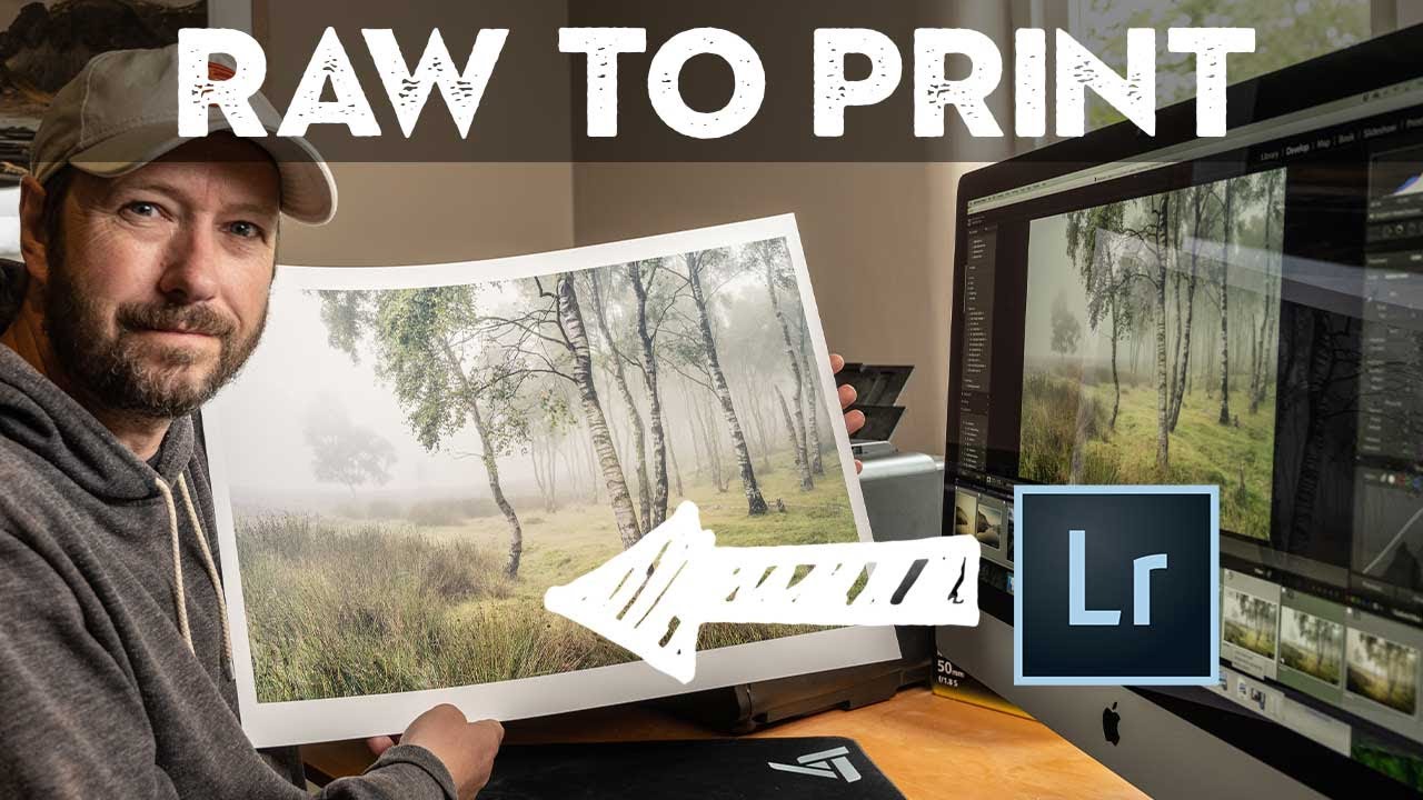
There’s a particular kind of frustration that comes from shooting a genuinely great scene and then watching the edit fall apart at your desk. You were there. You saw the fog rolling through the heather. You exposed carefully. And now the RAW file looks flat, muddy, and nothing like what you remember. This is the problem that a strong, repeatable editing workflow actually solves, and it’s why I keep coming back to tutorials from photographers who shoot seriously and edit seriously.
In this Nigel Danson tutorial, Watch the full tutorial on YouTube, Danson walks through editing a landscape shot taken in England’s Peak District during a rare foggy morning over heather moorland. What makes it worth studying isn’t just the beautiful conditions he was working with. It’s the discipline of his process. He moves through the edit in a logical order, makes decisions out loud, and thinks about the final print from the very first adjustment. I’ve pulled the whole workflow apart below so you can follow it on your own image without watching the video first, though you should absolutely watch it after.
One thing I want to flag before we get into the steps: Danson shot this with exposure-to-the-right in mind. The RAW file looks underexposed on screen, but the histogram is pushed toward the right without clipping. That’s intentional. It preserves highlight detail and gives you cleaner shadows to work with in post. If your starting image looks “too dark” and you’re shooting RAW, that might actually be exactly where you want it.
Step 1: Check Focus Before You Touch Anything
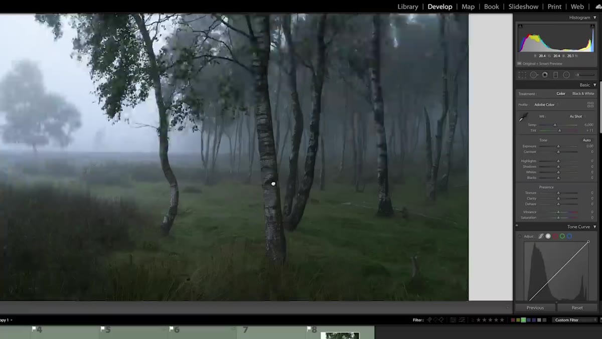 caption: Zooming in to check sharpness on foreground tree
Before any slider moves, Danson zooms into the image at 100% to confirm focus. He shot at f/10 and focused on the nearest tree in the frame. That tree is sharp. The background softens slightly, but since the scene is foggy, that softness reads as atmosphere rather than a mistake. This step matters because it saves you from spending twenty minutes editing an image that’s actually unusable. Make it a habit: zoom, check your critical focus point, then begin.
caption: Zooming in to check sharpness on foreground tree
Before any slider moves, Danson zooms into the image at 100% to confirm focus. He shot at f/10 and focused on the nearest tree in the frame. That tree is sharp. The background softens slightly, but since the scene is foggy, that softness reads as atmosphere rather than a mistake. This step matters because it saves you from spending twenty minutes editing an image that’s actually unusable. Make it a habit: zoom, check your critical focus point, then begin.
Step 2: Crop and Straighten First
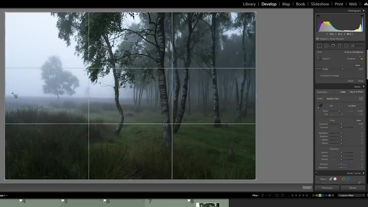 caption: Crop tool active with slight rotation applied
Danson crops before he touches exposure or color, and I think this is the right call. Cropping changes the visual weight of the image, and if you do it after you’ve tuned your tones, you often have to revisit everything. He makes a subtle crop here, tightening the frame slightly and applying a small rotation to level the horizon. Nothing dramatic. The goal is to commit to the composition so that every adjustment you make afterward is in service of the image you’re actually going to deliver.
caption: Crop tool active with slight rotation applied
Danson crops before he touches exposure or color, and I think this is the right call. Cropping changes the visual weight of the image, and if you do it after you’ve tuned your tones, you often have to revisit everything. He makes a subtle crop here, tightening the frame slightly and applying a small rotation to level the horizon. Nothing dramatic. The goal is to commit to the composition so that every adjustment you make afterward is in service of the image you’re actually going to deliver.
Step 3: Lift the Shadows, Protect the Highlights
 caption: Shadows slider being pulled right in Basic panel
With the crop locked in, Danson moves to the Basic panel and starts pulling shadows up. The fog creates a naturally low-contrast scene, so this isn’t about fighting the light, it’s about revealing the tonal detail that’s already there in the RAW file. He keeps an eye on the highlights, making sure nothing clips. If you’re following along on a foggy or overcast image of your own, you’ll likely find that the Whites and Highlights sliders need very little adjustment. The real work is in the midtones and shadows. Pull shadows up gradually and watch the image open up without losing that soft, diffused quality.
caption: Shadows slider being pulled right in Basic panel
With the crop locked in, Danson moves to the Basic panel and starts pulling shadows up. The fog creates a naturally low-contrast scene, so this isn’t about fighting the light, it’s about revealing the tonal detail that’s already there in the RAW file. He keeps an eye on the highlights, making sure nothing clips. If you’re following along on a foggy or overcast image of your own, you’ll likely find that the Whites and Highlights sliders need very little adjustment. The real work is in the midtones and shadows. Pull shadows up gradually and watch the image open up without losing that soft, diffused quality.
Step 4: Use the Tone Curve to Add Depth
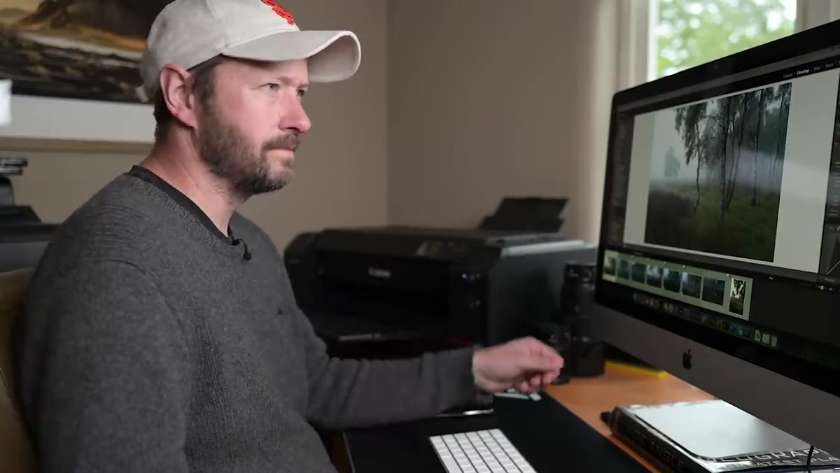 caption: Tone curve panel with subtle S-curve adjustment
After the Basic panel roughing-in, Danson refines contrast using the Tone Curve. He’s not applying a heavy S-curve here. It’s restrained. A gentle lift in the shadows and a subtle push in the upper midtones adds dimensionality without making the foggy scene feel harsh. This is where a lot of edits go wrong: people add too much contrast to a soft-light image and it starts to look like it was shot on a different day entirely. If your scene has natural atmosphere, protect it. The curve is there to sculpt, not overpower.
caption: Tone curve panel with subtle S-curve adjustment
After the Basic panel roughing-in, Danson refines contrast using the Tone Curve. He’s not applying a heavy S-curve here. It’s restrained. A gentle lift in the shadows and a subtle push in the upper midtones adds dimensionality without making the foggy scene feel harsh. This is where a lot of edits go wrong: people add too much contrast to a soft-light image and it starts to look like it was shot on a different day entirely. If your scene has natural atmosphere, protect it. The curve is there to sculpt, not overpower.
Step 5: Color Grade with Restraint
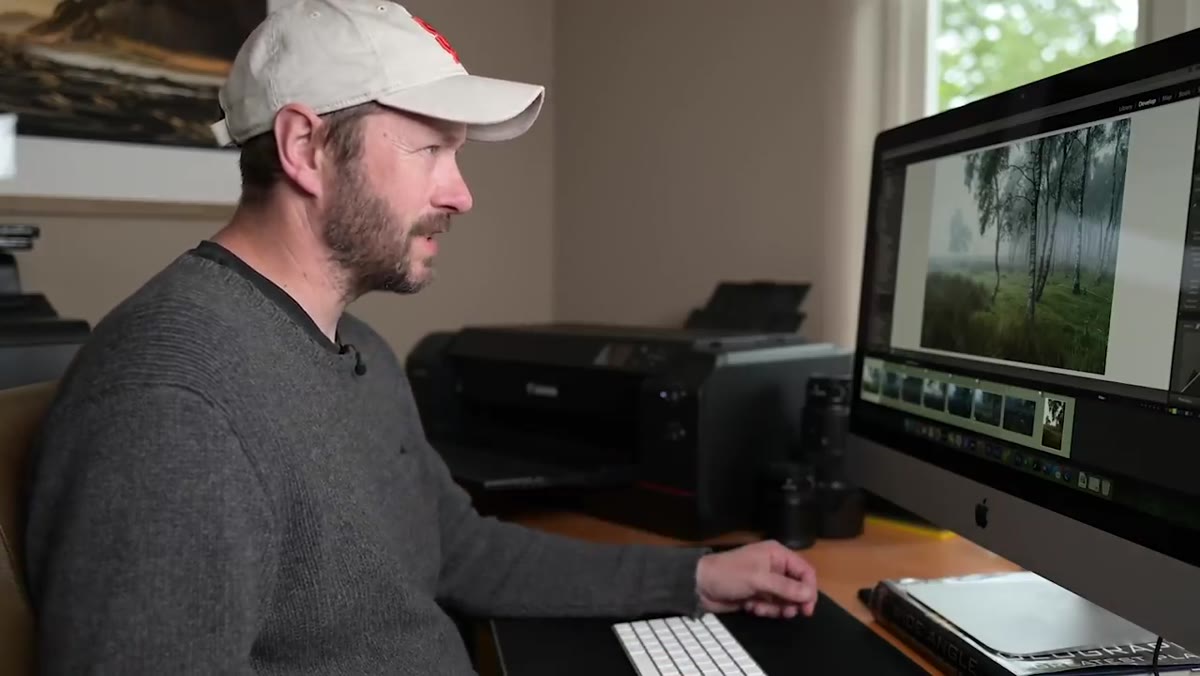 caption: HSL panel open with warm hue adjustments visible
Danson’s color work on this image is quiet but purposeful. He works through the HSL panel to adjust the hues and luminance of specific colors in the scene, particularly the warm tones in the heather and the cooler, neutral fog. The goal isn’t a dramatic look. It’s coherence. Every color in the frame should feel like it belongs to the same light. If you find yourself pushing saturation up to make the image “pop,” stop and ask whether the original colors just need their luminance adjusted instead. That shift alone often solves the problem without making anything look processed.
caption: HSL panel open with warm hue adjustments visible
Danson’s color work on this image is quiet but purposeful. He works through the HSL panel to adjust the hues and luminance of specific colors in the scene, particularly the warm tones in the heather and the cooler, neutral fog. The goal isn’t a dramatic look. It’s coherence. Every color in the frame should feel like it belongs to the same light. If you find yourself pushing saturation up to make the image “pop,” stop and ask whether the original colors just need their luminance adjusted instead. That shift alone often solves the problem without making anything look processed.
Step 6: Think About the Print the Whole Time
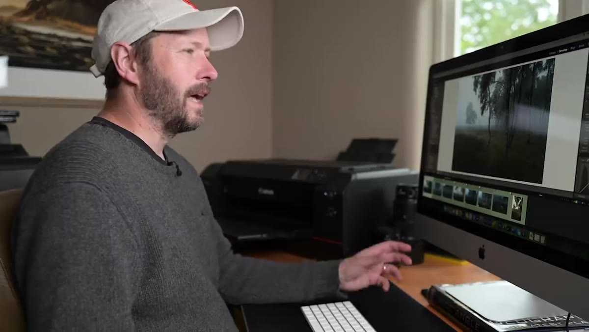
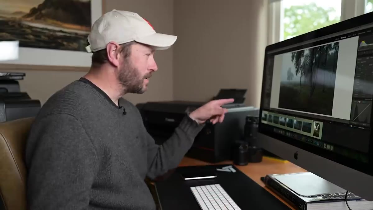 caption: Danson gesturing toward desktop printer on desk
Danson mentions early in the video that he’s editing this specific image for print, not just for screen. That single constraint changes how he works. Print softens shadows slightly and can shift color rendering depending on your paper profile, so he edits with a little extra headroom in the shadows and watches his midtone contrast carefully. If you plan to print, soft-proof in Lightroom before you call the edit done. Go to View, then Soft Proofing, load your printer’s ICC profile, and see what actually survives the translation from screen to paper.
caption: Danson gesturing toward desktop printer on desk
Danson mentions early in the video that he’s editing this specific image for print, not just for screen. That single constraint changes how he works. Print softens shadows slightly and can shift color rendering depending on your paper profile, so he edits with a little extra headroom in the shadows and watches his midtone contrast carefully. If you plan to print, soft-proof in Lightroom before you call the edit done. Go to View, then Soft Proofing, load your printer’s ICC profile, and see what actually survives the translation from screen to paper.
What I’d Add From My Own Experience
Danson’s workflow is clean and well-sequenced, but there’s one thing I’d layer in that he doesn’t cover here: local adjustments on the fog itself. In scenes like this, the fog can go flat or slightly muddy depending on how the global adjustments land. A radial or linear gradient mask over the foggy background, with a small negative Dehaze and a slight warmth shift, can make it feel like light is actually moving through the air rather than just sitting there. It’s a two-minute addition that makes the image feel three-dimensional without touching anything in the foreground.
I also keep a soft-contrast preset specifically for overcast and foggy work. Mine is named after a Mazzy Star song for reasons I won’t fully explain here, but the point is that having a starting point tuned to flat-light conditions gets me to a good edit faster and stops me from reaching for the Clarity slider when I shouldn’t.
The single most important thing Danson demonstrates in this video isn’t any individual slider. It’s the order of operations. Composition first. Exposure structure second. Color last. When you work in that sequence, every decision supports the one before it, and the edit feels intentional instead of improvised. It’s the difference between a photo that looks edited and one that just looks right.
Watch the full tutorial on YouTube to see Danson work through the print step at the end, which alone is worth the runtime.
Comments (2)
Applied this to my portfolio shots and the improvement is noticeable.
This is the kind of content that keeps me coming back.
Leave a Comment