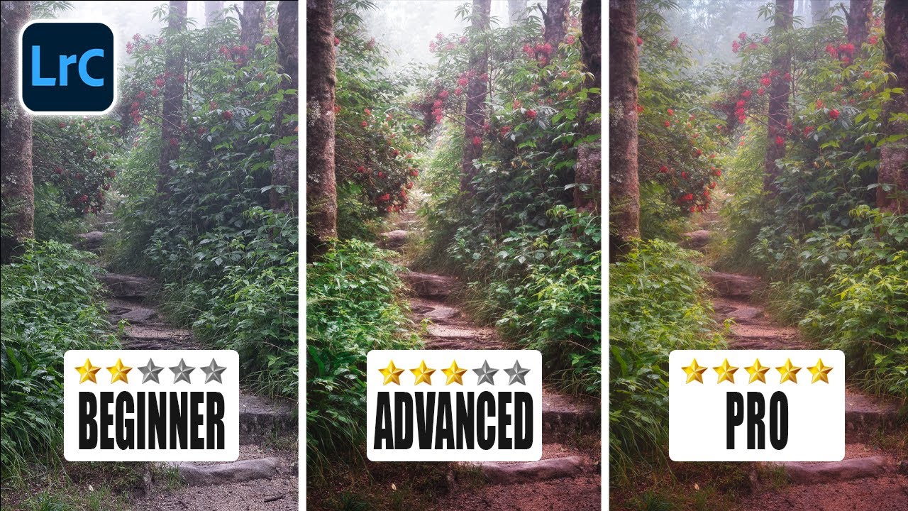
There’s a specific frustration I kept running into early in my editing workflow. I’d spend an hour on a landscape photo, get the tones looking clean, the colors feeling right, and then show it to someone who immediately looked at the wrong part of the frame. Not because the subject was unclear. Because the edit wasn’t doing its job. A technically correct photo and a visually directed photo are two completely different things, and for a long time I didn’t have the vocabulary to explain the gap between them.
Watch the full tutorial on YouTube
In this Mark Denney tutorial, he names that gap and then closes it. He calls the concept the “optical journey” - the deliberate path you design for a viewer’s eye to travel through your image. The core insight is deceptively simple: viewers gravitate toward brighter, more colorful, sharper areas. They avoid darker, flatter, softer ones. Once you internalize that as an editing principle rather than just a composition principle, your whole approach to Lightroom changes. You stop making global adjustments and start thinking like a lighting director.
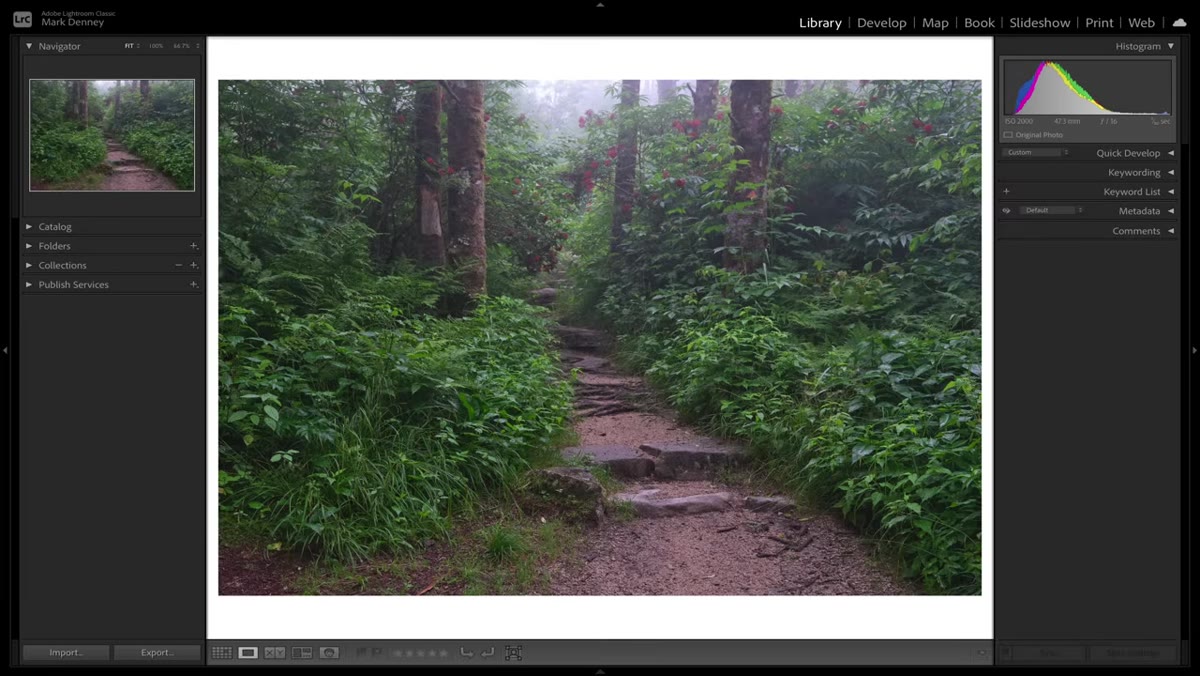
The image Denney uses as his subject is a forest path shot he shared on Instagram that generated a flood of “how did you edit this” messages. It’s a strong example because the raw file looks fine - exposed well, decent color - but it lacks direction. Your eye doesn’t know where to go. By the end of his process, the path through the frame feels inevitable. Here’s how he gets there.
Step 1: Analyze the Scene Before You Touch a Single Slider
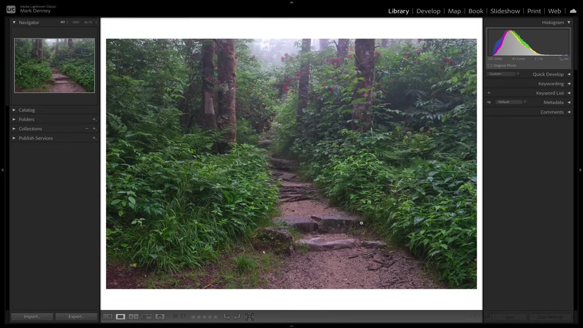
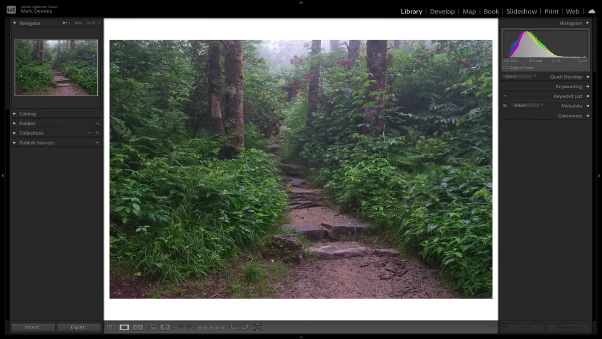 Raw file and final edit displayed side by side in Lightroom
Before opening any panel, Denney does something most people skip: he studies the raw file and asks two questions. Where do I want the viewer’s eye to start? And where do I want it to land? Not where it naturally goes based on the composition alone, but where you want it to go. This is an editorial decision, not a technical one, and making it before you edit saves you from making adjustments that fight each other.
Raw file and final edit displayed side by side in Lightroom
Before opening any panel, Denney does something most people skip: he studies the raw file and asks two questions. Where do I want the viewer’s eye to start? And where do I want it to land? Not where it naturally goes based on the composition alone, but where you want it to go. This is an editorial decision, not a technical one, and making it before you edit saves you from making adjustments that fight each other.
For his forest path image, he wants the eye to enter along the path and move toward the light in the background. Anything that competes with that journey, the darker edges, the less interesting sides of the frame, needs to be visually quieted. Write this down if it helps. Literally sketch the path on a piece of paper. The clearer this intention is before you edit, the more purposeful every adjustment becomes.
Step 2: Use Brightness and Color as Attention Tools
 Before and after comparison showing light guided toward path
Denney frames the entire edit around two axes of viewer attention. Brightness pulls the eye in. Darkness pushes it away. Color saturation draws attention. Muted color recedes. Think of these as rhetorical tools, not just aesthetic ones. When you brighten something in Lightroom, you’re not just making it look nicer - you’re saying look here. When you pull back the luminance on a distracting edge, you’re saying this doesn’t matter.
Before and after comparison showing light guided toward path
Denney frames the entire edit around two axes of viewer attention. Brightness pulls the eye in. Darkness pushes it away. Color saturation draws attention. Muted color recedes. Think of these as rhetorical tools, not just aesthetic ones. When you brighten something in Lightroom, you’re not just making it look nicer - you’re saying look here. When you pull back the luminance on a distracting edge, you’re saying this doesn’t matter.
This reframe is worth sitting with. Most beginners adjust brightness because something looks too dark or too bright. Denney adjusts brightness to control narrative. It’s a different motivation, and it produces a different kind of edit.
Step 3: Build the Optical Journey With Local Adjustments and Masks
 Masking panel open with path area selected in Lightroom
Global adjustments set the mood. Local adjustments set the direction. Denney uses Lightroom’s masking tools to isolate specific regions of the frame and adjust them independently. The path gets brighter. The light source in the background gets a boost. The peripheral areas, the sections that don’t serve the viewer’s journey, get darkened or desaturated.
Masking panel open with path area selected in Lightroom
Global adjustments set the mood. Local adjustments set the direction. Denney uses Lightroom’s masking tools to isolate specific regions of the frame and adjust them independently. The path gets brighter. The light source in the background gets a boost. The peripheral areas, the sections that don’t serve the viewer’s journey, get darkened or desaturated.
The practical approach here is to create a separate mask for each region of interest. Don’t try to do this with one gradient filter. Use subject selections, radial gradients, or brush masks to target exactly what you want to affect. For a scene like a forest path, you might have three to five masks running simultaneously: one brightening the path itself, one lifting the background light, one pulling down the left and right edges.
Step 4: Leverage a Vignette as a Structural Tool, Not an Afterthought
 Vignette applied in Effects panel pushing eye toward center
Denney makes a point about vignettes that reframed how I think about them. A vignette isn’t decoration. It’s a mechanical application of the same principle driving the whole edit: darken the edges, and the eye naturally moves toward the center. Used intentionally, it’s the simplest way to reinforce whatever optical journey you’ve built with your masks.
Vignette applied in Effects panel pushing eye toward center
Denney makes a point about vignettes that reframed how I think about them. A vignette isn’t decoration. It’s a mechanical application of the same principle driving the whole edit: darken the edges, and the eye naturally moves toward the center. Used intentionally, it’s the simplest way to reinforce whatever optical journey you’ve built with your masks.
In Lightroom’s Effects panel, he uses the Post-Crop Vignette. The key is keeping it subtle enough that it reads as atmosphere rather than filter. A Feather value around 80-90 and a Midpoint value that pushes the effect toward the edges rather than cramping the center will usually get you there. Pair it with your local adjustments rather than using it as a substitute for them.
Step 5: Refine and Check Against Your Original Intention
 Toggle between raw file and edited version in Lightroom
Denney toggles between the raw file and the edit throughout the process, not just at the end. This is a habit worth building. Each time you go back to the original, you’re asking: did this adjustment actually serve the optical journey, or did it just make the image look different? Those are not the same question.
Toggle between raw file and edited version in Lightroom
Denney toggles between the raw file and the edit throughout the process, not just at the end. This is a habit worth building. Each time you go back to the original, you’re asking: did this adjustment actually serve the optical journey, or did it just make the image look different? Those are not the same question.
A useful test is to look at your edit and trace where your eye goes first, second, third. If that path matches the one you sketched in Step 1, the edit is working. If your eye keeps getting snagged somewhere you didn’t intend, there’s a local adjustment that still needs attention.
One Thing I’d Add From My Own Experience
Denney’s framework works even better when you apply it to color temperature and saturation at the regional level, not just to exposure. In my own edits, I’ll often make the subject area very slightly warmer and more saturated than the surroundings. Not enough to look manipulated. Just enough that the eye registers it as the most alive part of the frame. You can do this with a radial mask and a small Temp and Vibrance bump. It’s the difference between a viewer glancing at your subject and actually stopping there.
The single most important takeaway from Denney’s tutorial is this: the edit doesn’t end when the image looks good. It ends when the image works - when a viewer’s eye travels exactly where you wanted it to go, feels satisfied when it arrives, and doesn’t wander somewhere unintentional along the way. That’s a much higher bar, and it’s the right one to aim for.
Watch the full tutorial on YouTube to see Denney walk through the complete edit on his forest path image. Watching the masking work in real time is worth it.
Comments
Leave a Comment