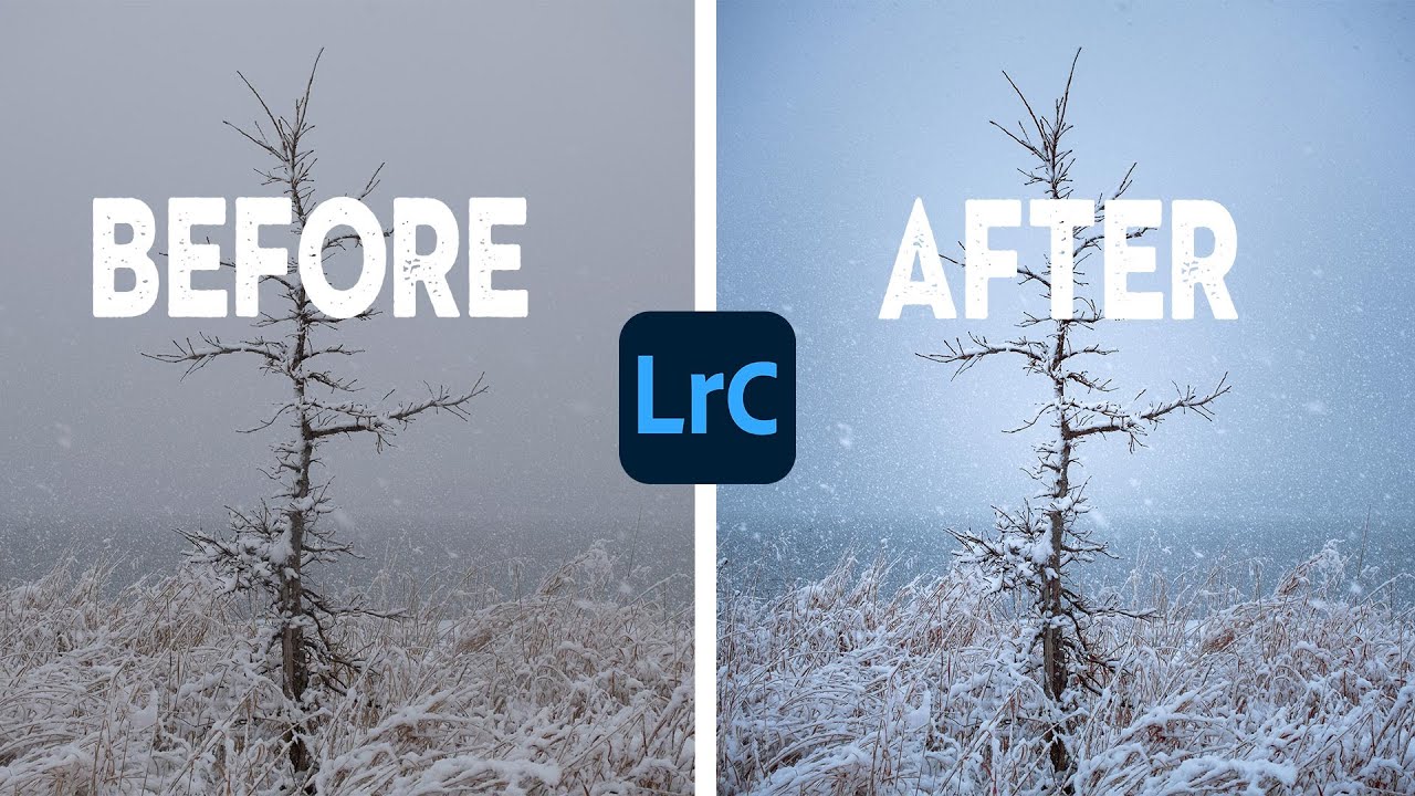
There’s a particular kind of sunset photo that almost every landscape photographer has taken. The pier, the warm glow on the water, the blown-out sky that felt magical in person and looks kind of flat on screen. I’ve had that exact experience more times than I want to admit, and for a long time my fix was to just throw a preset at it and call it done. What I actually needed was a workflow that treated warm and cool tones as a relationship, not a competition.
In this Nigel Danson tutorial, Nigel edits real photos submitted by his audience, working entirely inside Lightroom. The first image is a gorgeous sunset pier shot from the South Coast of England, and watching him work through it taught me something I keep coming back to: the goal isn’t to make everything look saturated, it’s to introduce contrast between warm and cool tones so each one makes the other sing.
What follows is my breakdown of exactly how he does it, step by step, so you can follow along on your own files without having to pause and rewind every 30 seconds.
Step 1: Establish a Neutral Starting Point in the Basic Panel
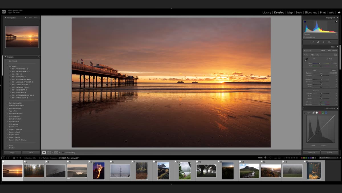 Nigel pulling down exposure and contrast sliders in Basic panel
Before reaching for any masks, Nigel dials back the global settings to give himself room to work. He lowers the overall exposure slightly, pulls contrast down a notch, and lifts the shadows to open up detail in the darker areas of the frame. The key move here is also cooling the white balance, just a few hundred Kelvin toward the blue end. This isn’t the final look. Think of it like priming a canvas: you’re removing the camera’s baked-in warmth bias so you can add warmth back selectively later, where it actually matters.
One thing I’ve started doing after watching this: I make these global adjustments as conservatively as possible. The masks do the heavy lifting. The basic panel just sets a sensible ceiling.
Step 2: Crop for Compositional Balance Before Masking
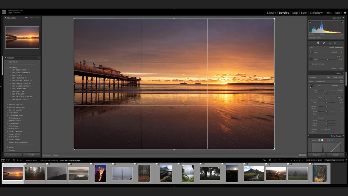 Crop tool active, Nigel adjusting frame boundaries
Nigel crops before committing to any mask work, which is the right order of operations. His reasoning is straightforward: if you spend 20 minutes masking a part of the frame that gets cropped out anyway, you’ve wasted 20 minutes. When he crops this image, he’s specifically trying to balance the visual weight of the sun on one side against the pier on the other. He uses distance as a guide, the gap between the frame edge and the sun roughly matching the gap on the opposite side. He also straightens the horizon while he’s in the crop tool, handling two compositional fixes in one step.
If your image has two competing focal points like this one, try thinking of them as weights on a scale. The crop is how you adjust the balance.
Step 3: Use a Linear Gradient to Cool the Sky
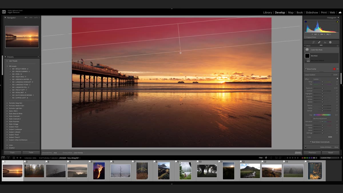 Linear gradient mask drawn across upper portion of image
With the global tone set, Nigel adds a linear gradient mask across the top of the frame. The gradient falls off gradually toward the horizon, which keeps the transition from looking like a hard filter was slapped over the sky. Inside that mask, he pushes the temperature cooler, adds a little contrast, and makes subtle adjustments to exposure and blacks. The result is that the upper sky becomes distinctly blue without it looking forced. The cool tones in the sky will later make the warm tones around the sun feel significantly more vivid by comparison.
This is the core principle of the whole edit, and it’s worth repeating: color contrast creates perceived saturation. You don’t need a more saturated orange. You need more blue next to it.
Step 4: Mirror the Gradient in the Foreground
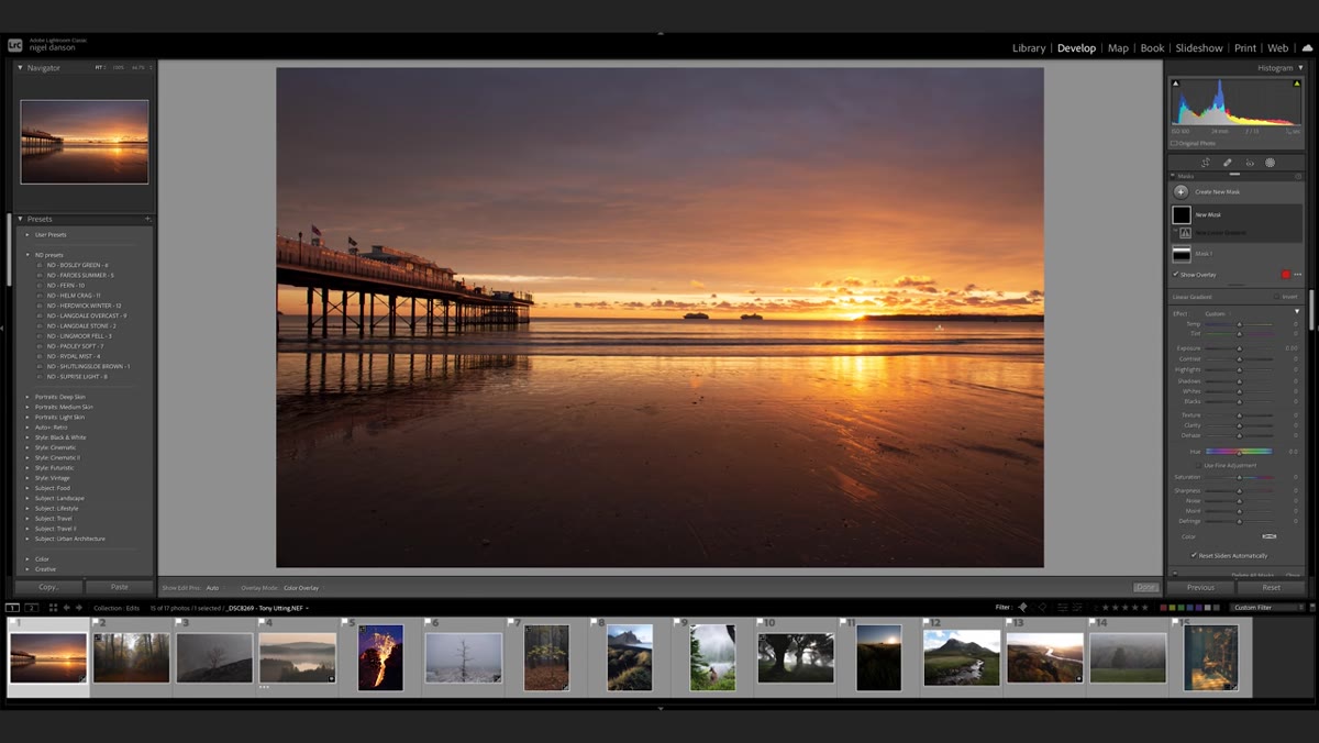 Second linear gradient applied to lower portion of image
Nigel creates a second linear gradient, this time pulling from the bottom of the frame upward, applying similar cooling adjustments to the water and foreground. The reflection in the water picks up the same blue-purple tones as the sky, which creates visual symmetry and makes the whole image feel more intentional. He notes he probably could have just duplicated the first mask, which is worth remembering as a workflow shortcut in Lightroom: if two regions need similar treatment, duplicate the mask and flip it rather than building from scratch.
The foreground and sky now read as one cohesive color story, which is what separates a good sunset edit from one where the sky and ground feel like they belong to different photographs.
Step 5: Add a Radial Gradient to Build the Sun’s Glow
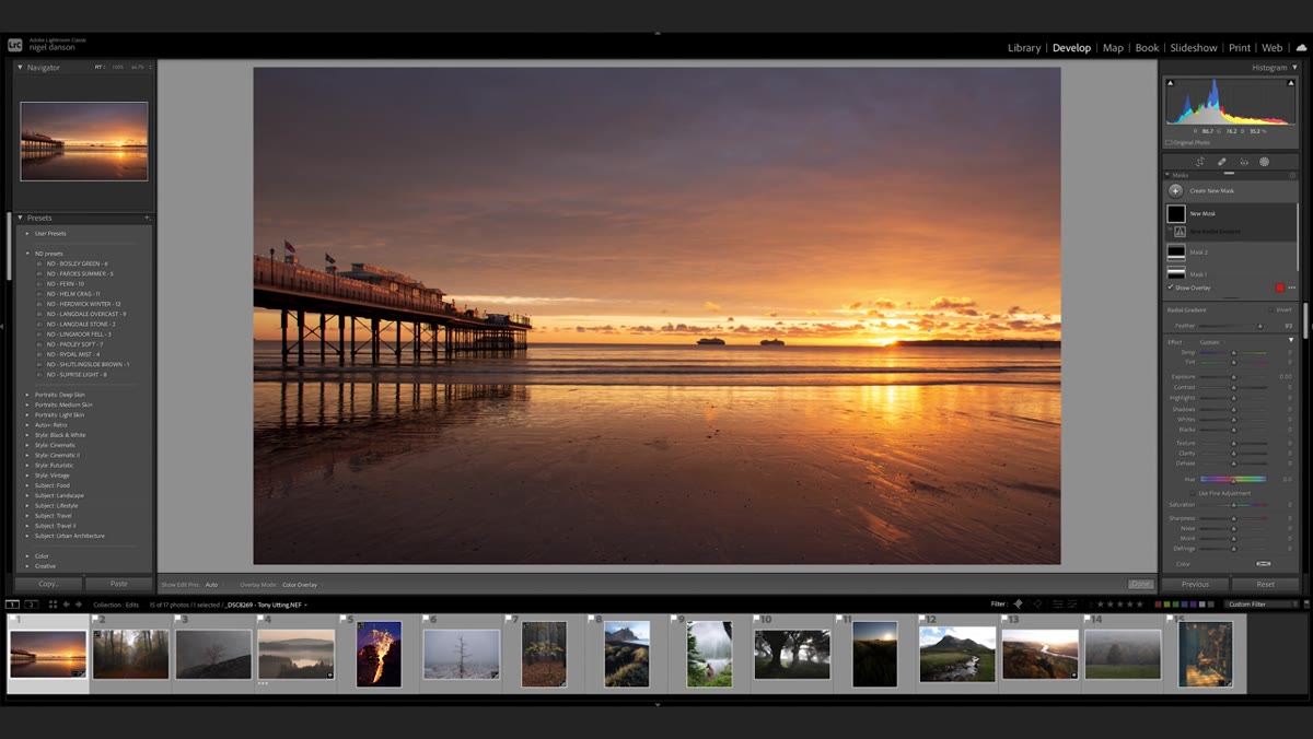 Large radial gradient centered on sun position
Here’s where the edit gets interesting. Nigel adds a large radial gradient centered on the sun and uses it to soften and warm that specific zone. He increases the temperature slightly, lifts the whites, and then does something I hadn’t thought to do here: he reduces the dehaze slider. Normally dehaze adds clarity and contrast. Pulling it in the negative direction does the opposite, blending detail together into a soft, luminous haze. For a glowing sun, that’s exactly what you want. You’re not trying to show the sun’s texture. You’re trying to show its light.
He then stacks a second, smaller radial gradient on top of the first, centered in the same spot. This inner gradient gets a brightness boost and a negative clarity adjustment, pushing the core of the sun toward a soft, almost overexposed yellow-white. Two gradients layered this way create a natural-looking falloff that one gradient alone can’t achieve.
What I Do Differently: Sensor Dust and Final Cleanup
Nigel flags sensor dust spots in this image but moves past them quickly to keep the tutorial focused. In my own workflow, I always do a final dust pass after all the masking is done, not before. The reason is that masking and color work can make spots more or less visible depending on how the tones shift. If you clone out a spot before you cool down an area, you might find it becomes invisible anyway, or that a new one appears in a different part of the frame. Save the healing brush for last.
I’d also add one step that isn’t in this particular video: after building out the warm-cool contrast, I’ll sometimes visit the HSL panel and nudge the orange luminance down slightly. It keeps the sunset tones rich without looking like they’ve been boosted in Photoshop. It’s subtle, but that’s usually where the best Lightroom decisions live.
The single most important thing I took from watching Nigel work through this image is that color vibrance is relational. You don’t fix a flat sunset by making it warmer. You fix it by introducing cool tones that give the warmth something to push against. Every mask in this edit exists to serve that idea.
Watch the full tutorial on YouTube to see Nigel apply these same principles to additional photos, including a street shot that takes the workflow in a completely different direction.
Comments (1)
The before and after really sells it. Incredible difference.
Leave a Comment