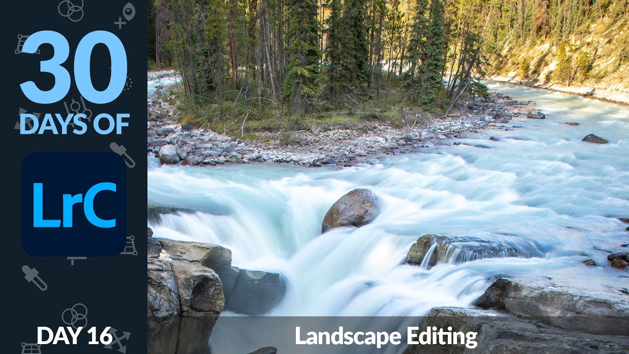
Landscape editing has a way of humbling you fast. You come home with a shot that looked incredible in the field, load it into Lightroom, and suddenly the sky is a blown-out white smear and the water looks like concrete. I’ve been there more times than I want to count. The problem isn’t usually the photo. It’s that landscapes have an extreme dynamic range that a single global edit almost never handles gracefully. You need targeted adjustments, and you need to know which tools to reach for first.
In this Aaron Nace (PHLEARN) tutorial, part of his 30 Days of Lightroom series, he walks through exactly that kind of targeted approach using a long-exposure landscape shot as the example image. Watch the full tutorial on YouTube if you want to follow along with the actual RAW file he provides. What I want to do here is break down the techniques step by step, because the decisions Aaron makes in this edit are ones I’ve started applying to almost every landscape I touch.
The photo itself is genuinely beautiful. Water shot at a slow shutter speed with a long exposure, giving it that silky, blurred quality that makes landscape photography feel cinematic rather than documentary. Getting there in-camera requires a specific balancing act. And getting the most out of that RAW file in Lightroom requires another one.
Step 1: Understand the In-Camera Exposure Logic Before You Edit
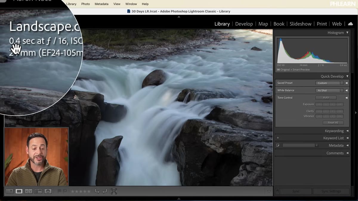 Camera settings panel showing shutter speed, aperture, and ISO values
Before touching a single slider, it helps to understand how the original image was captured, because that context shapes every editing decision you make. This shot used a shutter speed of around 4 seconds, which is a genuinely long exposure. That much time means a lot of light hits the sensor, so to compensate and still get a proper overall exposure, the aperture was stopped way down to f/16 and ISO was kept low at 50. Three levers, all pulling in different directions to land on a balanced result.
Camera settings panel showing shutter speed, aperture, and ISO values
Before touching a single slider, it helps to understand how the original image was captured, because that context shapes every editing decision you make. This shot used a shutter speed of around 4 seconds, which is a genuinely long exposure. That much time means a lot of light hits the sensor, so to compensate and still get a proper overall exposure, the aperture was stopped way down to f/16 and ISO was kept low at 50. Three levers, all pulling in different directions to land on a balanced result.
Why does this matter for editing? Because you’re working with a file that has very deliberately compressed highlights and a lot of shadow detail preserved. The sensor was doing its best across a wide scene, and your job in Lightroom is to push that further without losing the natural feel.
Step 2: Start with Auto Tone as a Fast Baseline
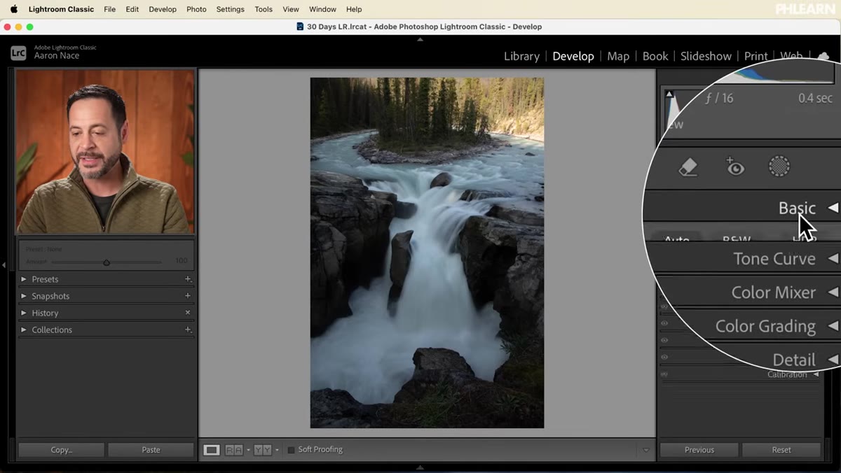 Basic panel in Develop module after clicking Auto button
Jump into the Develop module and open the Basic panel. Aaron’s first move is clicking Auto, and honestly, I used to skip this step because it felt like admitting defeat. I’ve changed my mind. Auto in modern Lightroom is remarkably smart about reading a RAW file’s histogram and distributing tones. It won’t give you a finished edit, but it gets you into a reasonable ballpark quickly, and you can see immediately what the file is capable of.
Basic panel in Develop module after clicking Auto button
Jump into the Develop module and open the Basic panel. Aaron’s first move is clicking Auto, and honestly, I used to skip this step because it felt like admitting defeat. I’ve changed my mind. Auto in modern Lightroom is remarkably smart about reading a RAW file’s histogram and distributing tones. It won’t give you a finished edit, but it gets you into a reasonable ballpark quickly, and you can see immediately what the file is capable of.
After clicking Auto, the image opens up considerably. The midtones get better, shadow detail comes forward, and the water picks up texture. But the sky and upper portion of the frame are still too hot. That overexposure in the top right corner becomes the main problem to solve.
Step 3: Apply a Linear Gradient Mask to Target the Overexposed Area
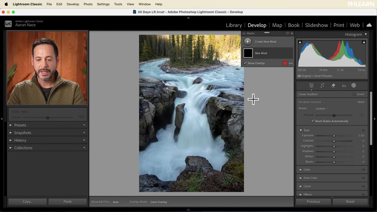 Masking panel open with linear gradient being drawn across upper frame
Head to the Masking panel in the toolbar. Create a new mask and choose Linear Gradient. Click and drag it across the top of the frame so the red overlay covers the bright, overexposed area you want to pull back. The red shows you exactly what the mask is affecting, which is one of those Lightroom features I genuinely love using.
Masking panel open with linear gradient being drawn across upper frame
Head to the Masking panel in the toolbar. Create a new mask and choose Linear Gradient. Click and drag it across the top of the frame so the red overlay covers the bright, overexposed area you want to pull back. The red shows you exactly what the mask is affecting, which is one of those Lightroom features I genuinely love using.
Here is where the technique gets interesting. The temptation is to grab the Exposure slider and just drag it down. Aaron specifically avoids this, and he’s right to. Reducing overall exposure inside that gradient will darken the trees at the edge of the mask, which looks unnatural. Instead, go to the Highlights slider and bring that down. Highlights are selectively targeting the brightest parts of the masked area without flattening everything else. It’s a more surgical fix, and the difference is visible.
Step 4: Add a Brush Mask to Fine-Tune the Shoreline
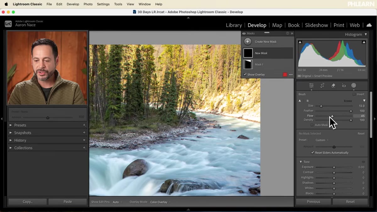 Brush tool active, painting over bright shoreline area with low flow setting
Even after the linear gradient, there’s often a band of brightness right along the horizon or shoreline that still looks a little too hot. This is where a second, separate mask with the brush tool earns its place. Create a new mask, choose Brush, and before you paint, drop the Flow setting down. Something like 20-30% gives you a gradual buildup rather than a hard application. That low flow is how you get a natural, feathered result instead of a painted-on look.
Brush tool active, painting over bright shoreline area with low flow setting
Even after the linear gradient, there’s often a band of brightness right along the horizon or shoreline that still looks a little too hot. This is where a second, separate mask with the brush tool earns its place. Create a new mask, choose Brush, and before you paint, drop the Flow setting down. Something like 20-30% gives you a gradual buildup rather than a hard application. That low flow is how you get a natural, feathered result instead of a painted-on look.
Paint along the shoreline and the area just above it. You’re not going for precision so much as coverage, letting the low flow do the blending work as you build up multiple passes. Once the area is masked, bring Exposure down slightly and pull the Highlights down a touch further. Keep the adjustments subtle. The goal is parity with the rest of the image, not a dramatic darkening.
Step 5: Add a Saturation Boost Inside the Mask
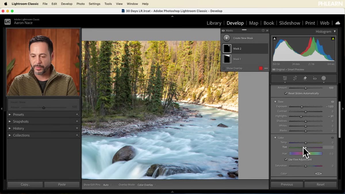 Color section inside brush mask with saturation slider being adjusted
This is a small step Aaron includes that I think is easy to overlook. After adjusting exposure and highlights inside that brush mask, flip open the Color section within the same mask and nudge Saturation up a little. When you pull down exposure and highlights on a selected area, colors in that region can look slightly washed out compared to the rest of the image. A gentle saturation bump inside the mask counteracts that and keeps the tones feeling consistent across the whole frame.
Color section inside brush mask with saturation slider being adjusted
This is a small step Aaron includes that I think is easy to overlook. After adjusting exposure and highlights inside that brush mask, flip open the Color section within the same mask and nudge Saturation up a little. When you pull down exposure and highlights on a selected area, colors in that region can look slightly washed out compared to the rest of the image. A gentle saturation bump inside the mask counteracts that and keeps the tones feeling consistent across the whole frame.
It’s the kind of micro-adjustment that separates edits that feel cohesive from edits where something just seems slightly off but you can’t figure out why.
Step 6: Compare Before and After with Masks Hidden
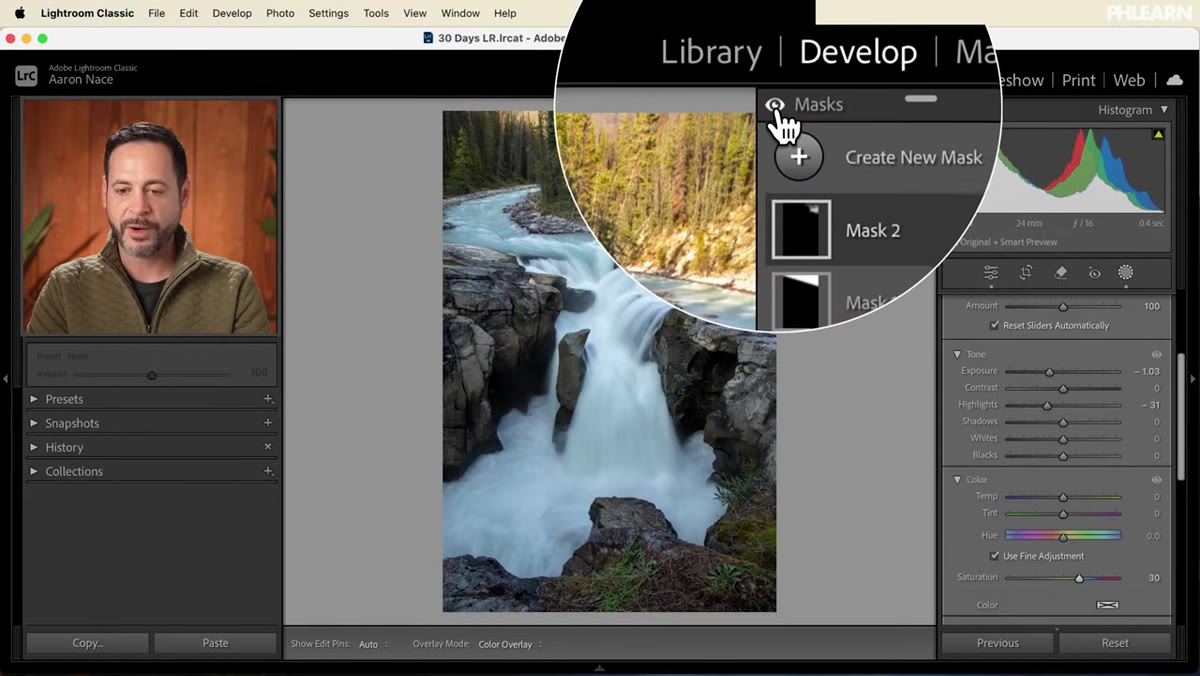 Before and after view with masks toggled off showing tonal improvement
Toggle the mask visibility off by clicking the mask icon so you can see the image clean. Then use Lightroom’s before-and-after view to assess your actual progress. The difference is real. The sky holds detail, the shoreline isn’t competing with the water for attention, and the long-exposure silkiness of the water reads the way it should.
Before and after view with masks toggled off showing tonal improvement
Toggle the mask visibility off by clicking the mask icon so you can see the image clean. Then use Lightroom’s before-and-after view to assess your actual progress. The difference is real. The sky holds detail, the shoreline isn’t competing with the water for attention, and the long-exposure silkiness of the water reads the way it should.
This comparison step isn’t just satisfying. It tells you whether your adjustments are working or whether you’ve overcorrected. Make it a habit before you move on to any color grading.
My Take: The Mask-First Mindset Changes Everything
I used to edit landscapes by moving global sliders until something broke and then trying to fix it. What Aaron’s workflow reinforced for me is that masking early, before color grading, makes every subsequent step easier. When your tones are already balanced across different zones of the image, global color adjustments actually behave the way you expect them to. You stop fighting the edit.
If you shoot in varied lighting conditions, which most landscape photographers do, getting comfortable with linear gradients and brush masks in Lightroom is probably the single highest-leverage skill you can build. Not presets. Not color science debates. Just the ability to treat different parts of your frame as different problems.
The most important thing I took from this tutorial is that Highlights and Exposure are not interchangeable sliders even when they seem to do similar things. Using the right one inside a mask is often the difference between a retouch that holds up and one that looks like you just slapped a filter on.
Watch the full tutorial on YouTube and download Aaron’s RAW file to follow along. There is no substitute for doing the edit yourself at least once.
Comments
Leave a Comment