Why Your Digital Photos Look Wrong (And How Film Emulation Actually Fixes It)

Why Your Digital Photos Look Wrong (And How Film Emulation Actually Fixes It)

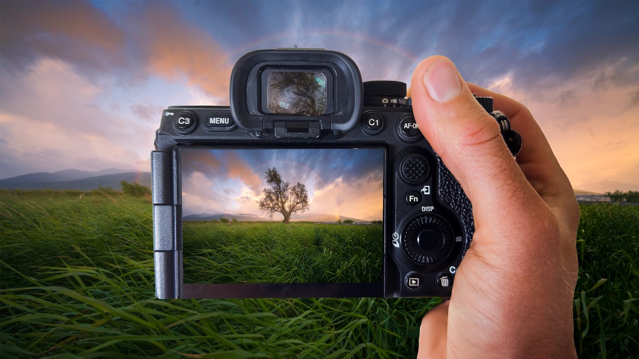
There’s a photo on my hard drive from about eight years ago. My band needed press shots and nobody in our circle could afford a photographer, so I picked up a camera, read enough to be dangerous, and shot them myself. The images were technically fine. Sharp, well-exposed, clean. And they looked completely lifeless. I spent three days trying to figure out why a photo of four people standing in actual sunlight looked like a screenshot from a corporate training video.

Lightroom's Quietly Dropped Two Masking Features That Change Everything About Local Adjustments

Lightroom's Quietly Dropped Two Masking Features That Change Everything About Local Adjustments

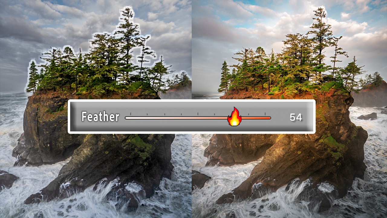
Color grading has always felt like one of those tools that’s 90% of the way there. The ability to push your highlights toward gold, nudge your shadows into teal, or breathe some cinematic warmth into your midtones is genuinely powerful. I use it on almost every landscape and portrait edit I touch. But for years, there’s been this maddening ceiling on what it can do: color grading applies globally, across the entire image, based on tonal values alone.

AI Just Walked the Red Carpet: What Dreams of Violets Means for Creative Professionals

AI Just Walked the Red Carpet: What Dreams of Violets Means for Creative Professionals

The Moment We’ve All Been Waiting For (Or Dreading) This June, something genuinely historic happens at the Tribeca Festival. A feature-length film called “Dreams of Violets” will premiere—and here’s the kicker: every single frame, every actor, every shadow and highlight was created entirely by artificial intelligence. No cameras. No location scouts. No 2 a.m. color grading sessions with cold coffee. I have to admit, when I first heard about this, my gut reaction was complicated.

Split Toning in Lightroom: How Two Colors Can Make or Break the Whole Mood of a Photo

Split Toning in Lightroom: How Two Colors Can Make or Break the Whole Mood of a Photo

I have a preset I built about three years ago called “Rumours.” Warm golden shadows, slightly cool highlights, the kind of look that makes a portrait feel like it was shot in a California living room in 1977. I named it after the Fleetwood Mac album because that’s the mood I was chasing when I built it. I’ve used it on maybe two dozen client galleries since then, and people consistently ask me how I got “that color.

Lightroom's Lens Blur Tool: Finally Getting That Bokeh Right in Post-Production

Lightroom's Lens Blur Tool: Finally Getting That Bokeh Right in Post-Production

Lightroom’s Lens Blur Tool: Finally Getting That Bokeh Right in Post-Production I’ve spent enough time in Lightroom to know which tools actually deliver and which ones are just taking up panel real estate. When Adobe introduced the Lens Blur feature to Lightroom Classic, I’ll admit I was skeptical. Can software really fake what a fast lens and proper aperture do in-camera? Turns out, the answer is more nuanced than a simple yes or no.

Stop Manually Dragging Sliders Back to Zero — There's a Much Faster Way

Stop Manually Dragging Sliders Back to Zero — There's a Much Faster Way

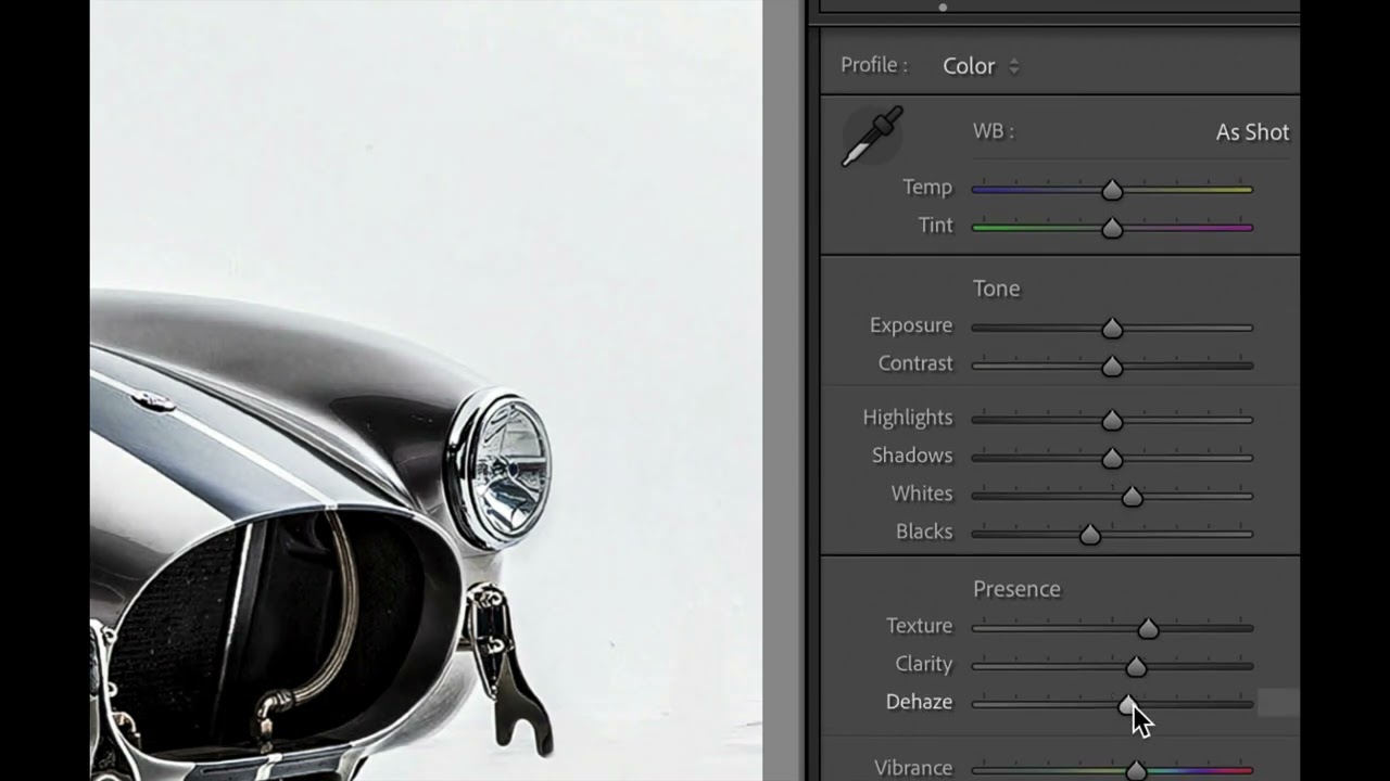
There’s a particular kind of frustration that hits when you’re deep in an edit and you realize a whole section of adjustments has gone sideways. The Presence panel is a mess, your Tone sliders look like a seismograph readout, and you need to back everything out and start fresh. For a long time, my solution was to drag each slider back to zero by hand, one at a time, like some kind of monk doing penance.

How to Edit a Sunrise RAW File When the Sky Is Already Doing the Work

How to Edit a Sunrise RAW File When the Sky Is Already Doing the Work

There’s a specific kind of heartbreak that landscape photographers know too well. You wake up before dawn, drive somewhere cold and beautiful, and something genuinely magical happens in front of your lens. You drive home buzzing. You pull up the RAW files. And then, nothing. Flat skies. Muddy colors. A scene that looks like a slightly overcast Tuesday instead of the light show you just witnessed with your own eyes. I’ve been editing photos long enough to know this isn’t a skill problem.

Split Toning Is the Difference Between a Good Edit and a Memorable One

Split Toning Is the Difference Between a Good Edit and a Memorable One

I had a folder of band press shots sitting on my desktop for three days before I figured out what was wrong with them. The exposure was right. The white balance was dialed. The skin tones looked natural. And the photos were completely, aggressively boring. They looked like stock photos of musicians rather than actual musicians. It wasn’t until I added a warm amber to the shadows and a faint blue to the highlights that the whole thing clicked.

What Lightroom Presets Actually Do to Your Files (And Why Most People Use Them Wrong)

What Lightroom Presets Actually Do to Your Files (And Why Most People Use Them Wrong)

A few years ago I released a preset pack on a Tuesday night, mostly because I’d spent the entire weekend building it and felt too stubborn to let it sit on my hard drive. I named every preset after a song, priced the pack at zero dollars, and went to bed. By Friday it had 50,000 downloads. The number wasn’t the surprising part. The surprising part was how many people emailed me to say the presets “weren’t working” because their photos looked nothing like the preview images on the download page.

When the Sky Blows Out: A Practical Guide to Recovering Highlights in Lightroom

When the Sky Blows Out: A Practical Guide to Recovering Highlights in Lightroom

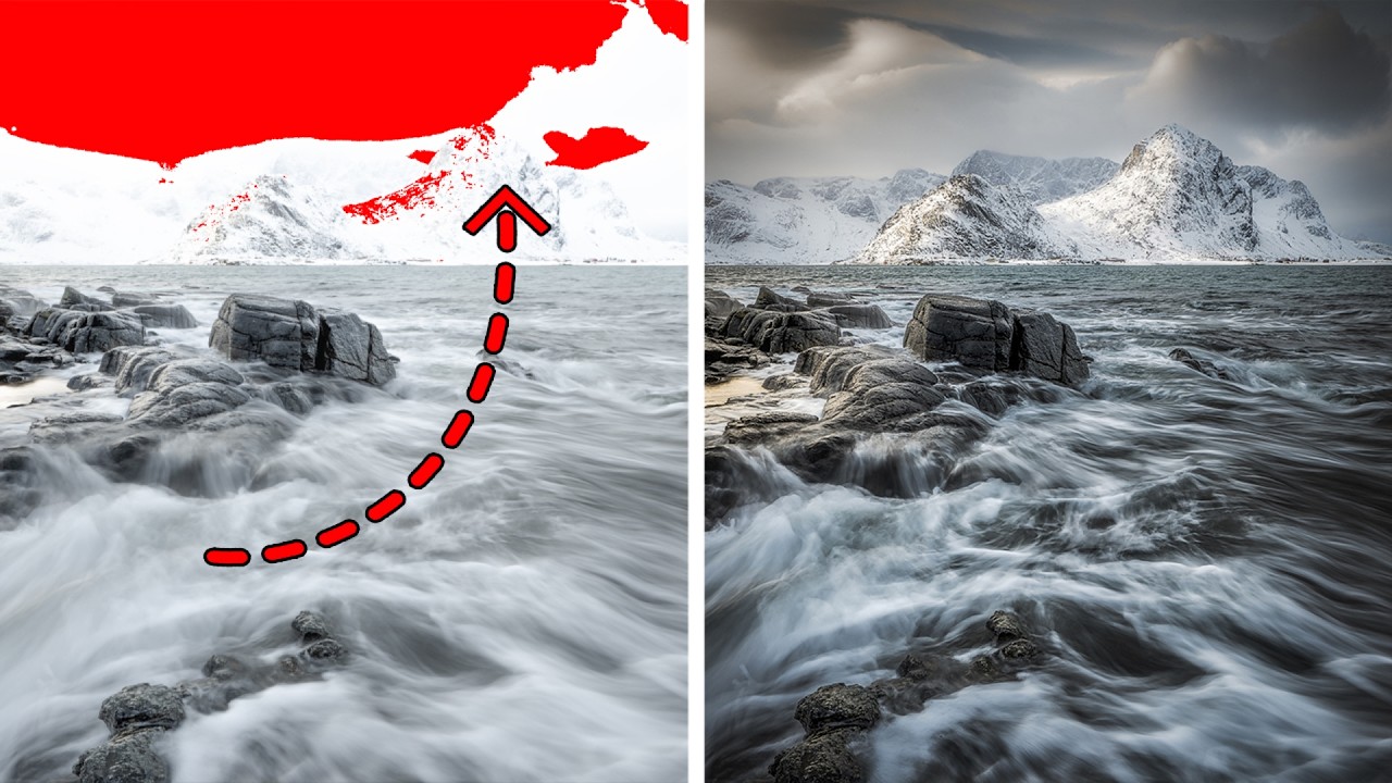
There’s a particular kind of heartbreak that happens when you come home from a shoot, pull up your RAW files, and realize the best frame of the day has a chunk of pure white where the sky used to be. No detail. No texture. Just a blank spot where your highlights burned straight through the sensor’s ceiling. I’ve been there more times than I want to admit, and for a long time my instinct was the same as everyone else’s: drag it to the trash and hope lightning strikes twice.

Google's New AI Image Tool Changes the Game for Creative Workflows

Google's New AI Image Tool Changes the Game for Creative Workflows

Google’s New AI Image Tool Changes the Game for Creative Workflows I’ve been watching the AI image generation space explode over the last couple of years, and honestly? Most of the tools have felt clunky and disconnected from real creative workflows. That changed this week when Google unveiled their latest creation tool integrated directly into their Workspace ecosystem. What’s Different This Time The beauty of this new platform isn’t that it generates images from scratch—we’ve all seen that done a thousand times by now.

The Color Grading Game-Changer: Why Complementary Colors Transform Your Lightroom Edits

The Color Grading Game-Changer: Why Complementary Colors Transform Your Lightroom Edits

The Color Grading Game-Changer: Why Complementary Colors Transform Your Lightroom Edits I’ve noticed something fascinating happening in the photography community lately. While everyone’s obsessing over preset packs and AI-powered tools, the real magic still happens in Lightroom’s color grading panel—a feature that remains criminally underutilized by most photographers. Here’s the thing: the difference between a photo that makes someone stop scrolling and one that gets buried in their feed often comes down to color.