
There’s a specific kind of edit I used to dread: a portrait with a blown-out background, slightly flat skin, and hair that reads as a muddy brownish-yellow on screen. It’s not a ruined photo. It’s a fixable photo. But the path from “fixable” to “finished” always felt like it had too many decision points, and I’d end up over-editing my way into something worse than what I started with. That changed when I started paying close attention to how photographers with a clear visual instinct move through Lightroom — not what buttons they press, but why and in what order.
In this Jessica Kobeissi tutorial, she walks through a portrait edit that looks deceptively simple on the surface. A tone curve tweak here, some brush work there. But what she’s actually demonstrating is a disciplined philosophy: make a few precise moves rather than a dozen vague ones. As someone who once spent an entire weekend building a preset pack, naming every preset after a song, then gave the whole thing away for free — I recognize that kind of taste-driven restraint when I see it. Let me break down exactly what she does, step by step.
Step 1: Reset to Default Before You Touch Anything
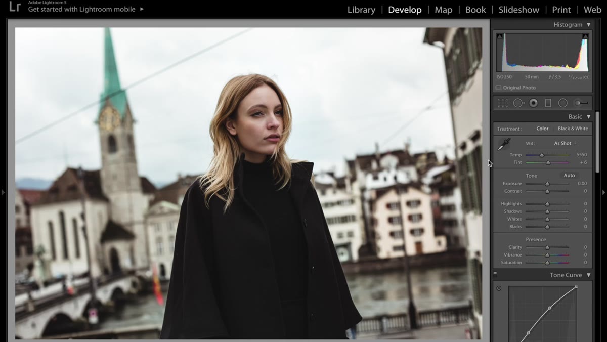 Lightroom develop panel being reset to default settings
Before Jessica makes a single creative decision, she wipes the slate clean. In Lightroom, that means hitting Command + Shift + R on Mac to reset all develop settings to their defaults. It sounds obvious, but a lot of beginners skip this and end up fighting against settings baked in from a previous session or a camera profile.
Lightroom develop panel being reset to default settings
Before Jessica makes a single creative decision, she wipes the slate clean. In Lightroom, that means hitting Command + Shift + R on Mac to reset all develop settings to their defaults. It sounds obvious, but a lot of beginners skip this and end up fighting against settings baked in from a previous session or a camera profile.
Think of it as mise en place. You want to see the actual raw file, not a version already halfway cooked. This reset habit is especially important if you’re working from a shoot where you applied settings to multiple images and are now circling back to refine individual shots.
Step 2: Shape the Image with the Tone Curve
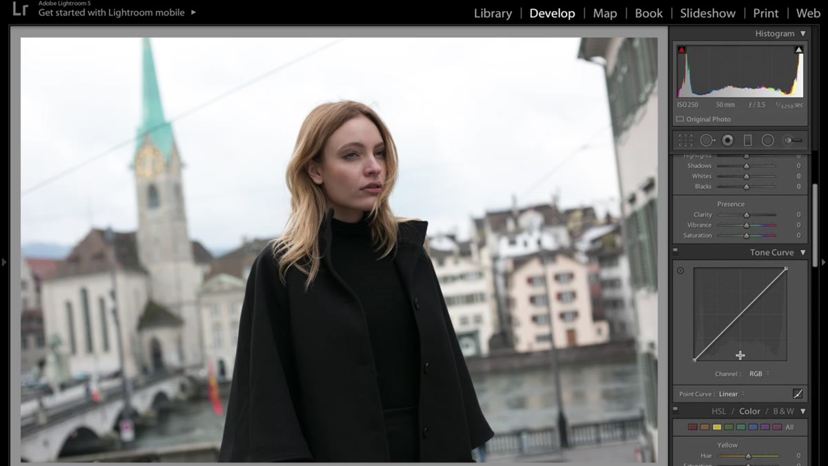 Tone curve panel open with subtle S-curve applied
The tone curve is Jessica’s first real creative move, and she’s transparent about keeping it simple. Rather than sculpting a dramatic S-curve, she places just four or five anchor points and makes subtle adjustments. The goal isn’t a cinematic look straight out of the curve panel. It’s a gentle lift that gives the image more dimension before any other work begins.
Tone curve panel open with subtle S-curve applied
The tone curve is Jessica’s first real creative move, and she’s transparent about keeping it simple. Rather than sculpting a dramatic S-curve, she places just four or five anchor points and makes subtle adjustments. The goal isn’t a cinematic look straight out of the curve panel. It’s a gentle lift that gives the image more dimension before any other work begins.
If you’ve always found the tone curve intimidating, this is the reframe you need: you don’t have to do much. Lift the shadows slightly so they don’t crush to black. Pull the highlights down just a hair to recover texture. That’s often all it takes. The curve doesn’t need to be your hero edit — it just needs to set the table.
Step 3: Desaturate the Yellows in the HSL Panel
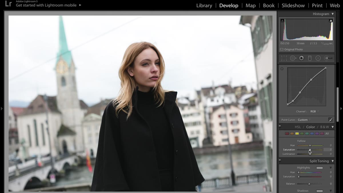 HSL panel open with yellow saturation slider pulled down
After the tone curve, Jessica moves into the HSL (Hue, Saturation, Luminance) panel and pulls down the saturation on yellows specifically. Her reason is straightforward: it cleans up hair tones that can look over-saturated or brassy in natural light, and gives the whole image a cooler, more editorial quality.
HSL panel open with yellow saturation slider pulled down
After the tone curve, Jessica moves into the HSL (Hue, Saturation, Luminance) panel and pulls down the saturation on yellows specifically. Her reason is straightforward: it cleans up hair tones that can look over-saturated or brassy in natural light, and gives the whole image a cooler, more editorial quality.
This is one of those micro-adjustments that separates a processed-looking photo from a polished one. You’re not desaturating the entire image. You’re targeting one color range that tends to misbehave in skin and hair, and quietly dialing it back. The effect is more visible than you’d expect, especially on warm-toned subjects shot in golden hour light.
Step 4: Set Up the Adjustment Brush for the Background
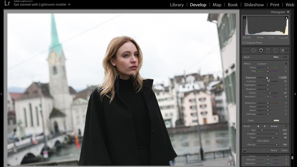 Adjustment brush panel open with exposure and contrast settings visible
Here’s where the real work happens. Jessica uses the Adjustment Brush with a predefined configuration she already trusts: exposure pulled down to around -37, contrast increased, sharpness set to 25, and a small boost to saturation (around 4). She also adds a subtle yellow color tint at about 16% opacity using the color picker at the bottom of the brush panel.
Adjustment brush panel open with exposure and contrast settings visible
Here’s where the real work happens. Jessica uses the Adjustment Brush with a predefined configuration she already trusts: exposure pulled down to around -37, contrast increased, sharpness set to 25, and a small boost to saturation (around 4). She also adds a subtle yellow color tint at about 16% opacity using the color picker at the bottom of the brush panel.
The reason for that color tint is smart. It ties the background tone to the warmth already present in the subject, preventing the background from reading as a separate, disconnected element. At 16%, it’s not something a viewer will consciously notice. They’ll just feel like the photo holds together.
Step 5: Paint the Background Without Touching the Subject
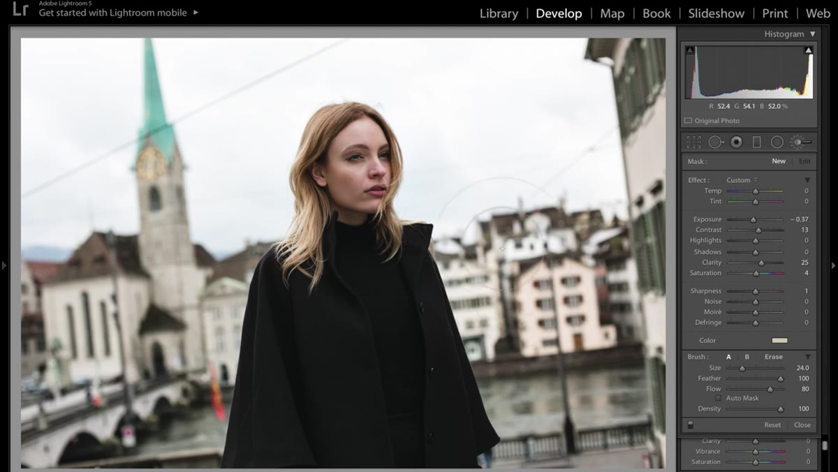 Adjustment brush being painted over the background, avoiding the model
With the brush configured, Jessica carefully paints across the background only, leaving the model completely untouched. This is the part that takes patience but makes the biggest visible difference. Keeping your brush off the subject preserves the natural exposure and color of the skin, which is almost always what you want to protect most in a portrait edit.
Adjustment brush being painted over the background, avoiding the model
With the brush configured, Jessica carefully paints across the background only, leaving the model completely untouched. This is the part that takes patience but makes the biggest visible difference. Keeping your brush off the subject preserves the natural exposure and color of the skin, which is almost always what you want to protect most in a portrait edit.
If you’re new to masking in Lightroom, turn on the red overlay (press O while the brush is active) to see exactly where you’re painting. It takes a few minutes to work around hair edges carefully, but that precision is what makes the background treatment look intentional rather than sloppy.
Step 6: Add a Highlight Color Tint to Finish the Grade
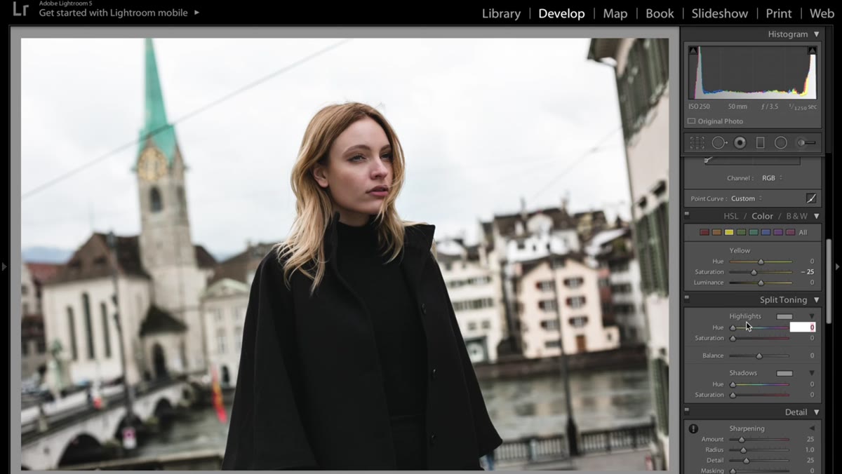 Color grading or tone curve highlight selector with faint blue tint applied
The final move is a faint blue added to the highlights. Jessica is specific here: it’s a very subtle value, almost imperceptible at first glance. But toggle it on and off and you’ll see immediately that it cools the brightest parts of the image just enough to create contrast against the warm midtones and shadows.
Color grading or tone curve highlight selector with faint blue tint applied
The final move is a faint blue added to the highlights. Jessica is specific here: it’s a very subtle value, almost imperceptible at first glance. But toggle it on and off and you’ll see immediately that it cools the brightest parts of the image just enough to create contrast against the warm midtones and shadows.
This is classic split toning logic. Warm shadows and neutral or cool highlights create depth and a sense of professional color grading without going anywhere near a LUT or a cinema preset. You don’t need a heavy-handed treatment when the color temperature differential is doing the work for you.
What I’d Do Differently (or in Addition)
Jessica keeps this edit appropriately clean for a beginner tutorial, and that’s exactly the right call. But in my own workflow, after the adjustment brush step, I’ll often add a second brush pass at a very low flow setting (around 15-20%) over the edges of the subject. It creates a soft luminosity transition between the subject and the background that sells the idea that the light was always that way, even when it wasn’t.
I’d also note that the yellow tint she applies to the background works brilliantly here because the image already has warm ambient light. If you’re working with a studio shot on a gray seamless background, you’d want to experiment with the hue slider rather than committing to yellow. The principle is the same: tie the background color to something already present in the image. The specific color is just a variable.
The biggest thing this tutorial reinforced for me is that restraint is a skill. Every slider you don’t push is a decision. Jessica moves through this edit quickly because she knows what she’s going for before she opens the panel, and she stops when she gets there. That intentionality is harder to teach than the settings themselves, but watching it in action is one of the fastest ways to internalize it.
Watch the full tutorial on YouTube and pay attention not just to where the sliders land, but to how quickly she moves on once the adjustment reads correctly. That confidence is the real technique.
Comments
Leave a Comment