
I have a folder on my hard drive called “Do Not Open.” It’s full of edits from my early years that I cannot look at without physically wincing. Over-sharpened skies. Shadows crushed to pure black like I was trying to make every photo look like a crime scene. Clarity sliders pushed so far right that the rocks look like they’re made of sandpaper. We’ve all been there. The problem is most of us don’t have a way to clearly see what changed between then and now, and more importantly, why it changed.
That’s what makes this Mark Denney tutorial hit differently. In Watch the full tutorial on YouTube, Denney pulls up a landscape photo he edited seven years ago, puts it next to the original RAW file, and re-edits it live with zero rehearsal. What you get isn’t just a Lightroom walkthrough. You get a window into how a working photographer’s instincts actually shift over time. The decisions he walks back are just as instructive as the ones he makes now.
I’ve been writing Lightroom tutorials for years, and I still took notes. Here’s everything that matters, broken down step by step.
Step 1: Read the Image Before You Touch a Single Slider
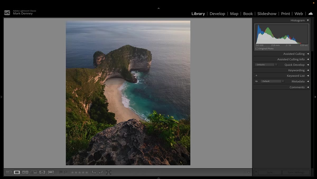 Raw file and old edit displayed side by side in Lightroom
Before Denney adjusts anything, he spends real time comparing the original RAW to his old edit. His immediate takeaways: the shadows were crushed too aggressively, a strip of sky at the top of the frame is both distracting and slightly crooked, and beautiful side light on the landscape got completely buried. He’s diagnosing before he’s treating. This is a habit that takes discipline to build, but it changes everything about how you edit.
Raw file and old edit displayed side by side in Lightroom
Before Denney adjusts anything, he spends real time comparing the original RAW to his old edit. His immediate takeaways: the shadows were crushed too aggressively, a strip of sky at the top of the frame is both distracting and slightly crooked, and beautiful side light on the landscape got completely buried. He’s diagnosing before he’s treating. This is a habit that takes discipline to build, but it changes everything about how you edit.
The practical move here: when you open a RAW file, spend 30 seconds just looking at the histogram and the image together. Ask yourself where the light is actually going, what’s pulling your eye that shouldn’t be, and what the photo is trying to do before you intervene.
Step 2: Balance the Exposure With a Light Touch
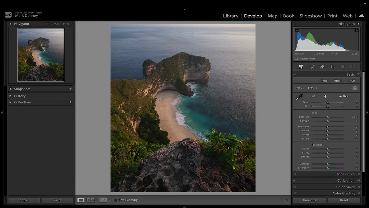 Lightroom histogram and basic panel sliders being adjusted
Denney’s approach to the Basic panel is conservative and intentional. He brings highlights down slightly, lifts the shadows considerably to recover that buried side light, nudges the whites up to push the histogram toward the right without clipping, and brings the blacks up to soften the overall feel of the image. He notes that lifting the blacks slightly is something he does intentionally to avoid that crushed, overly dramatic look he was chasing years ago.
Lightroom histogram and basic panel sliders being adjusted
Denney’s approach to the Basic panel is conservative and intentional. He brings highlights down slightly, lifts the shadows considerably to recover that buried side light, nudges the whites up to push the histogram toward the right without clipping, and brings the blacks up to soften the overall feel of the image. He notes that lifting the blacks slightly is something he does intentionally to avoid that crushed, overly dramatic look he was chasing years ago.
The combination he uses on nearly every photo: raise the blacks a small amount, reduce clarity, and increase texture. That trio gives you a smooth, almost painterly quality without sacrificing fine detail. It’s a counterintuitive move because most beginners reach for clarity to add punch, but pulling it back while raising texture actually reads as more refined on screen and in print.
Step 3: Add Depth With Dehaze
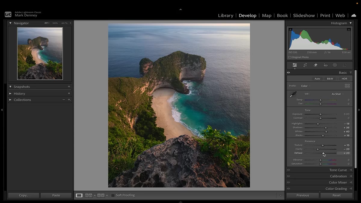 Dehaze slider being increased in the Effects panel
Because the landscape in this photo has some atmospheric haze, Denney adds a small amount of Dehaze. This isn’t a dramatic fix, just enough to push back the milkiness that was softening the midground. The key word is small. Dehaze is one of those sliders that beginners tend to drag hard because the effect is immediately visible, but overuse makes images look processed and heavy.
Dehaze slider being increased in the Effects panel
Because the landscape in this photo has some atmospheric haze, Denney adds a small amount of Dehaze. This isn’t a dramatic fix, just enough to push back the milkiness that was softening the midground. The key word is small. Dehaze is one of those sliders that beginners tend to drag hard because the effect is immediately visible, but overuse makes images look processed and heavy.
A working rule: if you can clearly see that you applied Dehaze, you probably applied too much. Aim for the version just before it becomes obvious.
Step 4: Set White Balance With the Eyedropper, Then Adjust
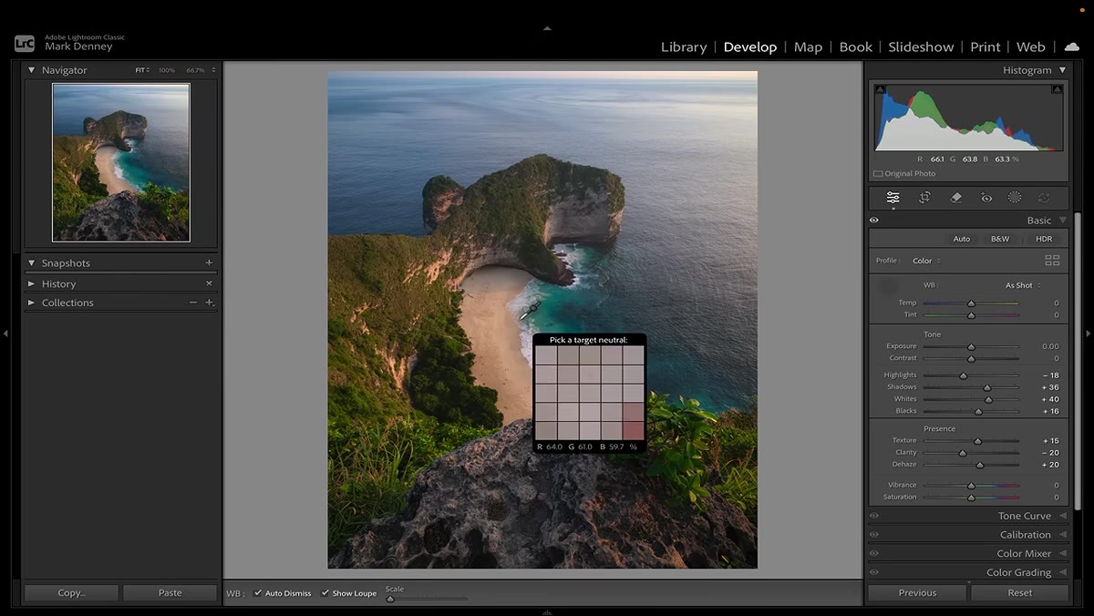 White balance eyedropper tool being used on a neutral area
Rather than dragging the Temperature and Tint sliders by feel, Denney uses the White Balance Selector eyedropper to find a neutral target in the scene, something that should be close to a true gray. He checks the RGB values at the bottom of the screen and looks for numbers that are roughly equal across all three channels. He lands on values around 50, 51, and 50, which is about as neutral as it gets.
White balance eyedropper tool being used on a neutral area
Rather than dragging the Temperature and Tint sliders by feel, Denney uses the White Balance Selector eyedropper to find a neutral target in the scene, something that should be close to a true gray. He checks the RGB values at the bottom of the screen and looks for numbers that are roughly equal across all three channels. He lands on values around 50, 51, and 50, which is about as neutral as it gets.
From there, he makes one small manual adjustment: cooling the temperature down just slightly. This is the right workflow order. Let the tool do the heavy lifting first, then make a creative micro-adjustment after. Trying to dial in white balance purely by eye from a warm or cool RAW file is like trying to tune a guitar in a loud room.
Step 5: Crop for Composition, Not Just Framing
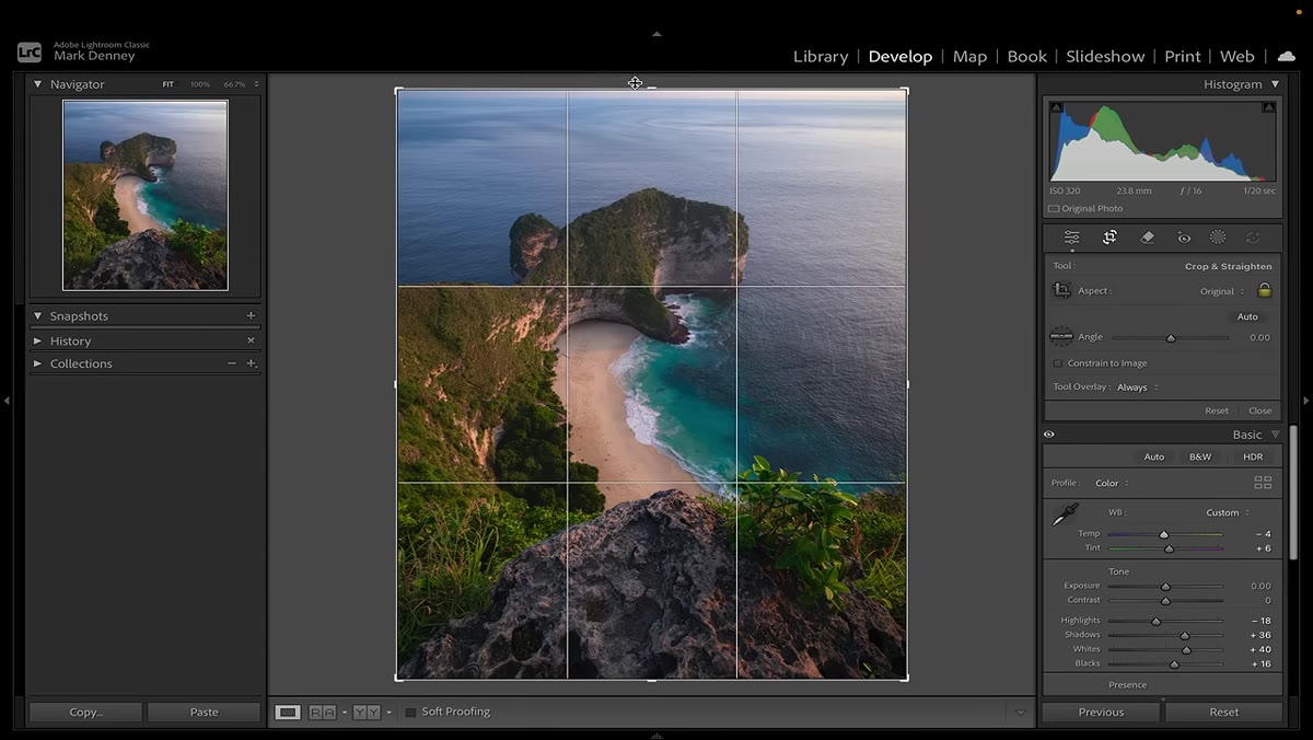 Crop tool removing sky sliver from top of frame
That sliver of sky across the top of the original edit was Denney’s most obvious mistake, and he’s direct about it. It adds nothing, it tilts slightly, and it pulls the eye up and away from where the actual subject is. He crops it out cleanly. The lesson isn’t really about cropping, it’s about being ruthless with elements that don’t earn their place in the frame.
Crop tool removing sky sliver from top of frame
That sliver of sky across the top of the original edit was Denney’s most obvious mistake, and he’s direct about it. It adds nothing, it tilts slightly, and it pulls the eye up and away from where the actual subject is. He crops it out cleanly. The lesson isn’t really about cropping, it’s about being ruthless with elements that don’t earn their place in the frame.
When you’re cropping, ask whether every edge of the frame is doing something useful. Dead strips of uninvested sky, half-visible objects at the margins, slightly tilted horizons: these are all things that register subconsciously with viewers and quietly undermine an otherwise strong image.
Step 6: Build Contrast in the Tone Curve, Not the Contrast Slider
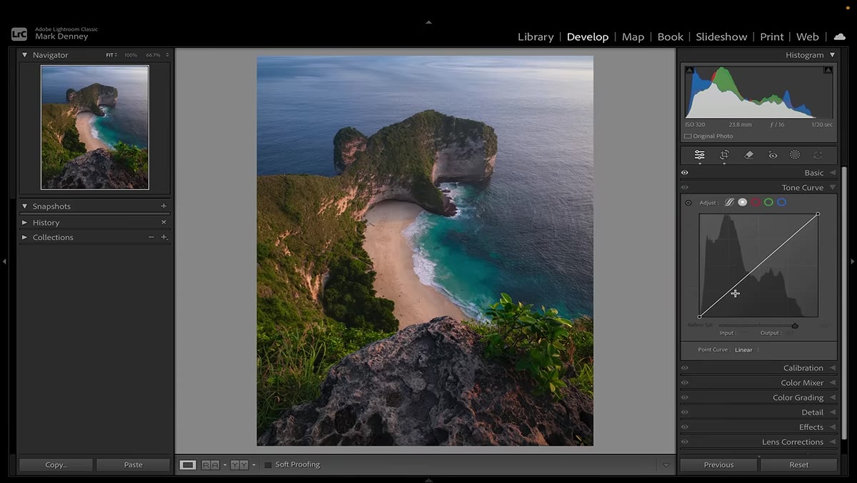 S-curve being shaped in the Tone Curve panel with multiple anchor points
Instead of using the basic Contrast slider, Denney works in the Tone Curve with multiple anchor points. He places points in the darker midtones, the midtones, and the brighter midtones to shape a gentle S-curve. Then he lifts the very bottom of the curve just slightly to fade the black point, which creates that soft, film-adjacent quality that separates polished edits from heavy-handed ones.
S-curve being shaped in the Tone Curve panel with multiple anchor points
Instead of using the basic Contrast slider, Denney works in the Tone Curve with multiple anchor points. He places points in the darker midtones, the midtones, and the brighter midtones to shape a gentle S-curve. Then he lifts the very bottom of the curve just slightly to fade the black point, which creates that soft, film-adjacent quality that separates polished edits from heavy-handed ones.
This is a technique I keep coming back to in my own work. The Contrast slider is a blunt instrument. The Tone Curve lets you decide exactly where contrast is added and where it isn’t, which is the difference between a photo that breathes and one that feels clamped.
What I’d Add: Revisit Your Old Work Intentionally
I started doing something similar to what Denney does in this video, but I made it a quarterly habit. I pick one image from two or three years ago, pull up the RAW file, and re-edit it without looking at what I did before. Then I compare. The delta between the two edits tells me more about where my eye has developed than any tutorial I’ve read.
If you’ve been editing for more than a year, try it. You will be surprised what you no longer do automatically, and equally surprised by a few old habits that somehow survived.
The single biggest idea in this tutorial isn’t any specific slider value. It’s that restraint is a skill you develop over time, not something you start with. Every heavy adjustment in Denney’s old edit made sense to him when he made it. The goal now is to build the judgment that keeps you from needing to walk things back seven years later.
Watch the full tutorial on YouTube and watch how Denney’s thought process unfolds in real time. The live, unrehearsed format means you see the hesitation and the recalibration, which is more honest and more useful than a polished walkthrough would be.
Comments (5)
Bookmarked. Coming back to this one for sure.
Simple but effective. Sometimes that's all you need.
I keep coming back to this article. It's that useful.
This saved me so much time on my last edit. Wish I'd found this sooner.
Excellent tutorial. I'd add that from a landscape standpoint, this technique is incredibly versatile.
Leave a Comment