
Every few months I open an old edit and cringe. Not because the photo was bad, but because I can see exactly what I was doing: hammering sliders that felt powerful without understanding what they were actually changing. Texture cranked. Clarity pushed. Dehaze doing whatever it wanted. The result looked edited, not enhanced, and there is a meaningful difference between those two things.
That is exactly what this Mark Denney tutorial addresses head-on. Watch the full tutorial on YouTube before or after reading this, because Mark’s visual demonstrations are worth seeing in real time. But if you want a step-by-step breakdown you can reference while you are actually inside Lightroom, that is what this walkthrough is for.
The premise is simple and a little uncomfortable: Lightroom gives you the tools, but it does not teach you how the tools work. So people guess. They push a slider to 80 because 80 feels decisive. They learn a look from a preset and then copy the values without understanding why those values were chosen. Mark’s tutorial is a correction to that habit, and it changed the way I think about several adjustments I use on almost every edit.
Step 1: Understand What Texture Is Actually Doing
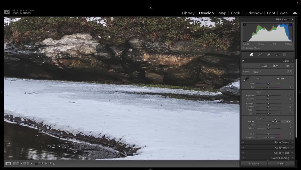 Texture slider being moved between -100 and +100
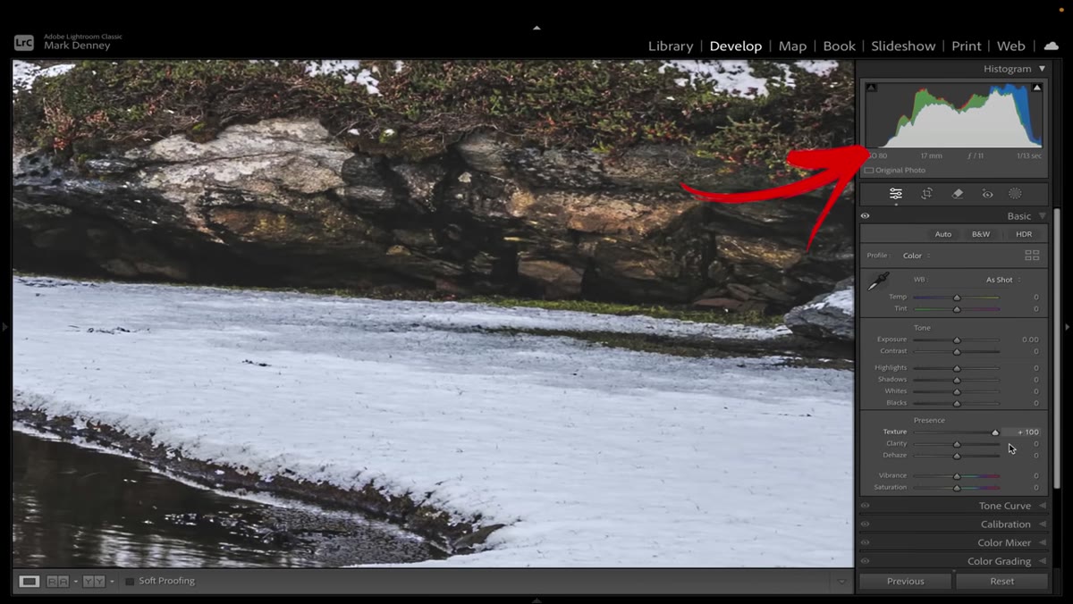
Texture is a subtle tool, and that subtlety is the point. When you drag the Texture slider from one extreme to the other, look at your histogram. Mark makes a point of this: the histogram barely moves. That is not a bug. It tells you that Texture is operating at a fine, localized level, affecting small detail without dramatically reshaping the tonal range of the image. It is best used for bringing out fine surface detail, like skin texture, bark, fabric, or rock face, and it works well as a light-touch sharpening alternative that does not introduce harsh halos.
Texture slider being moved between -100 and +100
Texture is a subtle tool, and that subtlety is the point. When you drag the Texture slider from one extreme to the other, look at your histogram. Mark makes a point of this: the histogram barely moves. That is not a bug. It tells you that Texture is operating at a fine, localized level, affecting small detail without dramatically reshaping the tonal range of the image. It is best used for bringing out fine surface detail, like skin texture, bark, fabric, or rock face, and it works well as a light-touch sharpening alternative that does not introduce harsh halos.
A safe working range is roughly +15 to +30 for most landscape or portrait work. Push it past +60 and you start seeing it work against you, making surfaces look gritty rather than detailed.
Step 2: Stop Treating Clarity Like a Contrast Boost
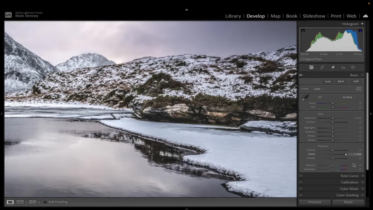 Clarity at +100 showing histogram expansion in midtones
Clarity does add contrast, but it does it specifically in the midtones, and that distinction matters. Watch the histogram when you push Clarity to +100 and you will see the center of the curve push outward in both directions. That mid-tone contrast can make an image look punchy and three-dimensional, but it can also make it look harsh, over-processed, and artificially crunchy in a way that reads as amateur even when the exposure is technically correct.
Clarity at +100 showing histogram expansion in midtones
Clarity does add contrast, but it does it specifically in the midtones, and that distinction matters. Watch the histogram when you push Clarity to +100 and you will see the center of the curve push outward in both directions. That mid-tone contrast can make an image look punchy and three-dimensional, but it can also make it look harsh, over-processed, and artificially crunchy in a way that reads as amateur even when the exposure is technically correct.
Clarity is best used on images where the subject has large structural shapes: dramatic cloud formations, rocky terrain, architectural subjects with strong geometry. For portraits, be conservative or go negative for a softening effect. The rule I follow is this: if Clarity is doing the heavy lifting in your edit, something earlier in the processing chain probably needs fixing first.
Step 3: Use Dehaze as a Surgical Tool, Not a Default
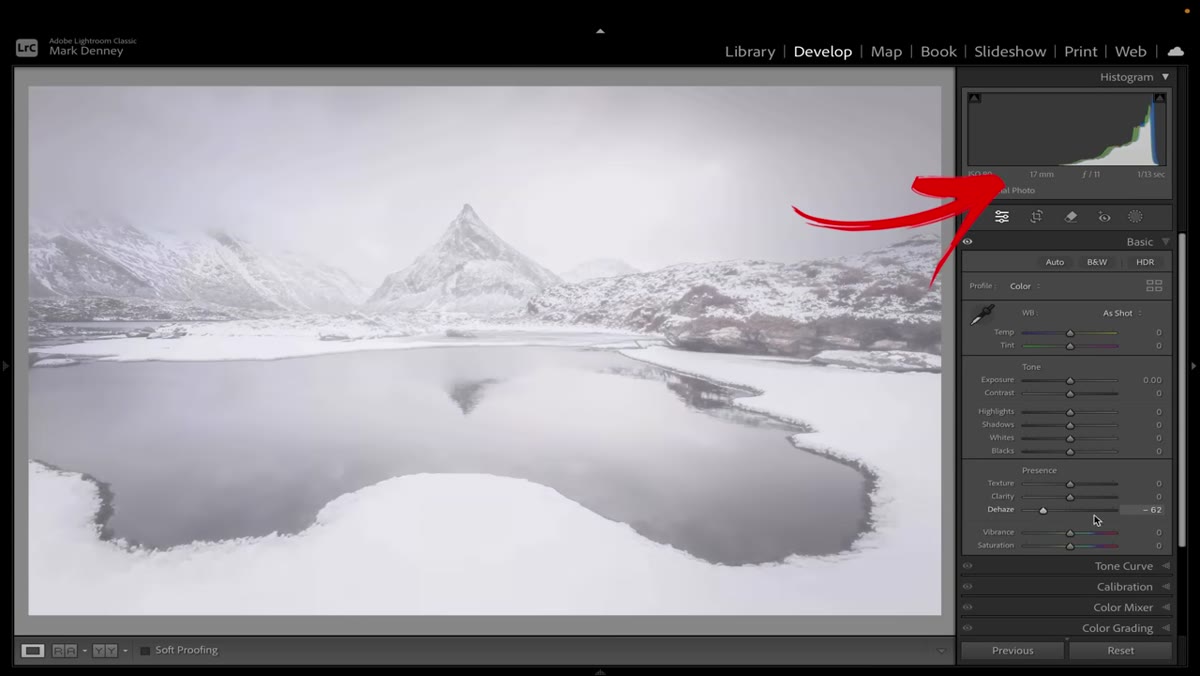 Dehaze applied globally showing histogram shift and color saturation increase
Dehaze is the most aggressive of these three sliders, and the histogram makes that obvious. Even a small Dehaze adjustment creates a substantial shift across the entire tonal range and simultaneously pushes color saturation. That combination can cut through fog beautifully, but it can also make a clean image look muddy and over-cooked almost instantly.
Dehaze applied globally showing histogram shift and color saturation increase
Dehaze is the most aggressive of these three sliders, and the histogram makes that obvious. Even a small Dehaze adjustment creates a substantial shift across the entire tonal range and simultaneously pushes color saturation. That combination can cut through fog beautifully, but it can also make a clean image look muddy and over-cooked almost instantly.
Mark’s recommendation is to use Dehaze selectively, applied to a masked area like the sky or foreground rather than to the whole image. If you are shooting in conditions where haze is actually present, a value between +10 and +25 in a targeted mask is usually enough. Reaching for Dehaze as a contrast or drama tool on a clear-day shot is one of the fastest ways to make an edit look like it was done by someone who just discovered Lightroom.
Step 4: Recognize the Flat Edit Trap
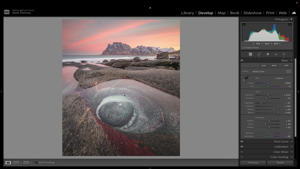 Example of an overly flat edit with lifted shadows and crushed highlights
This is the one that got me for a long time. The flat edit became popular because log-style footage and matte photo looks were everywhere, and a lot of people equated “flat” with “cinematic.” What actually happened is that people started lifting their blacks and crushing their highlights by default on every image regardless of whether the image called for it. The result is a photo that looks like it was edited in the right direction but never finished.
Example of an overly flat edit with lifted shadows and crushed highlights
This is the one that got me for a long time. The flat edit became popular because log-style footage and matte photo looks were everywhere, and a lot of people equated “flat” with “cinematic.” What actually happened is that people started lifting their blacks and crushing their highlights by default on every image regardless of whether the image called for it. The result is a photo that looks like it was edited in the right direction but never finished.
The fix is not to avoid low contrast looks. It is to understand that a flat look has to be deliberate and calibrated to the specific image. If you lift the shadows and bring down the highlights on a photo that already has low natural contrast, you are not creating mood. You are removing dimension.
Step 5: Watch Your Histogram, Not Just Your Preview
 Histogram showing minimal change during Texture adjustments
This is the underlying skill that connects everything Mark covers. The preview on your screen is affected by your monitor calibration, your ambient lighting, and how long you have been staring at the same image. The histogram does not care about any of that. It shows you what is actually in the file.
Histogram showing minimal change during Texture adjustments
This is the underlying skill that connects everything Mark covers. The preview on your screen is affected by your monitor calibration, your ambient lighting, and how long you have been staring at the same image. The histogram does not care about any of that. It shows you what is actually in the file.
When you are working with sliders like Clarity and Dehaze, glance at the histogram as you move them. If the histogram is shifting dramatically with a small slider movement, that tool is doing a lot of heavy lifting. That is useful information. It tells you to be conservative, to work in smaller increments, and to ask whether the change you are seeing is actually improving the image or just making it louder.
What I’d Add From My Own Editing Practice
Mark focuses on the problem of over-applying these sliders, which is the right place to start. But there is a second mistake I see just as often: using all three of these tools in combination without any of them doing a clear, defined job. Texture at +25, Clarity at +30, Dehaze at +15 can stack in ways that each slider individually would not produce. The image ends up with a thick, over-processed look that is hard to diagnose because no single adjustment is obviously wrong.
My approach is to decide which one of these sliders is doing the primary work on a given image and keep the other two minimal or at zero. If the image needs fine detail brought out, Texture is the tool. If it needs structural contrast, Clarity earns its place. If there is actual haze to cut through, Dehaze gets used, masked to the problem area. Treating them as a team that all goes up together is where things start going sideways.
The single most important takeaway from this tutorial is that powerful sliders require restraint, and the histogram is the most honest feedback you have on whether you are being restrained enough. Learn to read it while you edit and you will catch bad decisions before they make it into your final export.
Watch the full tutorial on YouTube to see Mark’s before and after comparisons in motion. The visual difference between the over-edited and corrected versions is worth seeing for yourself.
Comments (6)
Solid advice. Especially the part about taking your time with it.
Never thought of approaching it this way. Really creative.
Tried this technique this morning. Game changer for real.
Solid advice. Especially the part about taking your time with it.
Well explained. I think my audience would really benefit from this — mind if I link to it?
Wow, I had no idea you could do this. Mind blown.
Leave a Comment