Black & White Processing in Lightroom: How to Make Moody, High-Contrast Edits That Actually Hold Up

Black & White Processing in Lightroom: How to Make Moody, High-Contrast Edits That Actually Hold Up

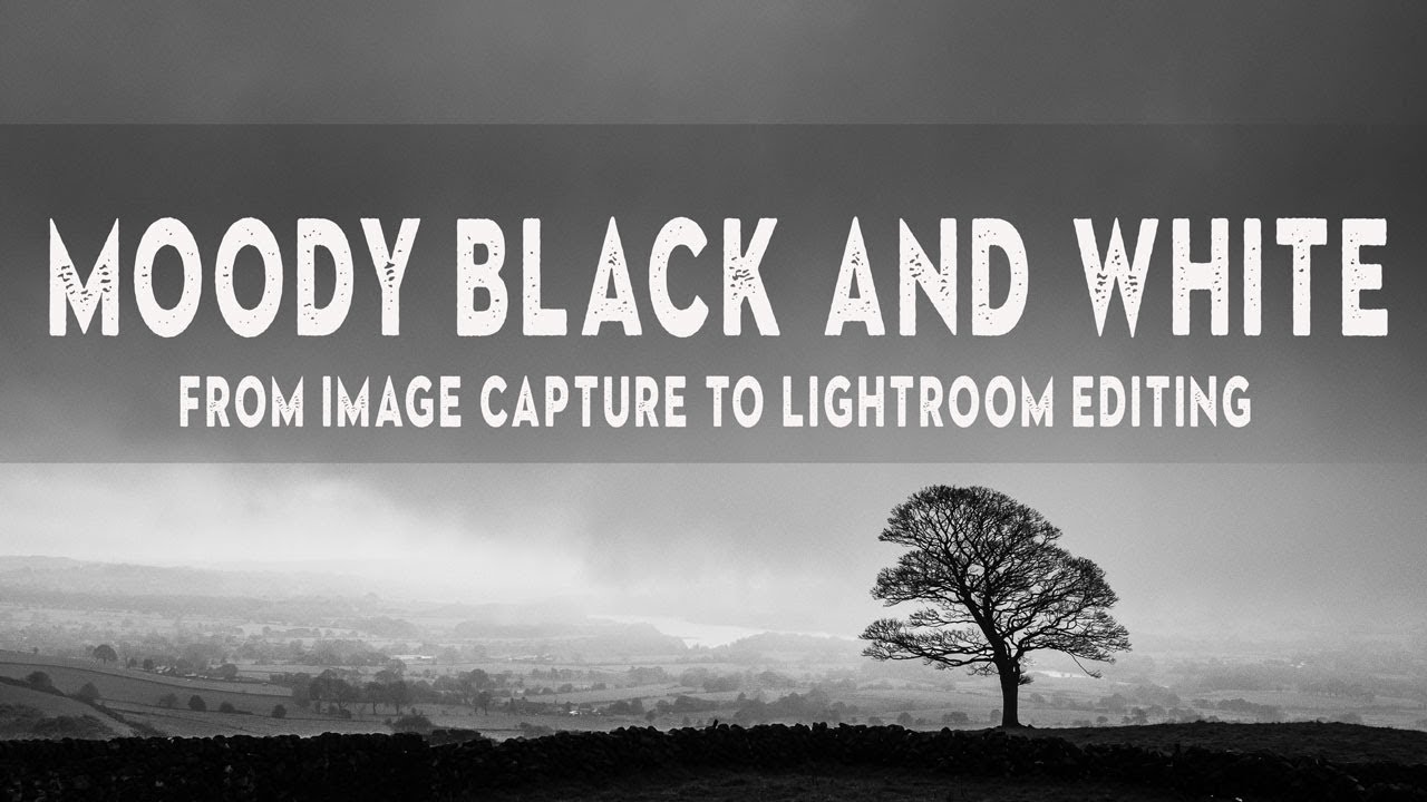
There’s a specific kind of photo that color ruins. You’ve got strong light, deep shadows, a subject with real presence, and the moment you look at it in color, it just… deflates. The tones fight each other, the sky goes muddy orange, and any grit you felt on location disappears into a sea of competing hues. I’ve been there more times than I want to admit, usually staring at a RAW file at midnight wondering why a shot that looked incredible in person looks like a stock photo from 2009.
Black & White Done Right: A Lightroom Classic Workflow That Actually Makes You Think in Monochrome

Black & White Done Right: A Lightroom Classic Workflow That Actually Makes You Think in Monochrome

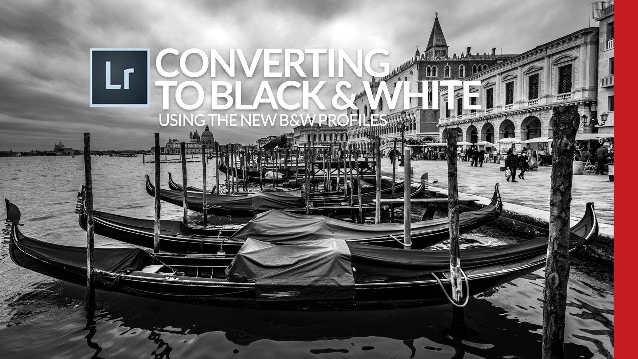
Most of my black and white conversions used to follow the same lazy pattern: desaturate, push the contrast, call it done. They looked fine. Fine is the enemy of interesting. What I was missing wasn’t effort, it was a smarter starting point, specifically, using Lightroom’s B&W creative profiles as a foundation rather than an afterthought. Watch the full tutorial on YouTube In this Scott Kelby tutorial, he works through a Venice street scene that, by his own admission, isn’t a trophy shot.

Black & White Done Right: The Lightroom Color Mix Method Most People Skip

Black & White Done Right: The Lightroom Color Mix Method Most People Skip

Black and white photography has a reputation problem. People treat it like a filter you slap on when a color photo isn’t working, a last resort rather than a deliberate creative decision. I used to do the same thing. Early on, my go-to move was dragging Saturation to zero and calling it a day, which produced flat, lifeless images that looked less like art and more like a printer running out of ink.

Dramatic Black & White Landscapes in Lightroom: What I Learned From Shooting in a Downpour

Dramatic Black & White Landscapes in Lightroom: What I Learned From Shooting in a Downpour

There’s a specific kind of RAW file that shows up in my Lightroom catalog way too often. The exposure is fine, the focus is sharp, the composition is solid. And yet the image sits there looking like a stock photo of nowhere in particular. No weight. No atmosphere. Just a technically correct photograph that nobody would ever stop scrolling for. If you shoot landscapes, you know exactly what I’m talking about.

Kodak's Ektapan Revival: What Film Photographers Need to Know About Editing These Classics

Kodak's Ektapan Revival: What Film Photographers Need to Know About Editing These Classics

Kodak’s Ektapan Revival: What This Means for Your Film Workflow I’ve been watching Kodak’s recent comeback with genuine excitement, and their latest announcement didn’t disappoint. The company just brought back one of their most legendary film stocks—Ektapan—and they’re doing it in a way that actually matters for working photographers. A Legendary Name Returns For those of us who appreciate film’s tactile history, Ektapan is basically the Beatles reunion we didn’t know we needed.

Editing Black and White Photos in Lightroom

Editing Black and White Photos in Lightroom

Black and white photography strips an image down to its essentials: light, shadow, shape, and texture. Without color to lean on, every tonal decision matters more. Lightroom gives you excellent tools for black and white conversion, but the defaults are just a starting point. The Conversion Click “B&W” in the Basic panel or press V. Lightroom converts the image to monochrome using its default mix of color channels. This default is decent but rarely optimal.