Fix a Flat, Boring Photo in Lightroom: Scott Kelby's Intermediate Workflow, Step by Step

Fix a Flat, Boring Photo in Lightroom: Scott Kelby's Intermediate Workflow, Step by Step

There’s a specific kind of photo I used to dread editing. Not a disaster shot, not a total throwaway, but the mediocre middle-ground image. Flat light, a blown highlight somewhere it shouldn’t be, colors that look like they were processed through a wet sock. The kind of file where you open it in Lightroom, stare at it for thirty seconds, and then go make coffee instead. I’ve got a whole folder of those from the early years, back when I was editing press photos for my band because nobody else was going to do it.

Lightroom's Quietly Dropped Two Masking Features That Change Everything About Local Adjustments

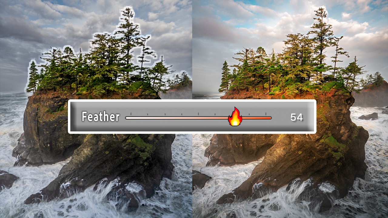
Lightroom's Quietly Dropped Two Masking Features That Change Everything About Local Adjustments

Color grading has always felt like one of those tools that’s 90% of the way there. The ability to push your highlights toward gold, nudge your shadows into teal, or breathe some cinematic warmth into your midtones is genuinely powerful. I use it on almost every landscape and portrait edit I touch. But for years, there’s been this maddening ceiling on what it can do: color grading applies globally, across the entire image, based on tonal values alone.