7 Lightroom & Photoshop Skills Worth Mastering When You Can't Shoot

7 Lightroom & Photoshop Skills Worth Mastering When You Can't Shoot

There’s a version of me that used to think editing was the boring part. Shooting was the job. Editing was the chore you did afterward so you could post something. Then I spent a rainy Nashville weekend going deep on color grading and came out the other side with a completely different understanding of what a photograph actually is. The edit isn’t the afterthought. It’s the second half of the creative decision.

Split Toning Is the Reason Your Photos Look Almost There (And How to Fix It)

Split Toning Is the Reason Your Photos Look Almost There (And How to Fix It)

I was editing a client’s golden hour shoot last spring, Rumours by Fleetwood Mac on the turntable, and I kept nudging the overall white balance warmer trying to get that rich, filmic feel. Warmer. A little warmer. Now it looked like the couple got married inside a tandoor oven. The problem wasn’t the temperature slider. The problem was I was treating the whole image as one tonal unit when it isn’t.

HSL in Lightroom: The Adjustment Most Editors Treat Like a Finishing Touch (It Shouldn't Be)

HSL in Lightroom: The Adjustment Most Editors Treat Like a Finishing Touch (It Shouldn't Be)

I was staring at a portrait last week, one of those golden-hour shots where the skin tones look almost right but something is pulling the whole image toward orange sherbet. The tone curve was clean. The white balance was dialed. And I kept reaching for the saturation slider like it was going to solve something it was never designed to solve. The HSL panel fixed it in about forty seconds.

HSL Adjustments Are the Reason Your Colors Look Flat (And How to Fix That)

HSL Adjustments Are the Reason Your Colors Look Flat (And How to Fix That)

Last week I was editing a portrait session shot at golden hour, the kind of light that should basically edit itself. The skin tones looked orange enough to rival a spray tan, the greens in the background were fighting with everything, and the whole image had this muddy quality that no amount of tweaking the temperature slider was going to fix. The Basic panel was completely maxed out in all the wrong ways.

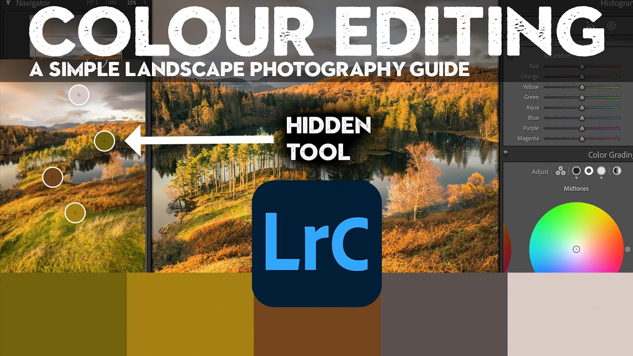
Lightroom Color Editing Finally Makes Sense — Here's the Tool You're Probably Ignoring

Lightroom Color Editing Finally Makes Sense — Here's the Tool You're Probably Ignoring

Color questions are the ones that fill my inbox. Not exposure, not sharpening, not even masking. Color. People want to know why their images look muddy, why the greens feel fake, why the sky went from moody to neon the second they touched the saturation slider. I spent years answering those questions one reply at a time before I realized the real problem: most photographers learn color tools in isolation, without ever understanding how each one interacts with the others.

HSL in Lightroom: The Adjustment Most Editors Use Wrong (And How to Fix That)

HSL in Lightroom: The Adjustment Most Editors Use Wrong (And How to Fix That)

I was editing a portrait last fall and something was bothering me about the skin tones. The overall exposure was solid, the white balance was dialed in, but the subject looked vaguely radioactive. That particular shade of orange that creeps into skin when you push a warm preset too hard. My first instinct, the instinct every beginner has, was to reach for the Temperature slider and walk it back. That would have fixed the skin and wrecked everything else in the frame.

HSL in Lightroom: The Color Control Most Editors Treat Like a Mystery Box

HSL in Lightroom: The Color Control Most Editors Treat Like a Mystery Box

I was editing a set of golden hour portraits last spring, and the skin tones looked like the subject had been standing inside a traffic cone. The overall white balance was fine. The exposure was good. But somewhere between the warm light and my heavy-handed orange push in the tone curve, everything had gone sideways in a very specific, very unflattering direction. The fix took about forty-five seconds once I opened the HSL panel.

Split Toning Is the Reason Your Photos Look Flat (And How to Fix It in 4 Steps)

Split Toning Is the Reason Your Photos Look Flat (And How to Fix It in 4 Steps)

A few years back I was editing press shots for my band. No budget, no photographer, just me with a Nikon and a free trial of Lightroom trying to make us look like we belonged on a festival poster. I kept cranking up the contrast and punching the saturation and wondering why every photo looked like it came out of a vending machine. Something was off, and I couldn’t name it.

Mastering HSL in Lightroom: The Secret to Surgical Color Control

Mastering HSL in Lightroom: The Secret to Surgical Color Control

Mastering HSL in Lightroom: The Secret to Surgical Color Control I used to think color grading was an all-or-nothing game. Adjust the shadows, watch your highlights blow out. Push the saturation, suddenly your skin tones look like a bad spray tan. Then I discovered HSL, and it fundamentally changed how I approach every single edit. HSL stands for Hue, Saturation, and Luminance — and it’s basically the surgical instrument of Lightroom’s toolkit.

Mastering HSL Adjustments in Lightroom: The Secret to Surgical Color Control

Mastering HSL Adjustments in Lightroom: The Secret to Surgical Color Control

Mastering HSL Adjustments in Lightroom: The Secret to Surgical Color Control I used to think Lightroom’s HSL panel was overkill. Why adjust individual colors when you can just tweak the overall exposure and call it a day? Then I spent an afternoon editing a portrait where the subject’s skin tone was slightly too orange, and I realized I’d been leaving money on the table for years. HSL stands for Hue, Saturation, and Luminance—and it’s the closest thing we have to a scalpel in Lightroom’s toolkit.

Master HSL Adjustments in Lightroom: Transform Your Colors Like a Pro

Master HSL Adjustments in Lightroom: Transform Your Colors Like a Pro

Master HSL Adjustments in Lightroom: Transform Your Colors Like a Pro I discovered HSL adjustments about three years into my Lightroom journey, and honestly, I felt robbed of those years. This tool changed everything about how I approach color grading—it’s like going from adjusting the master volume on your entire song to having individual faders for each instrument. HSL stands for Hue, Saturation, and Luminance, and it’s one of the most underrated features in Lightroom’s develop module.

Master HSL Adjustments in Lightroom: The Secret to Selective Color Control

Master HSL Adjustments in Lightroom: The Secret to Selective Color Control

Master HSL Adjustments in Lightroom: The Secret to Selective Color Control I’ll be honest—when I first discovered the HSL panel in Lightroom, I thought I’d unlocked a cheat code. Here’s why: while basic color temperature adjustments affect your entire image, HSL lets you surgically target individual colors. It’s the difference between turning up the heat on your whole house versus heating just one room. Let me walk you through what changed everything about how I approach color grading.