The Brightness Trick That Makes Dark-Background Extractions Actually Work in Photoshop

The Brightness Trick That Makes Dark-Background Extractions Actually Work in Photoshop

There’s a specific kind of frustration that comes from trying to select a subject standing against a dark background. The Quick Selection tool fumbles around the edges, the contrast isn’t there for it to grab onto, and you end up with a selection that looks like it was cut out with safety scissors. I’ve been there more times than I’d like to admit, including on some early band press shots where the lighting was, let’s say, “creative” in all the wrong ways.

From Flat to Finished: Terry White's Lightroom Workflow for Photowalk Images (And Why It Actually Works)

From Flat to Finished: Terry White's Lightroom Workflow for Photowalk Images (And Why It Actually Works)

Most of the photos sitting in my Lightroom catalog right now are not bad shots. They’re just unfinished ones. Images I took on a good day, with decent light, that came out of camera looking flat and got buried in a folder I keep telling myself I’ll get to. If you shoot on photo walks or street sessions, you know the feeling. You come home with 300 frames, cull them down to 40 worth keeping, and then stall out because the editing feels like starting from scratch on each one.

The Radial Gradient Is Doing Heavy Lifting in My Edits — Here's How I Actually Use It

The Radial Gradient Is Doing Heavy Lifting in My Edits — Here's How I Actually Use It

There’s a version of me from about four years ago who used the radial gradient exactly once, decided it was “just for vignettes,” and moved on. I was wrong, and I’ve been quietly making up for it ever since. The radial gradient - or radial filter, depending on which version of Lightroom you’re running - is one of those tools that looks simple on the surface and then turns out to have serious depth the moment someone who actually knows what they’re doing walks you through it.

Ilford's New Professional B&W Film Is a Game-Changer for Analog Purists (And Your Lightroom Workflow)

Ilford's New Professional B&W Film Is a Game-Changer for Analog Purists (And Your Lightroom Workflow)

Ilford’s New Professional B&W Film Is a Game-Changer for Analog Purists (And Your Lightroom Workflow) I’ve been seeing a lot of buzz lately about Ilford Photo’s latest release, and honestly, it’s got me excited. The legendary film manufacturer just announced a new limited-edition black-and-white 35mm stock called the Delta 400 Professional Collector’s Edition, and the specs are genuinely impressive. What Makes This Film Special? What caught my attention isn’t just that it exists—it’s how it performs.

Lightroom vs. Lightroom Classic: A Working Photographer's Tour of the Cloud-Based App

Lightroom vs. Lightroom Classic: A Working Photographer's Tour of the Cloud-Based App

I’ll be honest with you. For years I was a Lightroom Classic loyalist. Classic felt like home base, the place where my catalogs lived, where my presets (named after Wilco songs, naturally) were organized just the way I liked them. The cloud-based version of Lightroom felt like a younger sibling I hadn’t bothered to get to know. Then my editing workflow got messier as I started shooting more on the go, and I needed a way to access and edit images across devices without driving myself crazy.

Stop Clicking Auto: Why Adaptive Color Is the Smarter Starting Point in Lightroom

Stop Clicking Auto: Why Adaptive Color Is the Smarter Starting Point in Lightroom

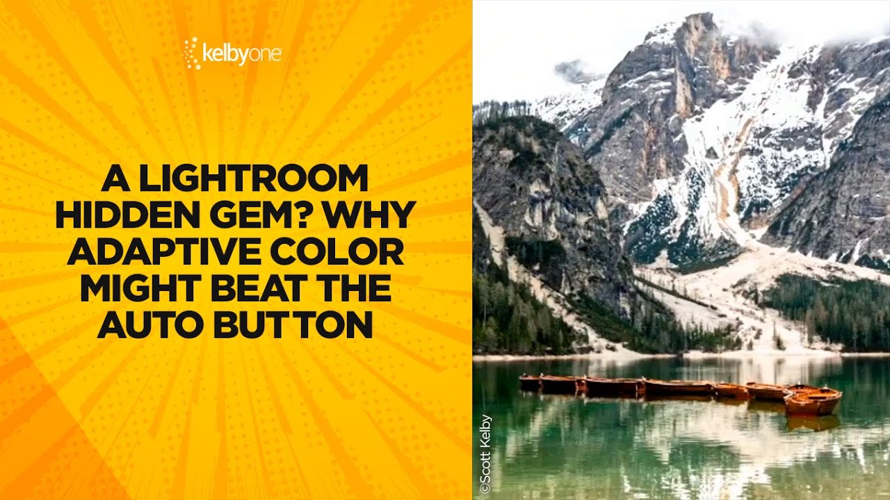
Every RAW file I open starts the same way: flat, a little lifeless, waiting. For years my first instinct was to hit the Auto button and let Lightroom’s AI take a swing at exposure before I started making real decisions. It works fine. But “fine” is not exactly the bar I’m trying to clear. Scott Kelby recently dropped a short tip over on KelbyOne that made me rethink that reflex entirely.

Chasing Soft Peach Tones: What Jessica Kobeissi's Portrait Workflow Taught Me About Restraint

Chasing Soft Peach Tones: What Jessica Kobeissi's Portrait Workflow Taught Me About Restraint

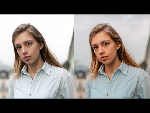
There’s a specific failure mode I see constantly in portrait edits: too much happening at once. Aggressive tone curves, oversaturated skin, highlights that blow out the sky, shadows so crushed you lose all the hair detail. The photo technically has “a look,” but it reads as effortful rather than intentional. What draws me to Jessica Kobeissi’s editing style is the opposite instinct. Her work is controlled, deliberate, and built on subtractions as much as additions.

The Tone Curve Isn't a Filter — It's the Most Precise Tool in Lightroom

The Tone Curve Isn't a Filter — It's the Most Precise Tool in Lightroom

I spent the first two years of my editing life completely ignoring the tone curve. I’d open Lightroom, drag the Contrast slider to somewhere around +30 because it made things look “punchier,” and move on. It worked, kind of. The photos looked fine. But fine isn’t a great bar to clear when you’re trying to build a consistent visual identity, whether you’re editing a wedding gallery, a portrait session, or your band’s press shots.

13 Lightroom Tricks That Changed How I Edit Every Single Day

13 Lightroom Tricks That Changed How I Edit Every Single Day

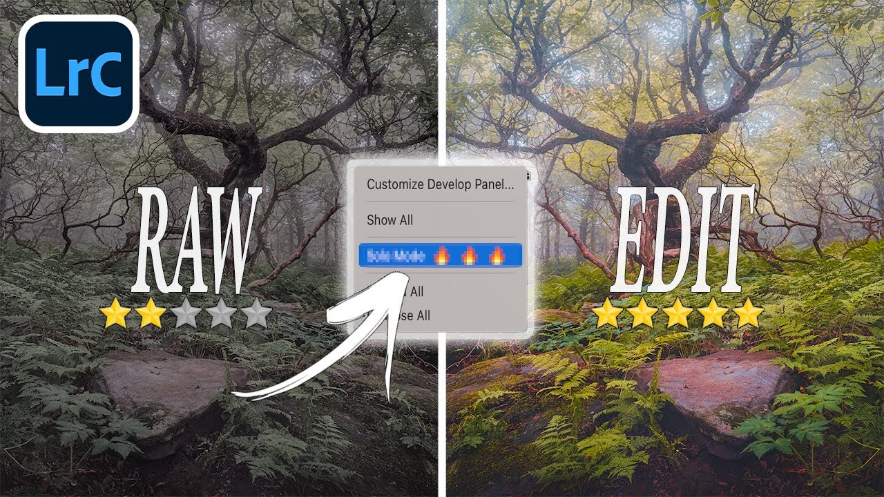
My editing sessions used to look like this: open the tone curve, check something in HSL, scroll down to color grading, scroll back up to basics, lose my place, get frustrated, close everything manually, repeat. It was the kind of low-grade chaos that doesn’t feel like a problem until you suddenly realize you’ve spent 20 minutes navigating panels instead of actually editing. I kept patching it with workarounds that never quite worked.

How to Fix Blown Skies and Flat Light in Landscape Photos Using Lightroom Masks

How to Fix Blown Skies and Flat Light in Landscape Photos Using Lightroom Masks

Landscape editing has a way of humbling you fast. You come home with a shot that looked incredible in the field, load it into Lightroom, and suddenly the sky is a blown-out white smear and the water looks like concrete. I’ve been there more times than I want to count. The problem isn’t usually the photo. It’s that landscapes have an extreme dynamic range that a single global edit almost never handles gracefully.

Camera-Specific Defaults and Sync FAQ: What Actually Changed in Lightroom Classic 9.2

Camera-Specific Defaults and Sync FAQ: What Actually Changed in Lightroom Classic 9.2

Every time Adobe drops an update, I do the same thing: open the release notes, skim for anything that affects my actual workflow, and ignore the rest. Most updates are minor. But the February 2020 update to Lightroom Classic was one I kept coming back to, because it quietly fixed something that had been annoying me for years. I shoot with two different Sony bodies depending on the job, and getting each one to open with sensible default settings has always involved too many steps and too much memory for what those steps even were.

Split Toning Is the Reason Your Photos Look Flat (And How to Fix That in 10 Minutes)

Split Toning Is the Reason Your Photos Look Flat (And How to Fix That in 10 Minutes)

The Problem With “Neutral” Edits I had a photo last spring that I’d spent about 45 minutes on. Exposure was dialed. Skin tones were clean. Sharpness was exactly where I wanted it. I sent it to the client and got back the most deflating reply possible: “It looks a little flat, can you make it more… cinematic?” Cinematic. The word photographers love to hear and hate to interpret. What they were actually asking for, without knowing it, was split toning.