Lightroom 8.2's Enhanced Details: What It Does, Who It's Actually For, and When to Skip It

Lightroom 8.2's Enhanced Details: What It Does, Who It's Actually For, and When to Skip It

Every February, Adobe quietly drops a point update to Lightroom. No splashy keynote, no Twitter hype cycle. Just a line item in the Creative Cloud updater that most people click past without reading. I almost did that with 8.2 until I caught Matt Kloskowski’s breakdown of what actually changed. Watch the full tutorial on YouTube before we dig in, because watching him toggle the before/after preview live makes the problem this feature solves click in a way that screenshots alone can’t.
The Lightroom Previous Button Is Doing the Work While You Sleep

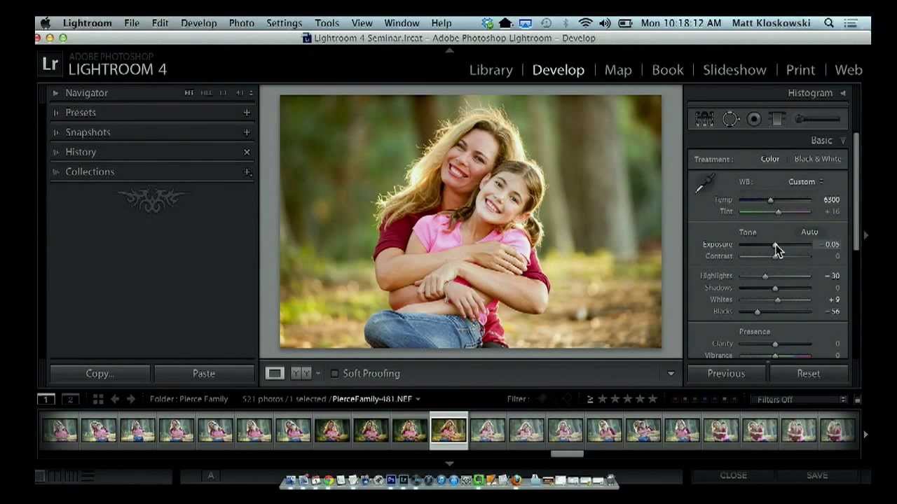
The Lightroom Previous Button Is Doing the Work While You Sleep

There’s a certain rhythm to editing a session of photos. You dial in the first image, get it exactly right, and then you look at the next 47 frames from the same shoot with the same light and the same subjects and quietly accept your fate. That used to be my Friday nights. Not anymore. In this Matt Kloskowski tutorial, he walks through one of the most criminally underused buttons in Lightroom’s Develop module, and it’s the kind of tip that makes you feel like you’ve been carrying groceries up four flights of stairs when there was an elevator the whole time.

Split Toning Is the Reason Your Photos Look Flat (And the Fix Takes 90 Seconds)

Split Toning Is the Reason Your Photos Look Flat (And the Fix Takes 90 Seconds)

I once handed a raw wedding photo to a friend who edits casually, watched her spend twenty minutes pushing the Vibrance and Clarity sliders around, and then declare it “still kind of lifeless.” The exposure was fine. The whites were clean. But the image had no emotional temperature. It didn’t feel like anything. That’s usually a split toning problem. Split toning is one of those techniques that professional colorists use constantly and beginners overlook almost entirely because it doesn’t produce the dramatic before/after of a heavy preset.

Build a Custom 6-Up Wedding Album Layout in Lightroom's Print Module (No Templates Required)

Build a Custom 6-Up Wedding Album Layout in Lightroom's Print Module (No Templates Required)

There’s a specific kind of frustration that hits when you’re building a wedding album and the layout you have in your head simply does not exist in Lightroom’s default template library. You scroll through the Book Module options, nothing fits, and you end up compromising on a layout that’s “close enough” instead of the one the client actually needs. I’ve been there more times than I’d like to admit. The fix, it turns out, has been sitting in the Print Module the whole time, and once you know how to use it, you’ll stop settling for close enough.

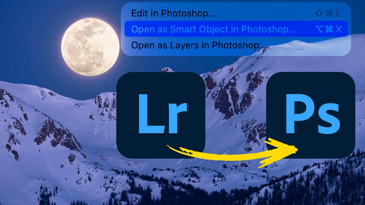
Lightroom to Photoshop: How Smart Objects and Multi-Layer Editing Finally Work Together

Lightroom to Photoshop: How Smart Objects and Multi-Layer Editing Finally Work Together

For a long time, switching from Lightroom (the cloud-based version, not Classic) to Photoshop felt like stepping off a moving train. You could get there, but you gave up a lot of control over what happened next. Specifically, the ability to send a photo to Photoshop as a smart object, open multiple layers, and move between Camera Raw and Photoshop without blowing up your whole editing session - those features just weren’t there.

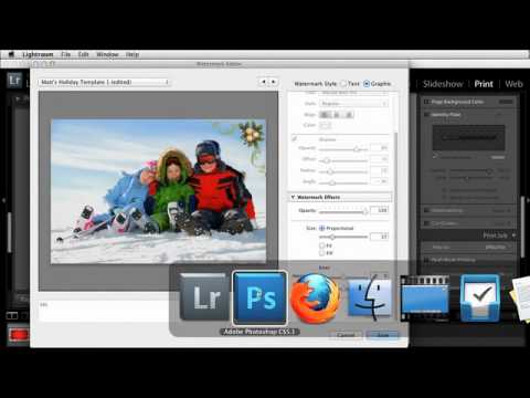
How to Use Stock Holiday Graphics as Lightroom Overlays (Without It Looking Cheap)

How to Use Stock Holiday Graphics as Lightroom Overlays (Without It Looking Cheap)

Every December I end up with the same client request: make this portrait feel festive without it looking like a greeting card from 2009. For a long time my answer was a wreath Lightroom border or a cheesy preset with fake snow. Neither felt right. What I actually wanted was a way to drop tasteful supporting graphics around a photo, keeping the image itself as the hero while the decorative elements did quiet, intentional work around it.

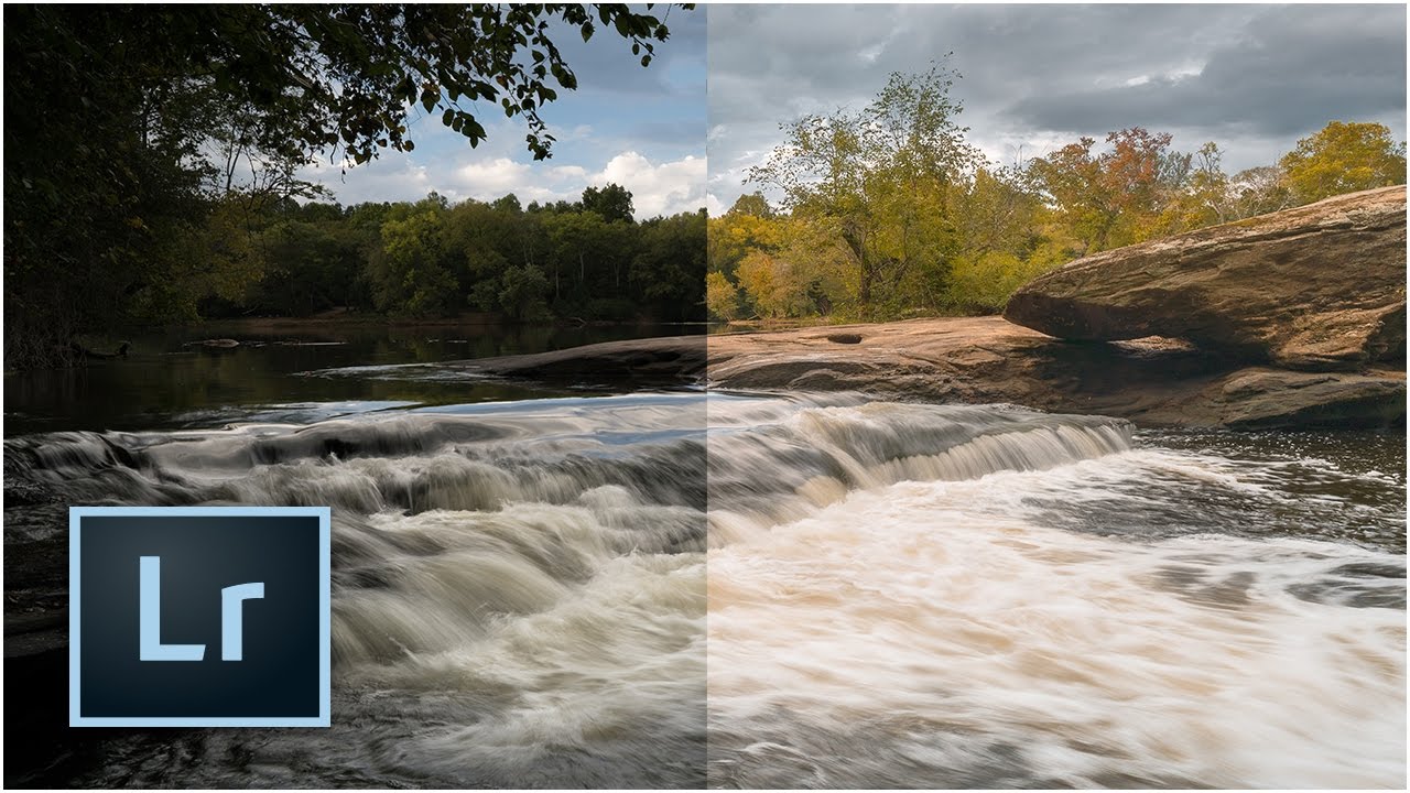
The 10-Minute Lightroom Landscape Workflow That Actually Holds Up

The 10-Minute Lightroom Landscape Workflow That Actually Holds Up

Every landscape photo I’ve edited in a hurry has the same problem: I rush the foundation. I skip lens correction, eyeball the exposure, and convince myself I’ll fix the color “later.” Later never comes, and the image ends up sitting in a reject folder next to seventeen other almost-good shots from a trip I was genuinely excited about. That’s why this tutorial from Mark Denney landed so well for me. It’s a Lightroom-only landscape workflow, no Photoshop, no plugins, no excuses.

Why Your Colors Look Flat After Editing (And the Lightroom Workflow That Fixes It)

Why Your Colors Look Flat After Editing (And the Lightroom Workflow That Fixes It)

I used to export a photo, post it, and immediately see what was wrong with it. The colors looked fine in Lightroom. On Instagram, everything went a little gray and dead. This happened to me for months before I finally slowed down and figured out why, and the answer wasn’t a better preset or a fancier monitor. It was the order in which I was doing things. Color grading in Lightroom isn’t just about moving sliders until something looks cool.

Lightroom 6/CC: An Honest Field Report on the Features Adobe Said Would Change Everything

Lightroom 6/CC: An Honest Field Report on the Features Adobe Said Would Change Everything

Every so often Adobe drops a major Lightroom release and the photography internet loses its mind. Speed boosts. AI features. Workflow revolution. I’ve been through enough of these cycles to know that the gap between the press release and the actual editing desk can be enormous. When Lightroom 6 and Lightroom CC landed, I was deep in the middle of editing a portrait session and genuinely needed to know whether upgrading mid-project was going to help me or blow up my afternoon.

HSL in Lightroom: The Adjustment Most Editors Treat Like a Finishing Touch (It Shouldn't Be)

HSL in Lightroom: The Adjustment Most Editors Treat Like a Finishing Touch (It Shouldn't Be)

I was staring at a portrait last week, one of those golden-hour shots where the skin tones look almost right but something is pulling the whole image toward orange sherbet. The tone curve was clean. The white balance was dialed. And I kept reaching for the saturation slider like it was going to solve something it was never designed to solve. The HSL panel fixed it in about forty seconds.

Virtual Copies in Lightroom: How to Deliver More Without Working More

Virtual Copies in Lightroom: How to Deliver More Without Working More

There’s a particular kind of client email I used to dread. The one that comes in two days after delivery asking if you can send “a few black and white versions too, and maybe one with a warmer feel?” Back when I was editing press shots for my band on a budget and no one else was going to do it, I learned fast that re-editing six photos three different ways could eat an entire afternoon.

Make Wildlife Eyes Pop in Lightroom: The Radial Gradient Trick That Changes Everything

Make Wildlife Eyes Pop in Lightroom: The Radial Gradient Trick That Changes Everything

There’s a specific kind of frustration that comes from a technically solid wildlife shot where the animal’s eye just looks dead. The exposure is right, the composition works, and you got the focus — but the eye is a dark void that pulls attention nowhere. I’ve been there more times than I’d like to admit, staring at a photo in Lightroom wondering why it feels flat when everything else checks out.