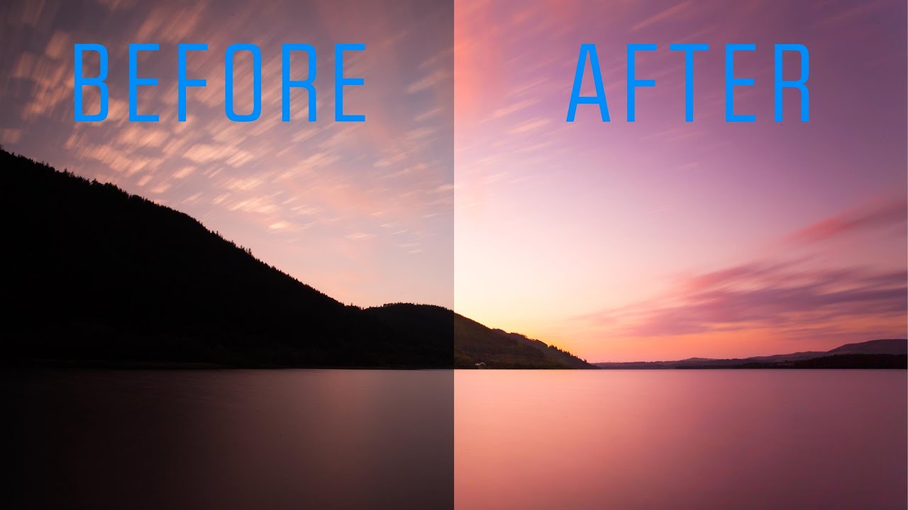
Lightroom (Not Classic) Finally Does What Bridge Never Could — Here's What Changed

Lightroom (Not Classic) Finally Does What Bridge Never Could — Here's What Changed

I’ll be honest with you. For years I told anyone who asked that Lightroom Classic was the only serious option. The newer Lightroom, the one Adobe just calls “Lightroom,” felt like a stripped-down cloud toy built for people who edit on iPads. I had strong feelings about this. I still have strong feelings about a lot of things in this industry. But a recent tutorial by Matt Kloskowski shifted my thinking on at least a few of those points, and when something changes my mind, I figure it’s worth writing about.

Black & White Done Right: The Lightroom Color Mix Method Most People Skip

Black & White Done Right: The Lightroom Color Mix Method Most People Skip

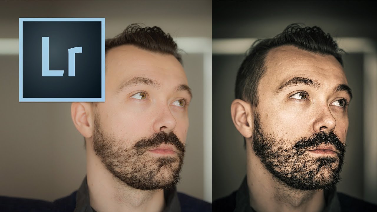
Black and white photography has a reputation problem. People treat it like a filter you slap on when a color photo isn’t working, a last resort rather than a deliberate creative decision. I used to do the same thing. Early on, my go-to move was dragging Saturation to zero and calling it a day, which produced flat, lifeless images that looked less like art and more like a printer running out of ink.

How Lightroom's Tone Curve Actually Works (And Why It's Not as Scary as It Looks)

How Lightroom's Tone Curve Actually Works (And Why It's Not as Scary as It Looks)

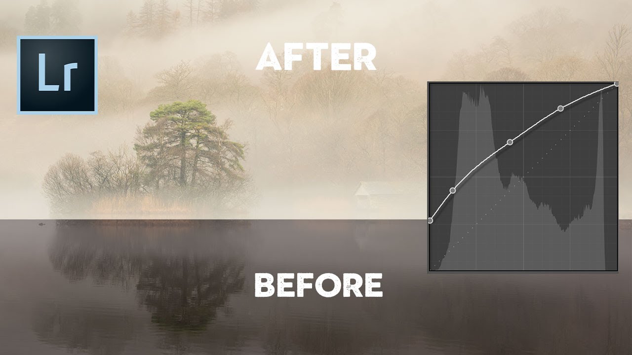
Every time I open a new editing session, the tone curve is one of the first panels I reach for. Not because it’s flashy, but because it gives me a level of control over light and contrast that the basic sliders just can’t replicate. That said, I’ve watched plenty of photographers drag a point around the curve, squint at the result, and then hit undo because they had no idea what they’d actually done.

Lightroom's Radial Mask Tool Is the Closest Thing to a Darkroom Spotlight (Here's How to Use It)

Lightroom's Radial Mask Tool Is the Closest Thing to a Darkroom Spotlight (Here's How to Use It)

There’s a specific frustration I run into on almost every edit, and it took me longer than I’d like to admit to find the right fix. The photo is technically fine. Exposure is decent. Composition is solid. But it looks flat. Nothing pulls the eye where it’s supposed to go. The subject is sitting in the frame competing with everything around it on equal footing, and the whole image feels like a shrug.

The Cinema Look in Lightroom: A Step-by-Step Breakdown That Actually Makes Sense

The Cinema Look in Lightroom: A Step-by-Step Breakdown That Actually Makes Sense

Every photographer hits a wall at some point where their images look technically correct but emotionally flat. Sharp, well-exposed, properly white-balanced – and somehow completely lifeless. That gap between a clean photo and a cinematic photo is something I spent a long time trying to close before I started really pulling apart tutorials from people who had already solved the problem. In this Kelvin Designs tutorial, Kelvin walks through how to build the cinema look from scratch in Lightroom, working through both a portrait and a landscape.

Split-Tone Any Photo in Photoshop Using Fill Layers (It's Faster Than You Think)

Split-Tone Any Photo in Photoshop Using Fill Layers (It's Faster Than You Think)

Most of my color work happens in Lightroom. That’s my home turf. But every so often a technique shows up in Photoshop that’s so clean, so flexible, that I have to stop and pay attention. This is one of those techniques. In this Aaron Nace (PHLEARN) tutorial, the concept is deceptively simple: drop a solid color fill layer on your image, change the blend mode, and suddenly you’re color grading like you’ve been doing it for years.

Shadow Recovery Is Killing Your Photos (Here's How to Fix the Noise It Creates)

Shadow Recovery Is Killing Your Photos (Here's How to Fix the Noise It Creates)

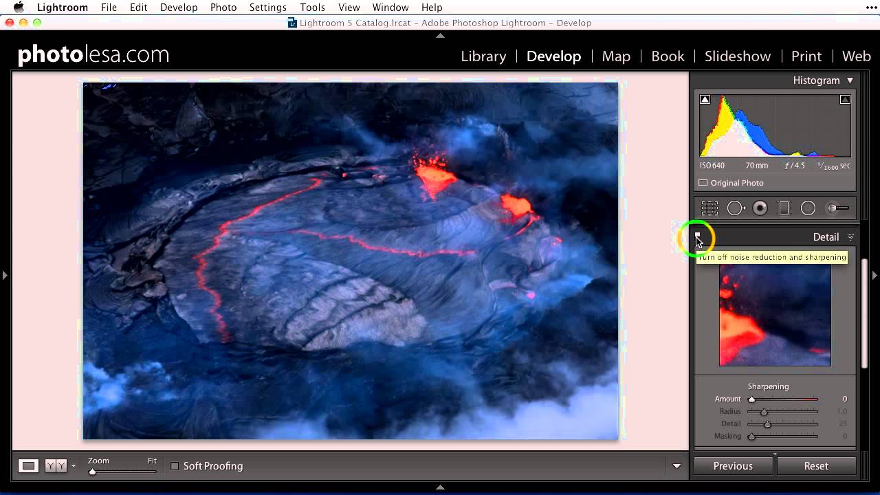
There’s a trade-off nobody warns you about when you first start editing in Lightroom. You shoot something in low light, you get it into the Develop module, and you drag those shadows up to rescue all that beautiful detail you knew was hiding in the dark. The image opens up. You feel like a genius. Then you zoom in and see it: grain. Speckles. A texture that looks less like film and more like your sensor had a bad night.

HSL in Lightroom: The Adjustment Most Editors Use Wrong (And How to Fix That)

HSL in Lightroom: The Adjustment Most Editors Use Wrong (And How to Fix That)

I was editing a portrait last fall and something was bothering me about the skin tones. The overall exposure was solid, the white balance was dialed in, but the subject looked vaguely radioactive. That particular shade of orange that creeps into skin when you push a warm preset too hard. My first instinct, the instinct every beginner has, was to reach for the Temperature slider and walk it back. That would have fixed the skin and wrecked everything else in the frame.

How to Pull a Usable Image Out of an Underexposed RAW File in Lightroom

How to Pull a Usable Image Out of an Underexposed RAW File in Lightroom

We’ve all been there. You’re out shooting, the light is doing something genuinely magical, you fire off the shot, and then you look at the back of the camera and feel your stomach drop. The exposure is off. Two stops under, maybe more. The moment is gone and you’re left with a dark, flat file that looks like it belongs in the trash. I used to think those shots were just losses.

Lightroom's AI Denoise Tool Actually Works — Here's the Proof

Lightroom's AI Denoise Tool Actually Works — Here's the Proof

I shoot a lot of golden hour and blue hour landscapes, which means I spend a lot of time fighting noise. ISO creep is real, especially when you’re chasing a specific shutter speed to keep moving water silky or freeze wind-blown leaves. For years, Lightroom’s built-in noise reduction was my least favorite part of the workflow. Crank the luminance slider and yes, the grain disappears, but so does everything else. The fine texture in bark, the detail in distant ridgelines, the individual strands of a waterfall.

The Masking Methods That Elevate Your Lightroom Edits From Flat to Polished

The Masking Methods That Elevate Your Lightroom Edits From Flat to Polished

The Masking Methods That Elevate Your Lightroom Edits From Flat to Polished I’ve spent enough time scrolling through photography communities to recognize a pattern: the difference between a good edit and a great edit often comes down to one thing—restraint paired with precision. And that’s exactly what I’m seeing more photographers discover right now with Lightroom Classic’s masking capabilities. Why Your Photos Feel “Overdone” We’ve all been there. You push the vibrance slider, boost contrast, add some warmth, and suddenly your photo looks like it was processed by a robot with no chill.

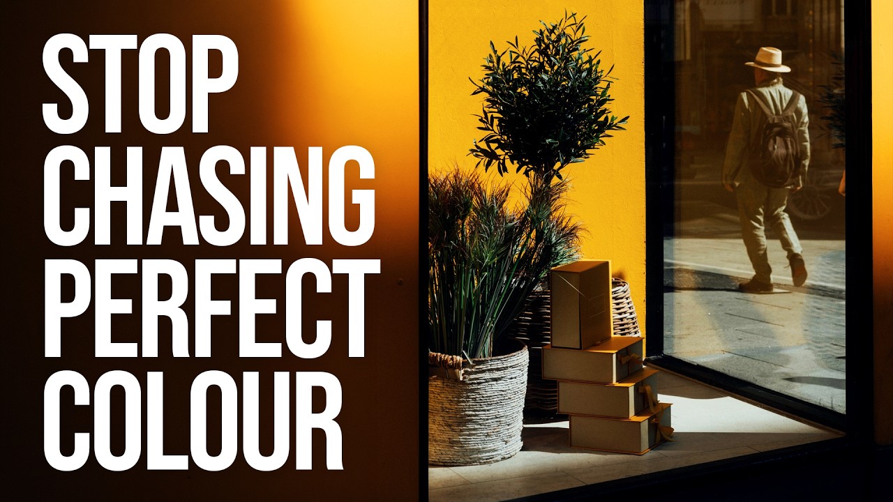
From Muddy to Intentional: What Sean Tucker's Colour Philosophy Taught Me About My Own Edits

From Muddy to Intentional: What Sean Tucker's Colour Philosophy Taught Me About My Own Edits

I used to name my presets after the feeling I was chasing. “Golden Hour Desperate.” “Blue That Isn’t Too Blue.” “Please Just Look Natural.” If you’ve ever stared at a raw file wondering whether your color instincts are broken, you already know the spiral I’m describing. Raw files are neutral by design, which is a gift and a curse. Film photographers had Kodachrome or Kodak Gold making the color decisions for them.