You're Not Using Lightroom Wrong — You're Using It Uninformed (Here's the Fix)

You're Not Using Lightroom Wrong — You're Using It Uninformed (Here's the Fix)

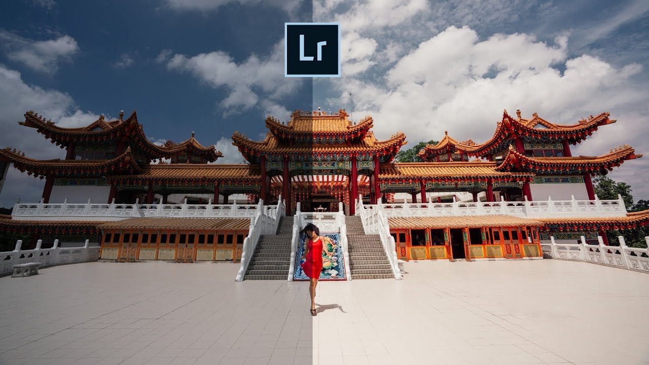
Every few months I open an old edit and cringe. Not because the photo was bad, but because I can see exactly what I was doing: hammering sliders that felt powerful without understanding what they were actually changing. Texture cranked. Clarity pushed. Dehaze doing whatever it wanted. The result looked edited, not enhanced, and there is a meaningful difference between those two things. That is exactly what this Mark Denney tutorial addresses head-on.

Color Grading in Lightroom (and Photoshop): How to Use Color Theory to Set the Mood of Any Photo

Color Grading in Lightroom (and Photoshop): How to Use Color Theory to Set the Mood of Any Photo

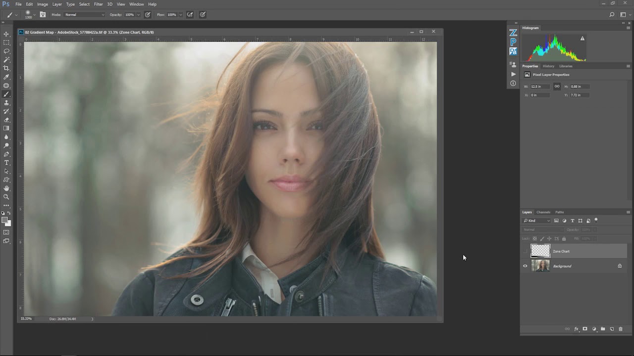
There is a version of photo editing where you nail the exposure, balance the whites, clean up the shadows, and call it done. Technically perfect. Emotionally inert. I spent an embarrassing amount of time in that version before I started paying attention to what color grading actually does to a viewer. It is not about making an image look “correct.” It is about making someone feel something before they even read your caption.

Why Your Lightroom is Crawling (And How to Fix It)

Why Your Lightroom is Crawling (And How to Fix It)

Why Your Lightroom is Crawling (And How to Fix It) We’ve all been there. You’re in the zone, color grading away, and suddenly Lightroom decides to move like it’s running on a potato from 2005. The rainbow spinning wheel of death appears. Your creative momentum evaporates. Your soul dies a little inside. Here’s the thing: Lightroom has come a long way in terms of performance. Adobe’s engineers have genuinely worked hard to keep this software snappy.

Black & White Done Right: A Lightroom Classic Workflow That Actually Makes You Think in Monochrome

Black & White Done Right: A Lightroom Classic Workflow That Actually Makes You Think in Monochrome

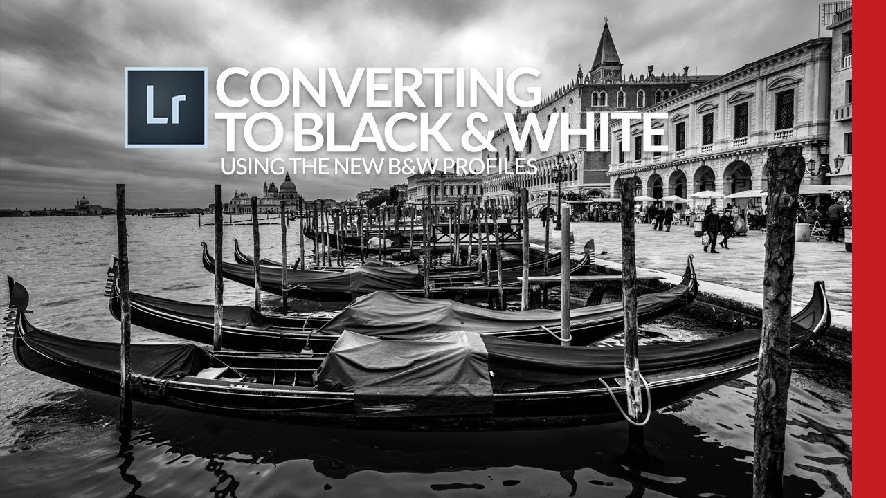
Most of my black and white conversions used to follow the same lazy pattern: desaturate, push the contrast, call it done. They looked fine. Fine is the enemy of interesting. What I was missing wasn’t effort, it was a smarter starting point, specifically, using Lightroom’s B&W creative profiles as a foundation rather than an afterthought. Watch the full tutorial on YouTube In this Scott Kelby tutorial, he works through a Venice street scene that, by his own admission, isn’t a trophy shot.

Stop Sending Crooked Photos Into the World: Four Lightroom Straightening Methods That Actually Stick

Stop Sending Crooked Photos Into the World: Four Lightroom Straightening Methods That Actually Stick

I’ll be honest with you: the crooked horizon line is the editing mistake that ages the worst. You can get away with slightly flat colors or a touch of noise, but a tilted horizon line reads immediately as careless, even to people who have never opened Lightroom in their lives. I learned this the hard way when I was editing press shots for my band, squinting at skewed rooftop photos and wondering why they looked “off” even after I’d color graded them within an inch of their lives.

Virtual Copies in Lightroom: One Photo, Three Versions, Zero Extra Storage

Virtual Copies in Lightroom: One Photo, Three Versions, Zero Extra Storage

There’s a specific kind of dread that hits when a client asks for “a few different looks” on 200 wedding photos. Your first instinct is to duplicate everything, which means double the storage, double the catalog clutter, and double the time spent organizing files you didn’t need in triplicate. For years, I handled this the hard way before I understood what virtual copies could actually do for a portrait and event workflow.

Lightroom Color Editing Finally Makes Sense — Here's the Tool You're Probably Ignoring

Lightroom Color Editing Finally Makes Sense — Here's the Tool You're Probably Ignoring

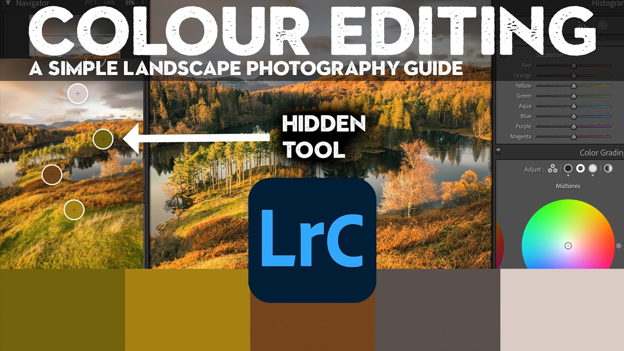
Color questions are the ones that fill my inbox. Not exposure, not sharpening, not even masking. Color. People want to know why their images look muddy, why the greens feel fake, why the sky went from moody to neon the second they touched the saturation slider. I spent years answering those questions one reply at a time before I realized the real problem: most photographers learn color tools in isolation, without ever understanding how each one interacts with the others.

The Lightroom Setting I Ignored for Years (And Why That Was a Mistake)

The Lightroom Setting I Ignored for Years (And Why That Was a Mistake)

For the longest time, I treated the Profile field in Lightroom’s Basic panel like the terms and conditions on a software update. I knew it was there. I scrolled past it every single time. My photos came out fine, my clients were happy, and I told myself the default was good enough. Then I started digging into how other editors actually approach the beginning of their workflow, and I realized I had been skipping one of the most powerful starting points in the entire develop module.

From Flat RAW to Cinematic: How Pierre T. Lambert's Lightroom Workflow Actually Works

From Flat RAW to Cinematic: How Pierre T. Lambert's Lightroom Workflow Actually Works

There’s a particular kind of frustration that hits when you open a RAW file and it looks absolutely nothing like what you saw through the viewfinder. Flat, muddy, lifeless. I’ve been editing photos long enough to know that the gap between the RAW capture and the finished image is where most photographers either give up or develop a real workflow. For a long time, my own workflow was a patchwork of habits I’d picked up from a dozen different sources, none of them quite fitting together.

How to Edit Dark and Moody Photos in Lightroom: A Step-by-Step Breakdown

How to Edit Dark and Moody Photos in Lightroom: A Step-by-Step Breakdown

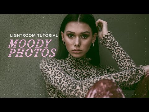
There’s a specific kind of photo that stops your scroll. Dark, atmospheric, a little desaturated, like it was found in a shoebox in someone’s attic. It doesn’t look over-processed. It looks like it has a past. Getting there in Lightroom is less about applying one magic slider and more about understanding a chain of decisions that each build on the last. I’ve been chasing that look for years, and Watch the full tutorial on YouTube from photographer Jessica Kobeissi is one of the cleaner, more honest breakdowns I’ve seen of the process.

How to Fake a 35mm Film Look in Lightroom Using a Masked Gradient (Peter McKinnon's Best Trick)

How to Fake a 35mm Film Look in Lightroom Using a Masked Gradient (Peter McKinnon's Best Trick)

There’s a specific problem I kept running into with digital photos that were supposed to feel vintage. I’d pile on the grain, drop the contrast, pull back the clarity, and the result still looked like a digital photo wearing a Halloween costume. Something was off. The scene felt sharp in a way that film never is, too evenly exposed, too present. It took me longer than I’d like to admit to figure out what was missing, and honestly, the answer was sitting in a Lightroom panel I was already using for other things.

Fix a Flat, Boring Photo in Lightroom: Scott Kelby's Intermediate Workflow, Step by Step

Fix a Flat, Boring Photo in Lightroom: Scott Kelby's Intermediate Workflow, Step by Step

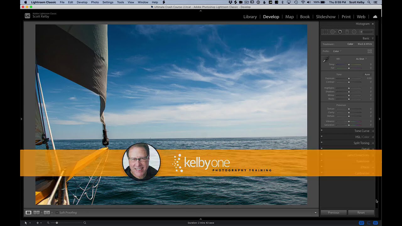
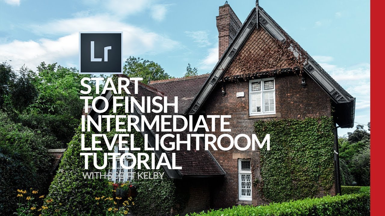
There’s a specific kind of photo I used to dread editing. Not a disaster shot, not a total throwaway, but the mediocre middle-ground image. Flat light, a blown highlight somewhere it shouldn’t be, colors that look like they were processed through a wet sock. The kind of file where you open it in Lightroom, stare at it for thirty seconds, and then go make coffee instead. I’ve got a whole folder of those from the early years, back when I was editing press photos for my band because nobody else was going to do it.