From Flat to Finished: Terry White's Lightroom Workflow for Photowalk Images (And Why It Actually Works)

From Flat to Finished: Terry White's Lightroom Workflow for Photowalk Images (And Why It Actually Works)

Most of the photos sitting in my Lightroom catalog right now are not bad shots. They’re just unfinished ones. Images I took on a good day, with decent light, that came out of camera looking flat and got buried in a folder I keep telling myself I’ll get to. If you shoot on photo walks or street sessions, you know the feeling. You come home with 300 frames, cull them down to 40 worth keeping, and then stall out because the editing feels like starting from scratch on each one.

The Tone Curve Isn't a Filter — It's the Most Precise Tool in Lightroom

The Tone Curve Isn't a Filter — It's the Most Precise Tool in Lightroom

I spent the first two years of my editing life completely ignoring the tone curve. I’d open Lightroom, drag the Contrast slider to somewhere around +30 because it made things look “punchier,” and move on. It worked, kind of. The photos looked fine. But fine isn’t a great bar to clear when you’re trying to build a consistent visual identity, whether you’re editing a wedding gallery, a portrait session, or your band’s press shots.

13 Lightroom Tricks That Changed How I Edit Every Single Day

13 Lightroom Tricks That Changed How I Edit Every Single Day

My editing sessions used to look like this: open the tone curve, check something in HSL, scroll down to color grading, scroll back up to basics, lose my place, get frustrated, close everything manually, repeat. It was the kind of low-grade chaos that doesn’t feel like a problem until you suddenly realize you’ve spent 20 minutes navigating panels instead of actually editing. I kept patching it with workarounds that never quite worked.

Split Toning Is the Reason Your Photos Look Flat (And How to Fix That in 10 Minutes)

Split Toning Is the Reason Your Photos Look Flat (And How to Fix That in 10 Minutes)

The Problem With “Neutral” Edits I had a photo last spring that I’d spent about 45 minutes on. Exposure was dialed. Skin tones were clean. Sharpness was exactly where I wanted it. I sent it to the client and got back the most deflating reply possible: “It looks a little flat, can you make it more… cinematic?” Cinematic. The word photographers love to hear and hate to interpret. What they were actually asking for, without knowing it, was split toning.

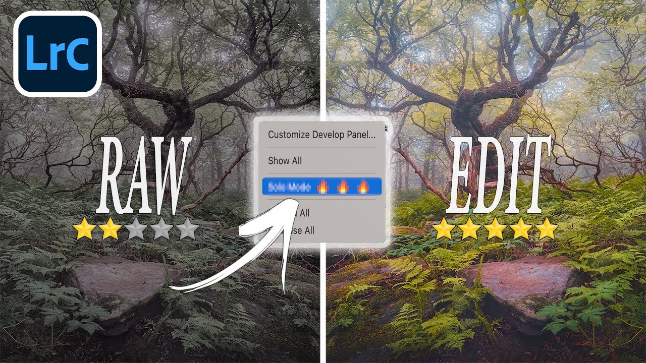
Two Lightroom Develop Panel Tricks That Changed How I Work (From Matt Kloskowski)

Two Lightroom Develop Panel Tricks That Changed How I Work (From Matt Kloskowski)

There’s a particular kind of frustration that hits mid-edit when you’re bouncing between the HSL panel and the Basic panel and Lightroom keeps slamming one shut every time you open the other. I’ve been there more times than I want to admit. Solo mode is supposed to be a feature, not a trap, but when you’re deep in a color grade and need two panels visible at once, it starts to feel like the software is working against you.

Fix Wonky Perspective in Lightroom With the Guided Upright Tool (It's Easier Than You Think)

Fix Wonky Perspective in Lightroom With the Guided Upright Tool (It's Easier Than You Think)

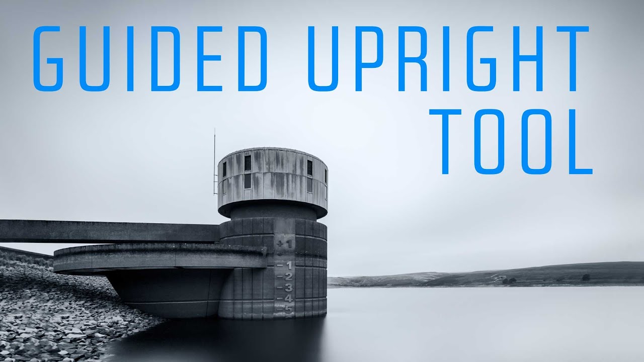
There’s a specific kind of frustration that hits when you nail the light, the moment, the composition - and then get home and realize the building in the background looks like it’s about to tip over. Wide-angle lenses are incredible for landscape and architectural work, but physics doesn’t care about your portfolio. The way light bends through a short focal length creates converging lines and skewed geometry that can turn a strong image into an awkward one.

Adobe Finally Gave Lightroom an AI Eraser That's Actually Worth Using

Adobe Finally Gave Lightroom an AI Eraser That's Actually Worth Using

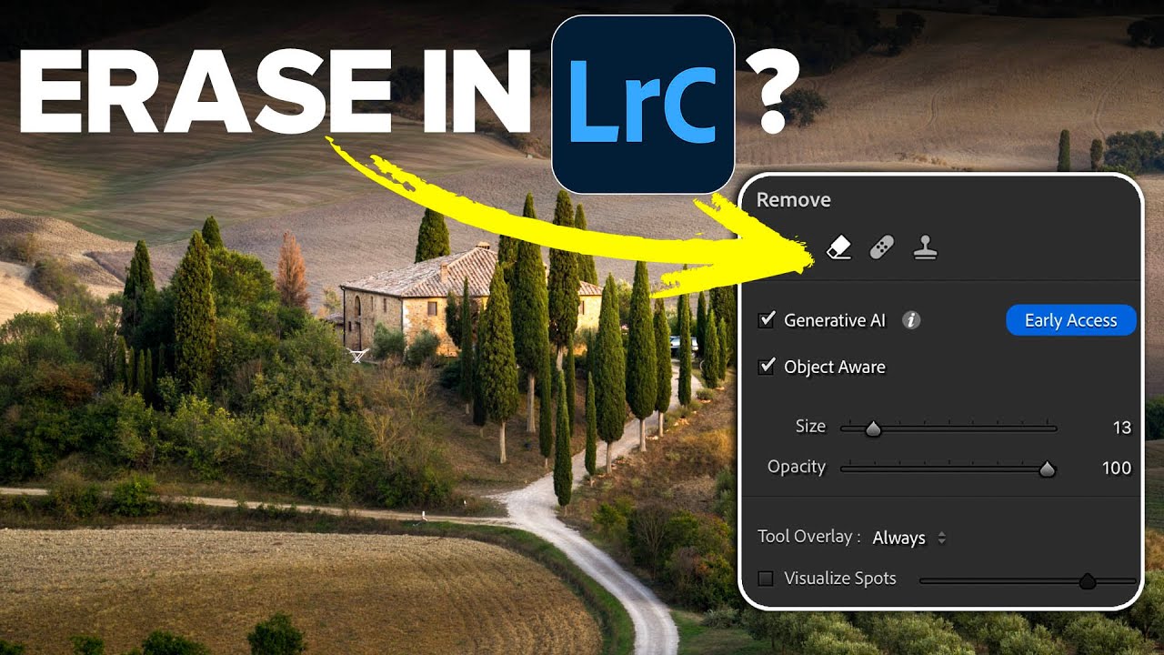
Every Lightroom user has a version of the same story. You spend twenty minutes getting a raw file exactly right, the tones are balanced, the colors are singing, and then you notice the power line cutting across the sky. Or the tourist walking through the background. Or the trash can that somehow ended up in the perfect composition. And just like that, you’re exporting to Photoshop, doing the thing, exporting back, and now you’ve got a TIFF sitting next to your raw file like a receipt you didn’t want.

I Switched to a Wacom Tablet for Lightroom Editing and I'm Not Going Back

I Switched to a Wacom Tablet for Lightroom Editing and I'm Not Going Back

I’ve been editing photos in Lightroom long enough to have strong opinions about things most people don’t notice, like the exact amount of friction a scroll wheel should have, or why the brush tool with a mouse feels like trying to paint with a bar of soap. For years I told myself the mouse was fine. It’s fine. Everyone uses a mouse. Then I watched Thomas Heaton pick up a Wacom Intuos Pro tablet for the first time and start editing like he’d been born with a stylus in his hand, and I felt that specific kind of creative jealousy that means you need to change something.

Why Your Lightroom Photos Look Banded and Funky (And How to Fix It)

Why Your Lightroom Photos Look Banded and Funky (And How to Fix It)

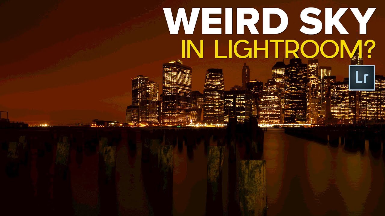
I’ve been editing photos in Lightroom long enough to know that the application has a gift for making you doubt yourself at exactly the wrong moment. You’re culling a shoot, you land on a landscape with a gorgeous gradient sky, and suddenly the sky looks like a television losing signal - horizontal lines cutting through what should be smooth, clean tones. Your stomach drops. You start mentally calculating whether your camera sensor is dying or your monitor is going bad.

Warm It Up: A Photoshop Layer-by-Layer Guide to Soft, Golden Fashion Tones

Warm It Up: A Photoshop Layer-by-Layer Guide to Soft, Golden Fashion Tones

There’s a specific problem I run into more than I’d like to admit. I shoot a portrait session on an overcast Nashville afternoon, pull the RAW files into Photoshop, and the whole thing looks like a dental office waiting room. Technically correct. Emotionally inert. The image needs warmth, not just a temperature slider drag, but a layered, intentional warmth that reads as a creative choice rather than a fix. That’s exactly the territory Jessica Kobeissi covers in her tutorial on creating a warm-toned fashion photo.

How to Build a Photography Style That's Actually Yours (A Lightroom Breakdown)

How to Build a Photography Style That's Actually Yours (A Lightroom Breakdown)

Every few months I’ll open my Lightroom catalog and feel that low-grade anxiety of looking at a grid of images that don’t quite belong together. Good photos, technically. But no thread connecting them. No sense that one person made all of these. If you’ve ever scrolled your own feed and thought “this looks like four different photographers,” this one’s for you. In this Nigel Danson tutorial, Watch the full tutorial on YouTube, Nigel tackles the question he says he gets asked more than anything else: how do you actually build a style?

What Lightroom Presets Actually Do to Your Raw Files (And Why Most People Use Them Wrong)

What Lightroom Presets Actually Do to Your Raw Files (And Why Most People Use Them Wrong)

A few years ago I released a preset pack on a Tuesday afternoon, mostly as an experiment. By Friday it had 50,000 downloads. I hadn’t charged a cent for it. The emails I got back were mostly some version of the same sentence: “I applied the preset and it looks nothing like your example photo.” That told me everything I needed to know about how people misunderstand what presets actually are.