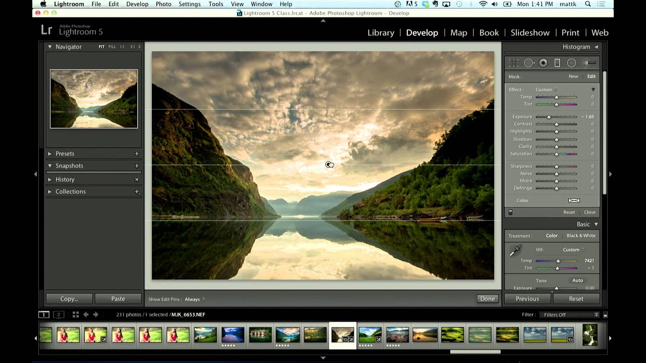
How to Darken a Sky Without Wrecking Your Treeline in Lightroom

How to Darken a Sky Without Wrecking Your Treeline in Lightroom

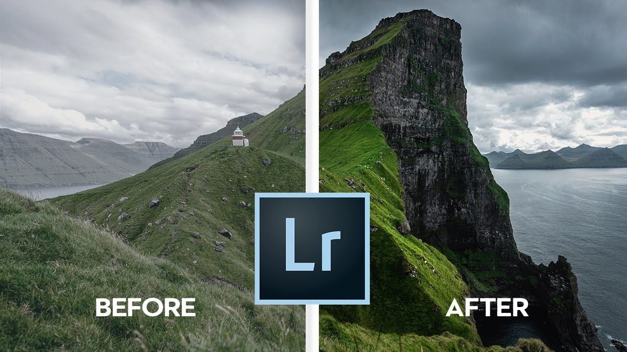
Sky editing is one of those things that sounds simple until you’re staring at a photo where the clouds are blown out and the foreground looks like it was shot at midnight. I’ve been in that exact situation more times than I want to count, and for a long time my fix was clunky at best. I’d pull down the overall exposure, hate what it did to the shadows, undo it, and then just… accept a mediocre sky.

Split Toning Is the Secret Your Flat Edits Are Missing (Here's How to Actually Use It)

Split Toning Is the Secret Your Flat Edits Are Missing (Here's How to Actually Use It)

I used to think split toning was a filter. One of those things you slap on a photo to make it look “cinematic” and call it a day. I’d see other editors’ work with those warm golden highlights and cool blue shadows, assume they had some secret preset, and move on. It wasn’t until I spent a weekend reverse-engineering a look from a photographer I admired that I realized split toning wasn’t a shortcut at all.

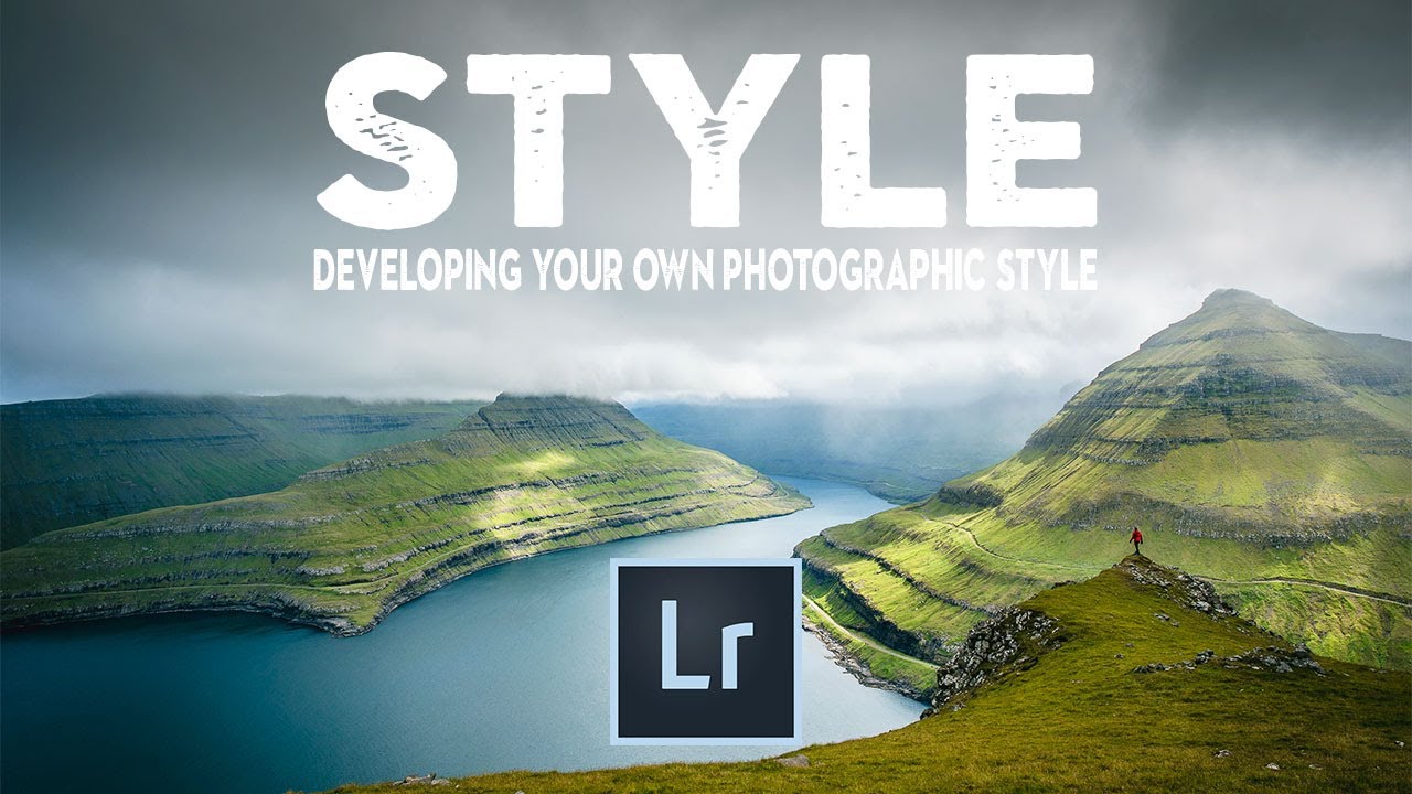
How to Find Your Lightroom Editing Style (Instead of Just Copying Everyone Else's)

How to Find Your Lightroom Editing Style (Instead of Just Copying Everyone Else's)

There’s a specific kind of frustration that hits when you open Instagram, scroll past three photographers whose work stops you cold, and then open your own Lightroom catalog and feel absolutely nothing. I spent a long time in that gap. I’d apply someone else’s preset, think “close enough,” and move on. The photos looked fine. They didn’t look like mine. The problem wasn’t technical skill. It was that I hadn’t done the work of figuring out what I actually wanted my images to feel like.

How to Add a Watermark in Lightroom Classic (Text or Logo, Done Right)

How to Add a Watermark in Lightroom Classic (Text or Logo, Done Right)

Every photographer eventually hits the same wall: you share a photo online, and somewhere between your hard drive and the internet, the credit disappears. It happened to me constantly when I was just starting out, posting band press shots on every platform imaginable and watching the images float off into the void without my name attached. A watermark is not a perfect solution, but it is a working one, and Lightroom Classic makes it easier than most people realize.

Back to Black and Into Color: Using Duotone and Tritone to Transform Your Photos

Back to Black and Into Color: Using Duotone and Tritone to Transform Your Photos

There’s a category of color grade that feels almost impossible to recreate with standard Lightroom sliders. You know the look: a photo where the shadows lean hard into one hue, the highlights drift somewhere completely different, and the whole thing feels unified in a way that no HSL panel adjustment is going to get you. I’ve spent enough hours pushing the Color Grading wheels around to know when I’m fighting the tool.

Color Toning in Photoshop with Levels: The Non-Destructive Trick I Keep Coming Back To

Color Toning in Photoshop with Levels: The Non-Destructive Trick I Keep Coming Back To

Most of my work happens in Lightroom, but every so often a technique from the Photoshop side of the world earns a permanent spot in my rotation. Color toning with a Levels adjustment layer is one of those techniques. It looks deceptively simple on the surface, and that simplicity is exactly why it works. No plugins, no complicated masking, no destructive pixel-pushing. Just a single adjustment layer and a little knowledge about how color channels behave.

Crop It Right: A Practical Guide to Lightroom's Crop, Straighten, and Perspective Tools

Crop It Right: A Practical Guide to Lightroom's Crop, Straighten, and Perspective Tools

Every time I open a fresh batch of photos, at least a third of them need some kind of compositional fix before I even think about color. A slightly tilted horizon. A subject who’s technically centered but feels crowded. A shot I want to repurpose for print but the dimensions are all wrong. Cropping and straightening sounds like the boring part of editing, but get it wrong and no amount of color grading will save you.

When Lightroom Isn't Enough: 5 Reasons to Open Photoshop (And How to Do Each One)

When Lightroom Isn't Enough: 5 Reasons to Open Photoshop (And How to Do Each One)

I spend about 95% of my editing life inside Lightroom. It’s faster, it keeps me working directly on raw data, and honestly, it handles most of what landscape and portrait photographers actually need. But every once in a while, I hit a wall. There’s something in the frame that needs to disappear, or I’ve got two shots that need to become one, and suddenly Lightroom just shrugs at me. That’s when Photoshop earns its place in the subscription.

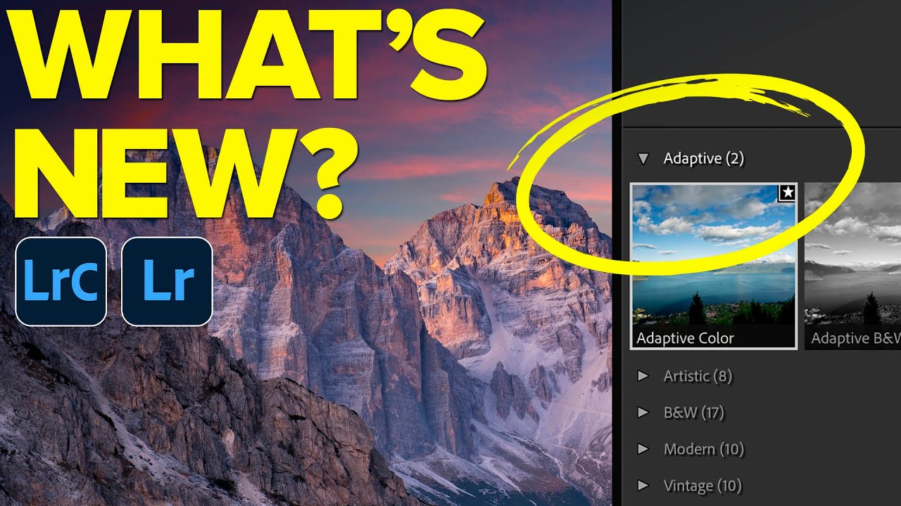
Adaptive Profiles in Lightroom Classic: The Smarter Starting Point You've Been Missing

Adaptive Profiles in Lightroom Classic: The Smarter Starting Point You've Been Missing

I spend a lot of time chasing the right starting point. Not the final edit - the moment before the moment, where the raw file either cooperates or fights back. For years, profiles were the answer I defaulted to: slap on Adobe Color, get a reasonable baseline, then start pushing sliders. It works. It’s fine. But “fine” is a weird place to park your workflow when better options exist. In this Matt Kloskowski tutorial covering the February 2025 Lightroom update, the feature that stopped me mid-scroll was Adaptive Profiles.

7 Lightroom Habits That Actually Stick (Broken Down From a Nigel Danson Tutorial)

7 Lightroom Habits That Actually Stick (Broken Down From a Nigel Danson Tutorial)

Every photographer eventually lands on a workflow they trust. Mine took longer than I’d like to admit. I learned Lightroom out of necessity - my band couldn’t afford a photographer, so someone had to figure out how to make our press shots look like we had our act together. That someone was me, armed with a cracked laptop and a lot of YouTube rabbit holes. Which is exactly why this Nigel Danson tutorial caught my attention.

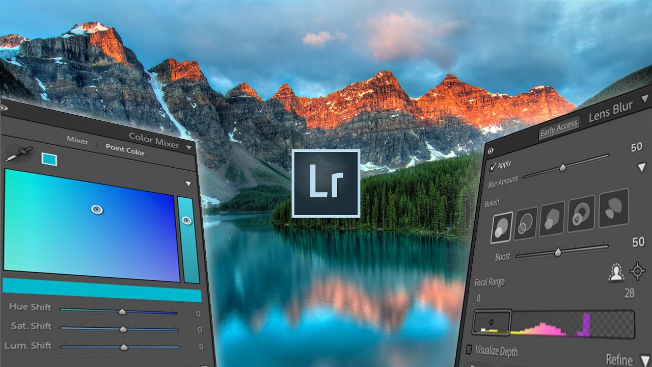
Lens Blur, Point Color, and HDR Editing: What Actually Changed in the Latest Lightroom Update

Lens Blur, Point Color, and HDR Editing: What Actually Changed in the Latest Lightroom Update

Every few months, Adobe drops an update and I spend the better part of an afternoon figuring out which features are genuinely useful and which ones exist mostly to fill a press release. This one, though, is different. The October Lightroom update landed with three additions that actually change how I work: a simulated lens blur tool, a point color panel, and native HDR editing support. I ran through all of them after watching Watch the full tutorial on YouTube from Mango Street, and I want to walk you through each feature in enough detail that you can follow along without having the video open beside you.

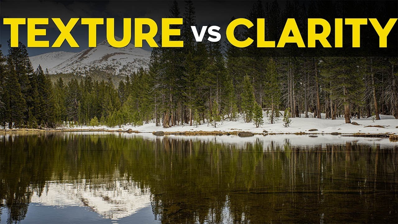
Texture vs. Clarity vs. Sharpening: What Lightroom's Texture Slider Actually Does (And When to Use It)

Texture vs. Clarity vs. Sharpening: What Lightroom's Texture Slider Actually Does (And When to Use It)

For a long time, my go-to move for adding detail to a photo was clarity. Crank it up, things look punchier. Pull it down, skin looks smoother. It worked well enough that I never questioned it. Then Lightroom dropped the Texture slider and I realized I had been using a sledgehammer when sometimes a scalpel was exactly what the job needed. The difference between these two tools is subtle in name and dramatic in practice, and once you understand what each one is actually doing to your pixels, you will not mix them up again.