Two Lightroom Tricks I Wish I'd Known During My First 1,000 Bracket Shots

Two Lightroom Tricks I Wish I'd Known During My First 1,000 Bracket Shots

There’s a specific kind of frustration that comes from shooting a bracketed sequence at golden hour, getting home, and realizing you have to manually drag exposure sliders on eight nearly identical files just to compare them fairly. I’ve been there more times than I’d like to admit. Back when I was editing press shots for my band on a borrowed laptop, I developed some genuinely bad habits around bracketed editing, and some of those habits followed me into my professional workflow longer than they should have.

Why Lightroom Feels Slow When Browsing (And the Two-Step Fix That Actually Works)

Why Lightroom Feels Slow When Browsing (And the Two-Step Fix That Actually Works)

There’s a specific kind of frustration that hits when you’ve just come back from a shoot with 400 raw files and Lightroom turns every arrow key press into a three-second waiting game. I’ve been there more times than I’d like to admit. Early on, I thought it was just the price of shooting raw. You take the slow rendering as payment for the flexibility. Turns out, I was wrong. I was just using Lightroom in the worst possible way for browsing.

Dehaze, Clarity, and Texture: The Lightroom Tools I Kept Getting Wrong (And How to Actually Use Them)

Dehaze, Clarity, and Texture: The Lightroom Tools I Kept Getting Wrong (And How to Actually Use Them)

For a long time, I treated the Dehaze slider like that one guitar pedal you keep on your board but never actually turn on. Too risky, too unpredictable, too easy to ruin a shot that was almost there. Clarity I’d use occasionally, usually too aggressively, and texture felt like the polite, younger sibling of a tool I didn’t fully understand either. I knew something was off about how I was using them, but I couldn’t articulate why my results kept looking crunchy, strange, or just weirdly brown.

Warm Highlights, Cool Shadows: How to Actually Use Photoshop's Color Grading Wheels

Warm Highlights, Cool Shadows: How to Actually Use Photoshop's Color Grading Wheels

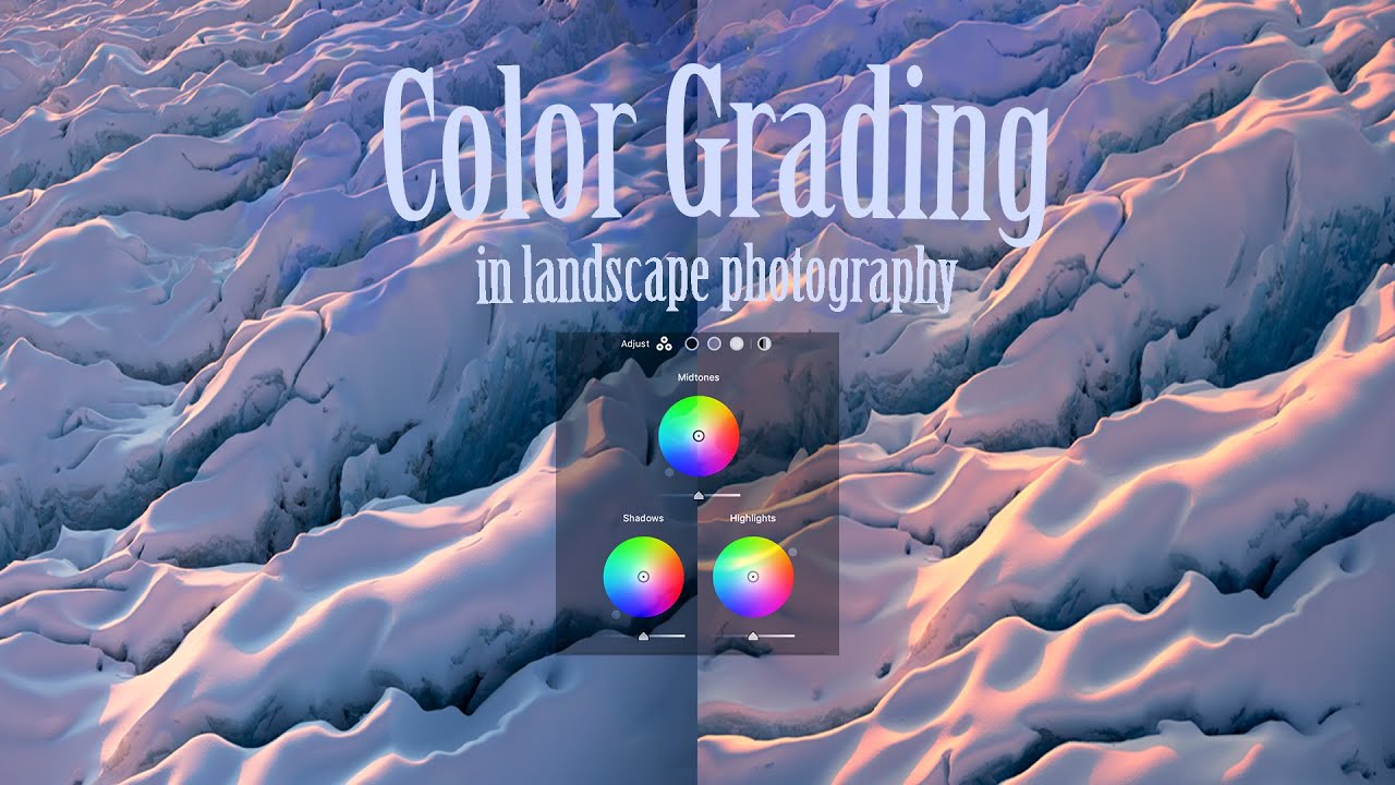
Every raw file I open has the same problem: the light looks flat. Technically correct, emotionally absent. The histogram is fine, the exposure is fine, and somehow the image still feels like it was shot through a grey sock. Color grading is the tool I reach for when the basic sliders have done their job and the photo still isn’t alive yet. Not the heavy-handed, “I watched a YouTube tutorial once” color grading.

Why Your Lightroom Edits Look Incredible on Screen and Terrible Everywhere Else

Why Your Lightroom Edits Look Incredible on Screen and Terrible Everywhere Else

I sent a client gallery last spring and got a message back within ten minutes: “These look kind of gray and flat? Did something go wrong?” Nothing went wrong with my edit. Everything went wrong with my export. The rich, warm tones I’d spent an hour dialing in looked like they’d been photocopied twice and uploaded through a 2009 Wi-Fi connection. I’ve been editing in Lightroom for over a decade and I still had a moment where I stared at my screen wondering if I’d lost my mind.

Lightroom's Print Module Hides a Pixel-Sizing Trick Most People Never Find

Lightroom's Print Module Hides a Pixel-Sizing Trick Most People Never Find

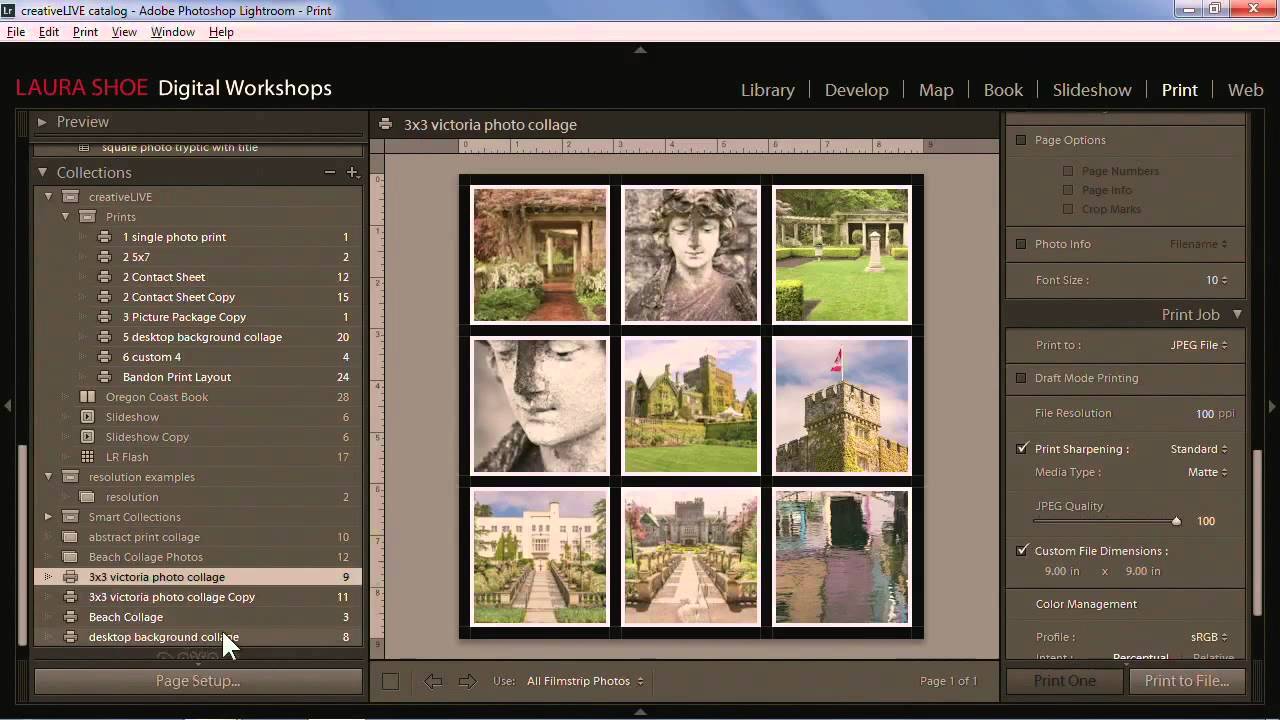
There’s a particular kind of frustration that lives inside the Lightroom Print module. You’ve done the work. The image looks exactly right in the Develop module. Then you try to export for a specific platform or send it to a printer and everything falls apart. The sizing is off. The colors shift. The output doesn’t match what you’ve been staring at for the last hour. I’ve been in that place more times than I want to admit, usually late at night with a deadline attached.

Lightroom's AI Masking Just Changed How I Edit Portraits (And Almost Everything Else)

Lightroom's AI Masking Just Changed How I Edit Portraits (And Almost Everything Else)

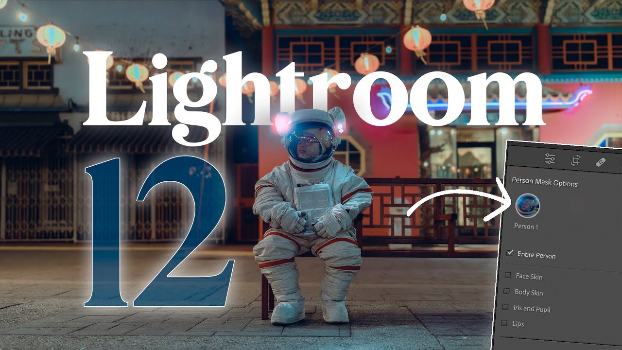
There’s a specific kind of frustration that comes from knowing exactly what you want a photo to look like and spending twenty minutes jumping between apps to get there. Lightroom for the broad strokes, Photoshop for the mask, back to Lightroom, export, repeat. I’ve been doing that dance long enough that I stopped questioning it. Then version 12 dropped and rearranged some things I thought were settled. Watch the full tutorial on YouTube

Lightroom Presets Aren't Magic — But They're Pretty Close If You Know What's Inside Them

Lightroom Presets Aren't Magic — But They're Pretty Close If You Know What's Inside Them

A few years back, I built a preset pack over a single long weekend. Named every preset after a Fleetwood Mac song, spent about 40 hours fine-tuning the tone curves, and then just… gave the whole thing away. No email capture, no upsell, nothing. It hit 50,000 downloads inside three months. What I learned from the comments, the DMs, and the forum threads that followed was uncomfortable: most people were applying those presets, deciding they looked “off,” and then cranking the exposure slider until the photo technically looked brighter.

Lightroom Mobile Is a Full Editing Studio in Your Pocket — Here's How to Actually Use It

Lightroom Mobile Is a Full Editing Studio in Your Pocket — Here's How to Actually Use It

My phone used to be where photos went to die. I’d shoot something decent on my mirrorless, import it to my computer, and if I hadn’t edited it within 48 hours, it entered a kind of limbo. Meanwhile, whatever I shot on my phone sat in a camera roll that I’d scroll past guiltily for months. The gap between “captured” and “edited” was just too wide. Lightroom Mobile closes that gap almost entirely, and I didn’t fully appreciate how capable it was until I went through this overview tutorial from Aaron Nace over at PHLEARN.

Lightroom's Creative Profiles and LUTs Just Changed How I Edit Everything

Lightroom's Creative Profiles and LUTs Just Changed How I Edit Everything

Every few years, something shifts in Lightroom that makes me stop mid-edit and actually pay attention. Not a UI refresh, not a slider rename — something that changes how I think about the whole workflow. I’ve been editing photos since my old band needed press shots and couldn’t afford anyone with a real portfolio, so I learned Lightroom out of necessity. That history means I’ve watched a lot of updates come and go without much fuss.

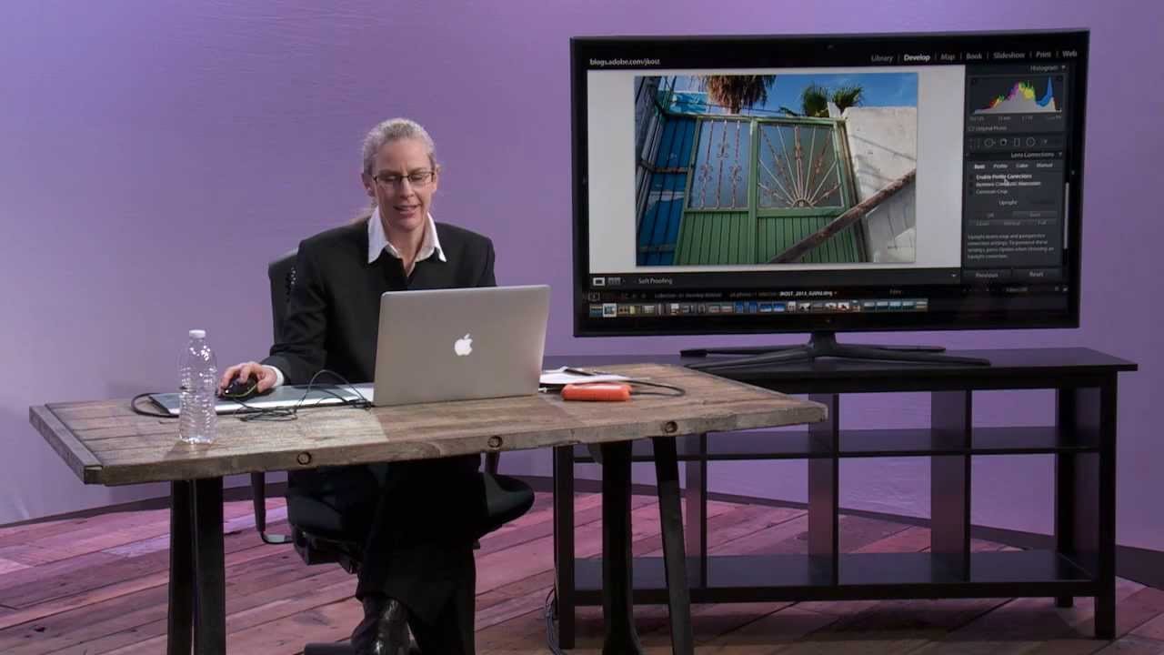
Stop Fighting Crooked Horizons: A Practical Guide to Lightroom's Upright Tool

Stop Fighting Crooked Horizons: A Practical Guide to Lightroom's Upright Tool

There’s a particular kind of frustration that comes from shooting architecture or interiors, loading the photos into Lightroom, and realizing that every single vertical line looks like it’s slowly falling over. I’ve been there more times than I want to count. Whether you’re tilting the camera up to catch a full building facade or shooting a doorway at a slight angle, perspective distortion creeps into the frame almost invisibly on location and becomes glaringly obvious on a 27-inch monitor.

The Tone Curve Isn't a Filter — It's the Whole Conversation

The Tone Curve Isn't a Filter — It's the Whole Conversation

I used to drag the Highlights slider down, lift the Shadows slider up, call it a day. My edits looked fine. Technically correct. Like a photo that had been to the dentist. Clean, but not exactly alive. The tone curve sat there in the Develop module, that little diagonal line, and I treated it like a sign I couldn’t read yet. That lasted longer than I’d like to admit. When I finally committed to understanding it, not just poking at it, it completely rewired how I think about light in an image.