How to Build a Solar Eclipse Composite in Lightroom and Photoshop (Before You Even Shoot It)

How to Build a Solar Eclipse Composite in Lightroom and Photoshop (Before You Even Shoot It)

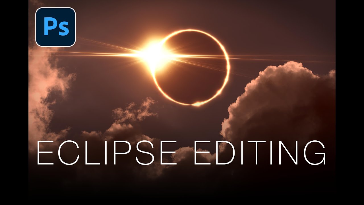
Most editing tutorials are reactive. You shoot something, it comes out weird, and then you go looking for a fix. What I genuinely appreciate about this Matt Kloskowski tutorial on editing solar eclipse photos is that it flips that order entirely. The argument he makes at the top of the video is one I wish someone had made to me earlier in my shooting life: your post-processing vision should inform your shooting decisions, not the other way around.

How to Rescue a Blown-Out, Underexposed Wildlife Shot in Lightroom

How to Rescue a Blown-Out, Underexposed Wildlife Shot in Lightroom

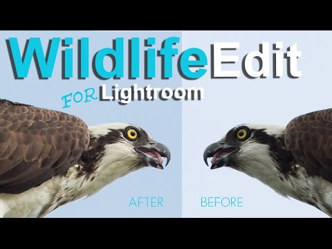
Wildlife photography is unforgiving. You get one shot at the heron, the fox, the hawk — and that shot is usually backlit, rushed, and technically a disaster. I’ve been there more times than I want to admit. The subject is dark, the sky is nuclear white, and somewhere in the chaos you managed to clip the bird’s wing at the frame edge. The question isn’t whether your wildlife shots have problems.

The Tone Curve Isn't a Mystery — You're Just Using It Wrong

The Tone Curve Isn't a Mystery — You're Just Using It Wrong

The Tone Curve Isn’t a Mystery — You’re Just Using It Wrong I had a folder of band press shots that looked like they were taken inside a fluorescent-lit dentist office. Flat, cold, lifeless. I’d shot them myself because we couldn’t afford to hire anyone, and I remember sitting at my desk, dragging the Exposure and Contrast sliders around like I was trying to fix a broken engine with a butter knife.

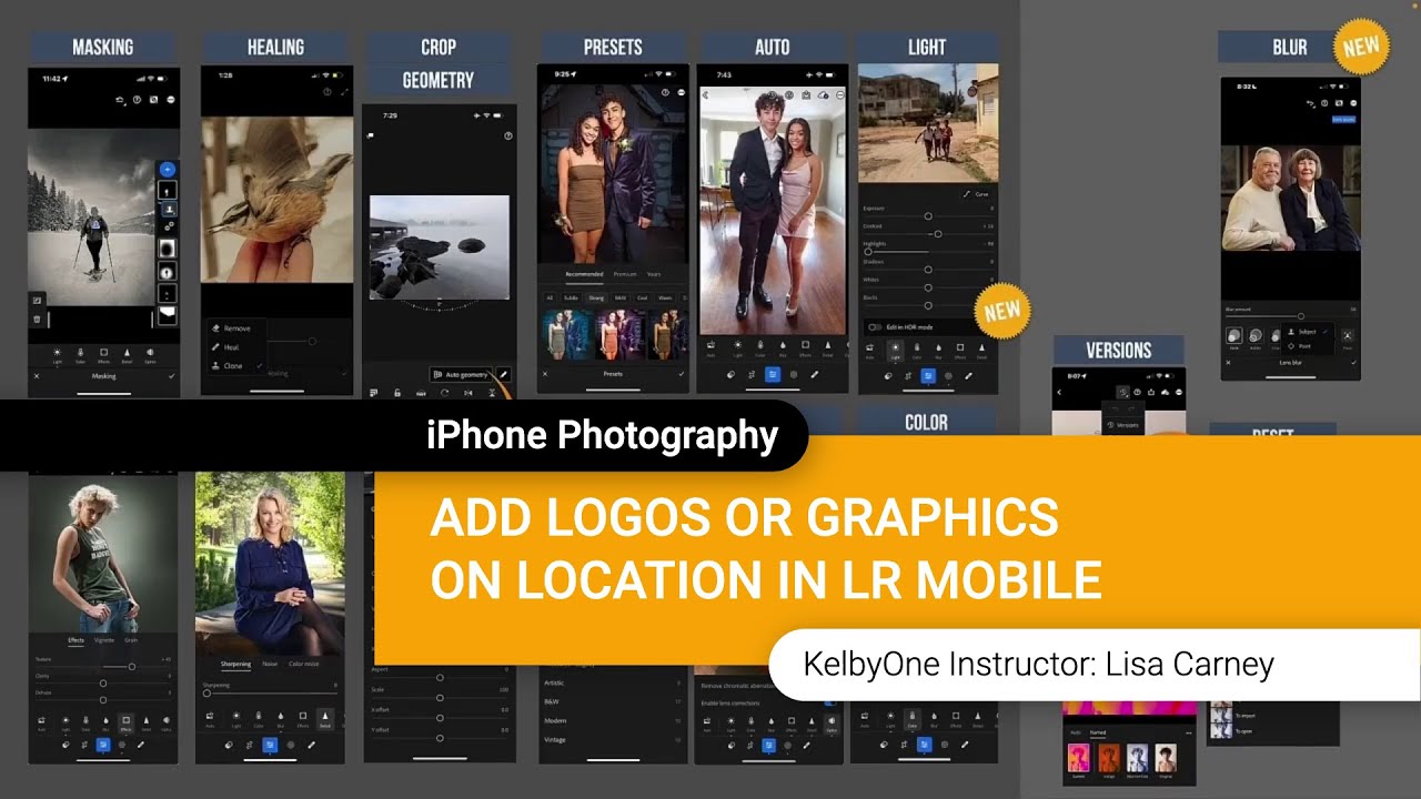
Brand Your Shots on the Spot: How to Add Logos and Textures in Lightroom Mobile

Brand Your Shots on the Spot: How to Add Logos and Textures in Lightroom Mobile

There’s a specific kind of chaos that happens when you’re shooting on location and a client texts asking for a watermarked preview image before you’ve even packed up your gear. I used to handle that by saying “I’ll send it when I’m back at my desk,” which is a perfectly reasonable answer that also makes you look slightly less impressive than the photographer who sends a branded image before they leave the parking lot.

Reference View in Lightroom CC 2015.8: How to Reverse Engineer Any Photo's Look

Reference View in Lightroom CC 2015.8: How to Reverse Engineer Any Photo's Look

There’s a specific kind of frustration I know too well. You’re staring at a JPEG you edited on your phone six months ago, the tones are exactly right, the contrast sits perfectly, and you have absolutely no idea what you did to get there. No develop history. No settings to copy. Just a finished photo mocking you from across the catalog. For a long time, my only move was to squint at it and try to rebuild it from memory, which is about as reliable as it sounds.

The Tone Curve Is Not a Brightness Slider (Here's What It Actually Does)

The Tone Curve Is Not a Brightness Slider (Here's What It Actually Does)

I used to drag the Contrast slider up to about +40 on every single photo and call it a day. This was around the time I was shooting my band’s press photos in a parking garage with a borrowed Nikon, editing everything myself because hiring a photographer was not in the budget. The photos looked punchy in a vague, everything-kind-of-glows way. I thought that was good. Then someone showed me the tone curve, and I realized the Contrast slider is basically training wheels bolted onto something far more precise.

Why Your Lightroom Presets Look Nothing Like the Preview (And How to Fix That)

Why Your Lightroom Presets Look Nothing Like the Preview (And How to Fix That)

I’ve watched the same thing happen to photographers at every skill level. They buy a preset pack, drop one onto a photo, and the result looks like a completely different product than the thumbnail they paid for. The highlights are blown. The colors are muddy. The mood that sold them on the purchase is nowhere. So they blame the presets, delete the pack, and go back to editing from scratch. Nine times out of ten, the presets weren’t the problem.

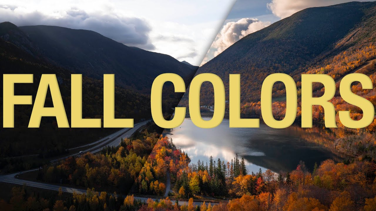
Fall Color Editing Is Harder Than It Looks — Here's How to Actually Get It Right

Fall Color Editing Is Harder Than It Looks — Here's How to Actually Get It Right

Every October I tell myself I’m going to nail the fall color edit this year. And every October I open Lightroom, drag the Vibrance slider up until the leaves look radioactive, and quietly close the file. The problem isn’t effort — it’s that fall color is deceptively tricky. The range of hues shifts dramatically depending on where you live and whether you’re shooting in direct sun or open shade, which means there’s no single slider that solves it for everyone.

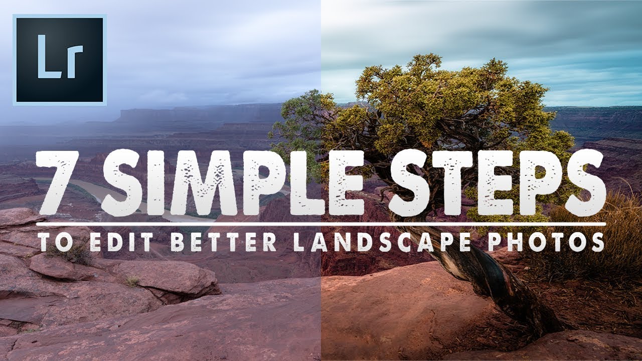
A Beginner's Lightroom Workflow That Actually Sticks: Breaking Down Mark Denney's 7-Step Method

A Beginner's Lightroom Workflow That Actually Sticks: Breaking Down Mark Denney's 7-Step Method

There’s a specific kind of paralysis that hits when you open a raw file and stare at Lightroom’s right panel. Every slider is an option. Every option feels equally valid or equally wrong. I remember that feeling vividly from when I was first teaching myself the software, back when I was editing band press shots in a one-bedroom apartment because nobody else was going to do it. The problem wasn’t effort.

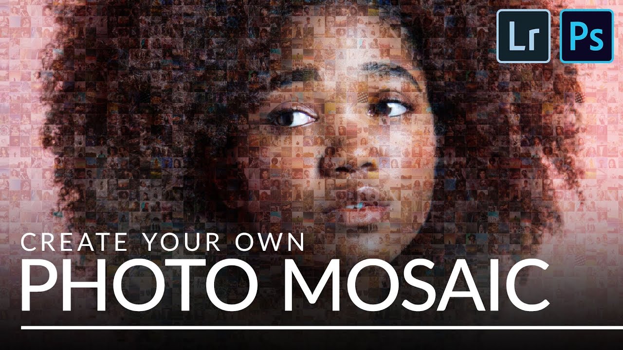
Build a Photo Mosaic From Scratch Using Lightroom and Photoshop

Build a Photo Mosaic From Scratch Using Lightroom and Photoshop

Every few months I get a message that starts with something like: “I have 200 employee headshots and I want to do something interesting with them.” I used to have no good answer for that. A slideshow felt lazy. A contact sheet felt clinical. But a photo mosaic - a single image built from dozens or hundreds of smaller photos - that actually makes people stop scrolling. This technique landed on my radar through Aaron Nace’s tutorial over at PHLEARN, and I want to walk you through what he covers because the workflow is genuinely clever.

The Lightroom Trick That Finally Made My Photos Look Three-Dimensional

The Lightroom Trick That Finally Made My Photos Look Three-Dimensional

Every flat photo I’ve ever hated had the same problem. Not bad light, not bad composition. The image just looked like a photograph of a scene instead of a window into one. That two-dimensional wall between the viewer and the subject is one of the most frustrating things to diagnose when you’re learning to edit, because the fix isn’t obvious. You can push sliders all day and still miss it.

The Brightness Trick That Makes Dark-Background Extractions Actually Work in Photoshop

The Brightness Trick That Makes Dark-Background Extractions Actually Work in Photoshop

There’s a specific kind of frustration that comes from trying to select a subject standing against a dark background. The Quick Selection tool fumbles around the edges, the contrast isn’t there for it to grab onto, and you end up with a selection that looks like it was cut out with safety scissors. I’ve been there more times than I’d like to admit, including on some early band press shots where the lighting was, let’s say, “creative” in all the wrong ways.