Editing Techniques
Masking Tools in Lightroom: The Secret Weapon for Surgical Edits
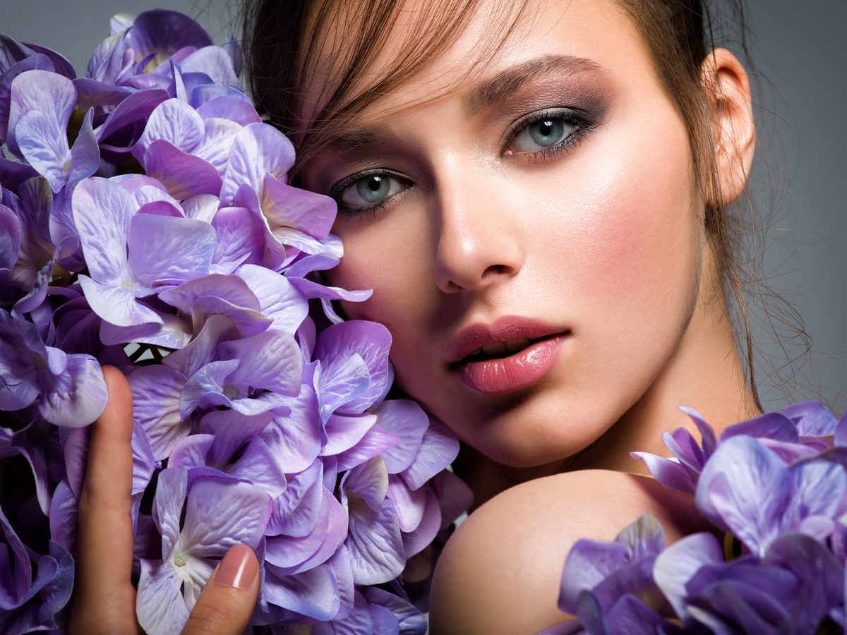
Masking Tools in Lightroom: The Secret Weapon for Surgical Edits I used to edit photos like I was applying makeup with oven mitts on—crude, imprecise, and affecting way more than I intended. Then I discovered Lightroom’s masking tools, and everything changed. Suddenly, I could brighten someone’s eyes without blowing out their entire face. I could warm up skin tones while keeping the sky perfectly cool. It’s the difference between using a sledgehammer and a scalpel.