Lightroom's Adaptive Presets Finally Made Me a Preset Person (And I've Been Resisting for Years)

Lightroom's Adaptive Presets Finally Made Me a Preset Person (And I've Been Resisting for Years)

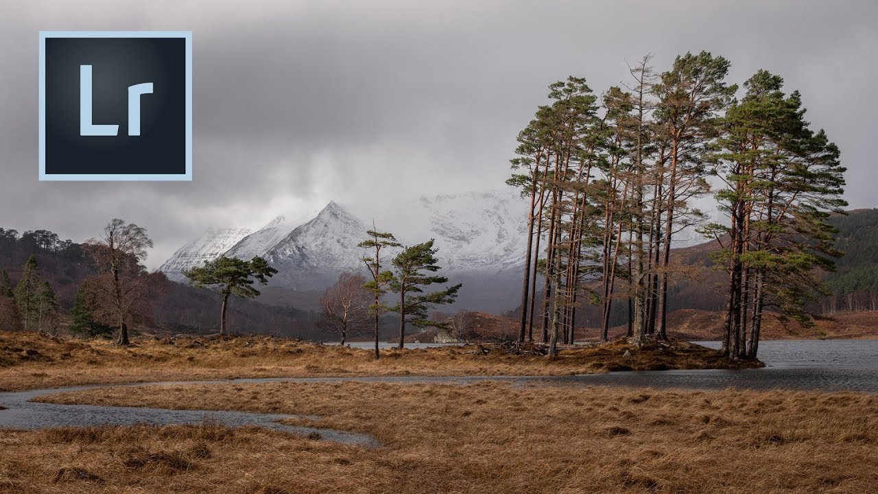
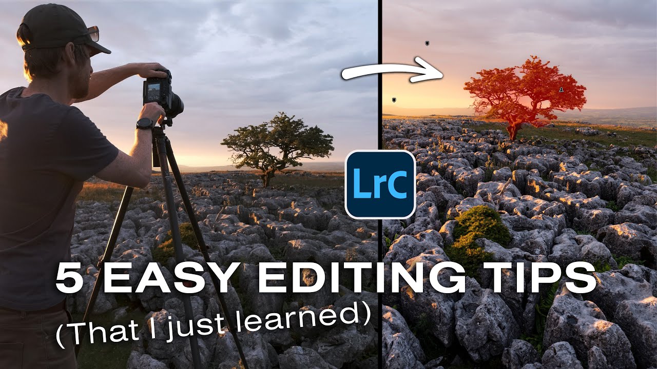
There’s a version of me from about two years ago who would have rolled his eyes at presets. Hard. I named my own presets after Wilco songs and built every mask by hand because I believed that was the only honest way to edit a photo. Then I watched Thomas Heaton — a landscape photographer I respect precisely because he’s methodical and unsentimental about gear and software — admit on camera that he’d been running an outdated version of Lightroom for so long that he used it during a paid Adobe presentation.
Lightroom From the Top: How Tony Northrup's Culling-First Workflow Will Change How You Edit

Lightroom From the Top: How Tony Northrup's Culling-First Workflow Will Change How You Edit

Every photographer I know has the same problem: a memory card full of 300+ shots from one session, a vague intention to “edit those later,” and a folder that never gets touched again. I fell into this exact trap when I was editing press photos for my band on zero budget, learning Lightroom by trial and error with no system whatsoever. The editing wasn’t the hard part. The chaos before the editing was.

Stop Fixing Colors Globally — Here's How to Dial In Each One Individually in Lightroom

Stop Fixing Colors Globally — Here's How to Dial In Each One Individually in Lightroom

Every time I hand off an edited landscape or portrait to a client, I think about how badly my early work would have embarrassed me. Back when I was cutting my teeth on Lightroom, editing my band’s press shots in a Nashville apartment at midnight, I treated color like a single dial. Warm it up, crank the vibrance, call it done. The results looked like a sunset filter threw up on a perfectly decent photo.

Stop Letting Your Lightroom Collections Turn Into a Junk Drawer (Use Collection Sets Instead)

Stop Letting Your Lightroom Collections Turn Into a Junk Drawer (Use Collection Sets Instead)

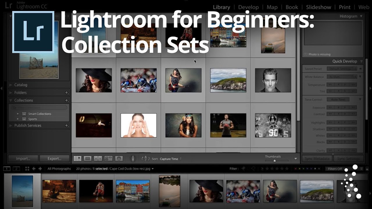
My Lightroom catalog used to look like the back seat of a touring van. Photos everywhere, collections named things like “final_REAL_v3,” no logical hierarchy, just a long scrolling list of panic. When you’re importing shoots constantly, organization is the thing that always feels like it can wait until later. Later never comes. Collection Sets fixed that for me, and I genuinely wish someone had walked me through them when I was starting out.

Lightroom Just Split in Two — Here's What That Actually Means for Your Editing Workflow

Lightroom Just Split in Two — Here's What That Actually Means for Your Editing Workflow

Every few months I get the same message from readers: “My Lightroom looks different and I don’t know what happened.” Usually it’s a minor UI shuffle. This time, though, Adobe made a move significant enough that I spent a good chunk of my week digging through the changes before I felt comfortable writing about them. The short version is that Lightroom is no longer one app. It’s two. And depending on where you are in your photography journey, that’s either great news or mildly annoying news.

Lightroom Mobile Is More Powerful Than You Think — Here's the Proof

Lightroom Mobile Is More Powerful Than You Think — Here's the Proof

I resisted Lightroom’s cloud-based desktop and mobile app for an embarrassingly long time. I had my Classic catalog, my folder structure, my backup drives humming under my desk like old friends. The idea of handing my raw files over to the cloud felt like trading a filing cabinet for a promise. Then I actually started using it, and I owe a small apology to the app I ignored for two years.

Stop Fighting Flat RAWs: How Camera Profiles and Color Targets Fix Your White Balance at the Source

Stop Fighting Flat RAWs: How Camera Profiles and Color Targets Fix Your White Balance at the Source

Every photographer I know has spent too much time dragging the Contrast slider back and forth trying to resurrect a flat, muddy RAW file. I did it for years. Back when I was editing press shots for my band on a borrowed laptop, I thought contrast was something you added manually, like salt to a recipe. Turns out I was starting from the wrong ingredient entirely. That’s the core lesson in this CreativeLive tutorial on color management policies in Lightroom.

Stop Noise From Ruining Your Wildlife and Nature Shots (A Lightroom Brush Technique Worth Knowing)

Stop Noise From Ruining Your Wildlife and Nature Shots (A Lightroom Brush Technique Worth Knowing)

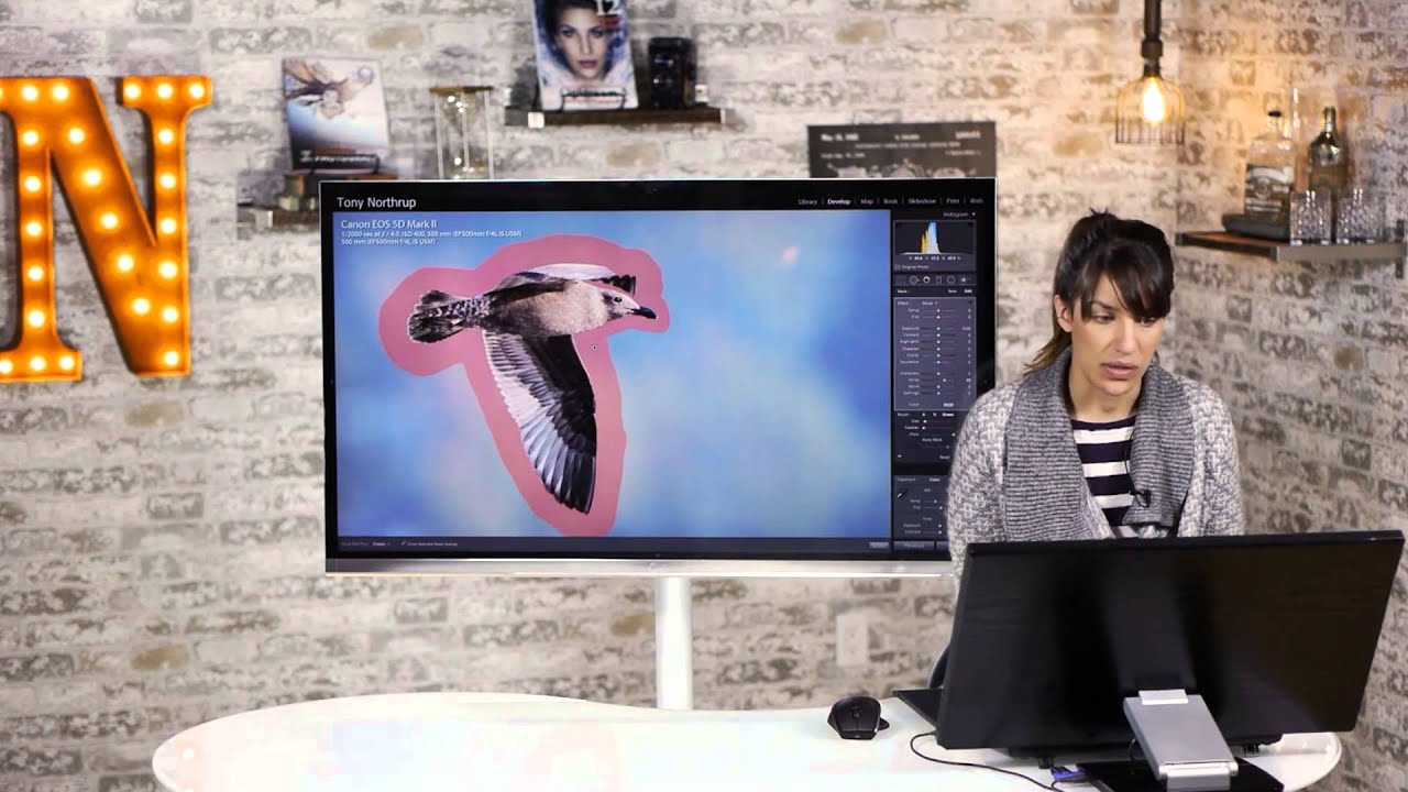
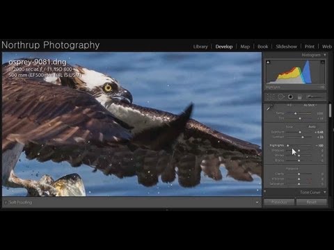
There’s a specific kind of frustration that comes from nailing a wildlife shot, getting the exposure right, holding your breath long enough for the bird to turn its head just so, and then zooming in at your desk to find the background looks like a bowl of colored gravel. I’ve been there more times than I’d like to admit. Noisy backgrounds don’t just look bad on their own. They actively pull the viewer’s eye away from your subject, which is the one thing you actually cared about when you pressed the shutter.

Lightroom Web Is Better Than You Think — Here's What Adobe Just Added

Lightroom Web Is Better Than You Think — Here's What Adobe Just Added

I’ve been a Lightroom guy for a long time. Long enough that I have an embarrassingly large catalog, presets named after Wilco songs, and genuine opinions about tone curve shapes. But I’ll be honest with you: I had basically written off Lightroom web. I poked at it a couple of years ago, thought “that’s cute,” and went back to the desktop app. Big mistake. Katrin Eismann’s recent session for KelbyOne, filmed around Adobe Max, changed that.

The Contrast Method I Wish I'd Known Earlier (A Lightroom Breakdown Worth Your Time)

The Contrast Method I Wish I'd Known Earlier (A Lightroom Breakdown Worth Your Time)

Contrast is one of those editing decisions that feels deceptively simple until you’re forty minutes into a session wondering why your image looks either muddy or crunchy and you’re not sure which slider made it worse. I’ve been editing in Lightroom long enough to have strong opinions about most things in this software, but contrast has always been the one area where I kept second-guessing myself. Too much and the photo looks like it was processed by someone who just discovered the Dehaze slider for the first time.

Range Masking in Lightroom: The One Feature That Makes Your Graduated Filters Actually Work

Range Masking in Lightroom: The One Feature That Makes Your Graduated Filters Actually Work

There’s a problem I run into constantly when editing landscape shots, and I’d bet you’ve hit it too. You’ve got a blown-out sky sitting on top of a beautifully exposed foreground, so you reach for Lightroom’s graduated filter, drag it down over the sky, pull the exposure back, and then stare at the result in quiet frustration. The filter doesn’t care about your mountain peak. It doesn’t care that your brightest cloud and your darkest ridge are sitting two inches apart.

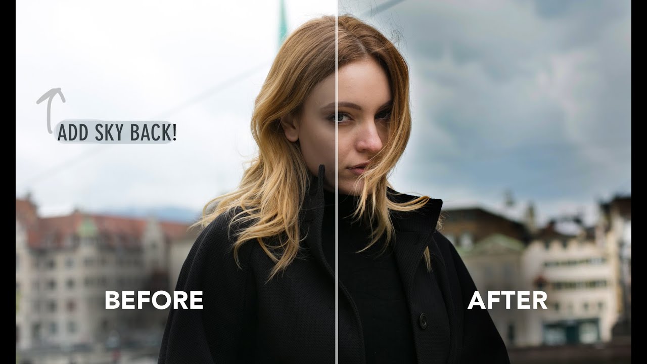
How to Recover Blown-Out Skies in Lightroom (Without Making It Look Fake)

How to Recover Blown-Out Skies in Lightroom (Without Making It Look Fake)

There’s a particular kind of frustration that comes with reviewing a shoot and realizing the sky is completely blown out. The subject looks great, the light on their face is perfect, and the sky is just… white. Nothing. A void. I’ve been there more times than I’d like to admit, and for a while my solution was to either swap the sky entirely or just crop it out and pretend it never existed.