You're Not Using Lightroom Wrong — You're Using It Uninformed (Here's the Fix)

You're Not Using Lightroom Wrong — You're Using It Uninformed (Here's the Fix)

Every few months I open an old edit and cringe. Not because the photo was bad, but because I can see exactly what I was doing: hammering sliders that felt powerful without understanding what they were actually changing. Texture cranked. Clarity pushed. Dehaze doing whatever it wanted. The result looked edited, not enhanced, and there is a meaningful difference between those two things. That is exactly what this Mark Denney tutorial addresses head-on.
Color Grading in Lightroom (and Photoshop): How to Use Color Theory to Set the Mood of Any Photo

Color Grading in Lightroom (and Photoshop): How to Use Color Theory to Set the Mood of Any Photo

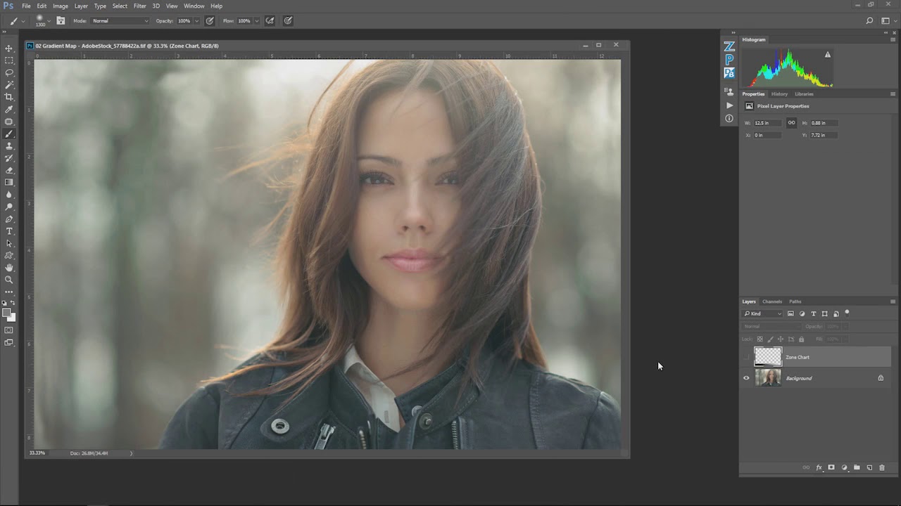
There is a version of photo editing where you nail the exposure, balance the whites, clean up the shadows, and call it done. Technically perfect. Emotionally inert. I spent an embarrassing amount of time in that version before I started paying attention to what color grading actually does to a viewer. It is not about making an image look “correct.” It is about making someone feel something before they even read your caption.

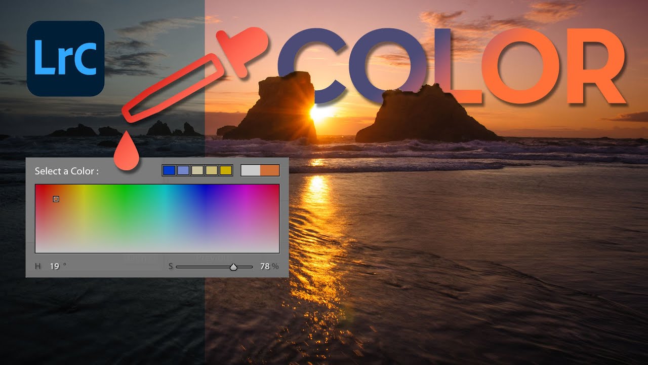
The Lightroom Color Tool You're Probably Not Using (And Why It Should Be Your First Stop)

The Lightroom Color Tool You're Probably Not Using (And Why It Should Be Your First Stop)

There’s a specific frustration I’ve run into more times than I can count: you nail the exposure on a shot, everything looks clean and balanced, and then you try to push the color in a creative direction using the Temperature slider. Suddenly your highlights are clipping, your tones are shifting, and what was a clean edit is now a mess you have to chase back down. I always assumed this was just the cost of doing business with white balance.

Stop Uploading Unprotected Photos: How to Build a Signature Watermark in Lightroom

Stop Uploading Unprotected Photos: How to Build a Signature Watermark in Lightroom

Every photographer I know has a version of this story. You upload a clean, well-edited image to Instagram or a portfolio site, and a few weeks later you spot it somewhere else with zero credit. It happened to me early on, back when I was editing band press shots in a one-bedroom apartment and had no idea that a watermark was even something I could automate. I just assumed you had to manually stamp every single file before sharing, which meant I never did it at all.

Print Your Own Lightroom Calendar for Free: A Step-by-Step Guide Using Ed Weaver's Templates

Print Your Own Lightroom Calendar for Free: A Step-by-Step Guide Using Ed Weaver's Templates

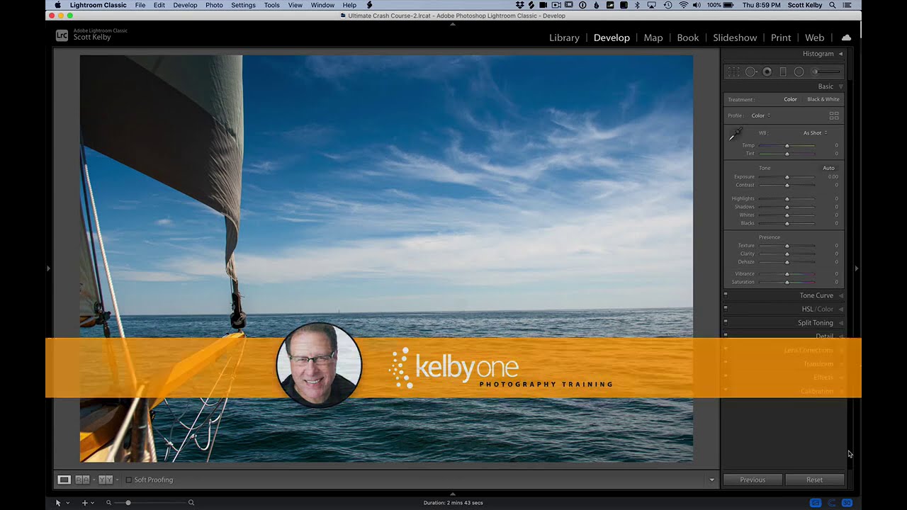
Every January I tell myself I’m going to do something meaningful with the thousands of photos sitting in my Lightroom catalog. Not just export them to a hard drive and forget they exist, but actually put them somewhere physical where people can see them. A printed calendar is one of the best answers to that problem, and it costs almost nothing if you know where to look. In this Scott Kelby tutorial, he walks through a workflow built around free calendar templates created annually by photographer Ed Weaver.

Stop Typing Blind in Lightroom's Print Module — Use This Copy-Paste Trick Instead

Stop Typing Blind in Lightroom's Print Module — Use This Copy-Paste Trick Instead

If you’ve ever tried to build a proper print layout in Lightroom and wanted to add more than a single line of text, you’ve probably hit the same wall I did. The identity plate field looks simple enough until you try to hit Return and Lightroom treats it like you just clicked OK. That’s it. Done. No line breaks, no centering, no tracking. Just a flat string of text sitting on your print like a name tag at a conference.

Lightroom's February 2018 Update: The Folder Tools You Didn't Know You Needed

Lightroom's February 2018 Update: The Folder Tools You Didn't Know You Needed

My catalog is a disaster. Not a “creative chaos” disaster — a genuine, scroll-for-forty-seconds-to-find-the-right-folder disaster. I organize everything by shoot name, not by date, because I think in terms of subjects and places, not years. Ask me when I shot something and I’ll have no idea. Ask me what the folder is called and I’ll get you there eventually. The problem is “eventually” adds up fast when you’re jumping between jobs.

How to Build a Multi-Photo Car Poster Entirely in Lightroom (Then Finish It in Photoshop)

How to Build a Multi-Photo Car Poster Entirely in Lightroom (Then Finish It in Photoshop)

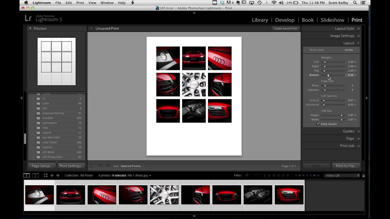
Every few months I’ll see someone post a finished image and my first reaction is “okay, that had to be a full Illustrator project.” Then I find out it was mostly Lightroom and I feel both humbled and relieved. That’s exactly what happened when Scott Kelby shared an Audi R8 poster he made for a client. Nine photos, grid layout, clean margins, big empty space for text at the bottom. It looked like a print ad.

Stop Sending Crooked Photos Into the World: Four Lightroom Straightening Methods That Actually Stick

Stop Sending Crooked Photos Into the World: Four Lightroom Straightening Methods That Actually Stick

I’ll be honest with you: the crooked horizon line is the editing mistake that ages the worst. You can get away with slightly flat colors or a touch of noise, but a tilted horizon line reads immediately as careless, even to people who have never opened Lightroom in their lives. I learned this the hard way when I was editing press shots for my band, squinting at skewed rooftop photos and wondering why they looked “off” even after I’d color graded them within an inch of their lives.

Virtual Copies in Lightroom: One Photo, Three Versions, Zero Extra Storage

Virtual Copies in Lightroom: One Photo, Three Versions, Zero Extra Storage

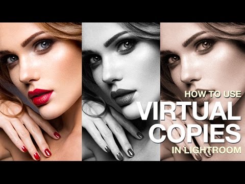
There’s a specific kind of dread that hits when a client asks for “a few different looks” on 200 wedding photos. Your first instinct is to duplicate everything, which means double the storage, double the catalog clutter, and double the time spent organizing files you didn’t need in triplicate. For years, I handled this the hard way before I understood what virtual copies could actually do for a portrait and event workflow.

Lightroom Color Editing Finally Makes Sense — Here's the Tool You're Probably Ignoring

Lightroom Color Editing Finally Makes Sense — Here's the Tool You're Probably Ignoring

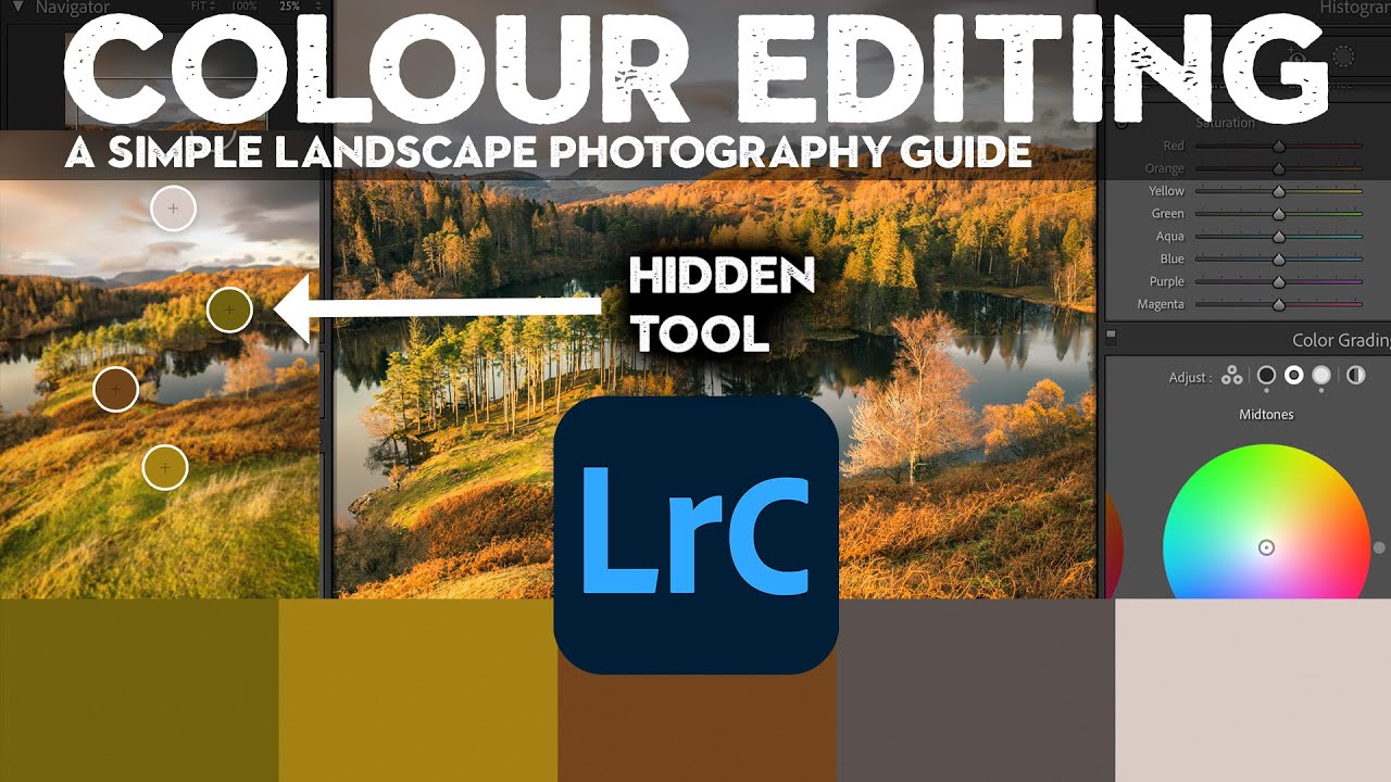
Color questions are the ones that fill my inbox. Not exposure, not sharpening, not even masking. Color. People want to know why their images look muddy, why the greens feel fake, why the sky went from moody to neon the second they touched the saturation slider. I spent years answering those questions one reply at a time before I realized the real problem: most photographers learn color tools in isolation, without ever understanding how each one interacts with the others.

There's a Hidden Vibrance Brush in Lightroom (And It's Been There the Whole Time)

There's a Hidden Vibrance Brush in Lightroom (And It's Been There the Whole Time)

I’ve been editing photos in Lightroom long enough to think I’d found all the tricks. And then something comes along and completely rearranges my mental model of how a tool works. That happened recently when I watched a tutorial by Matt Kloskowski showing a vibrance adjustment hidden inside Lightroom’s local adjustment tools. Not a workaround. Not a hack. A legitimately different rendering behavior that’s been sitting there quietly the whole time.