The Mobile-to-Desktop Lightroom Workflow That Actually Works for Travel Photographers

The Mobile-to-Desktop Lightroom Workflow That Actually Works for Travel Photographers

There is one workflow problem that used to wreck me every time I came home from a trip. My phone camera roll is a disaster of food photos, screenshots, and actual keepers all jumbled together. My Sony files are sitting on a card. And somewhere between those two worlds is a batch of photos I genuinely care about, waiting to get lost or forgotten. For a while my solution was “deal with it later,” which, as any photographer knows, is code for “never deal with it.

How to Fake a 35mm Film Look in Lightroom Using a Masked Gradient (Peter McKinnon's Best Trick)

How to Fake a 35mm Film Look in Lightroom Using a Masked Gradient (Peter McKinnon's Best Trick)

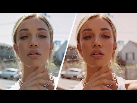
There’s a specific problem I kept running into with digital photos that were supposed to feel vintage. I’d pile on the grain, drop the contrast, pull back the clarity, and the result still looked like a digital photo wearing a Halloween costume. Something was off. The scene felt sharp in a way that film never is, too evenly exposed, too present. It took me longer than I’d like to admit to figure out what was missing, and honestly, the answer was sitting in a Lightroom panel I was already using for other things.

Fix a Flat, Boring Photo in Lightroom: Scott Kelby's Intermediate Workflow, Step by Step

Fix a Flat, Boring Photo in Lightroom: Scott Kelby's Intermediate Workflow, Step by Step

There’s a specific kind of photo I used to dread editing. Not a disaster shot, not a total throwaway, but the mediocre middle-ground image. Flat light, a blown highlight somewhere it shouldn’t be, colors that look like they were processed through a wet sock. The kind of file where you open it in Lightroom, stare at it for thirty seconds, and then go make coffee instead. I’ve got a whole folder of those from the early years, back when I was editing press photos for my band because nobody else was going to do it.

How to Build a Photo Book Layout in Lightroom's Print Module (Without Buying Fancy Software)

How to Build a Photo Book Layout in Lightroom's Print Module (Without Buying Fancy Software)

Every time a client asks me about photo books, my first instinct is still to recommend some dedicated software with a subscription fee and a learning curve shaped like a cliff. Then I remember that Lightroom has been quietly capable of this the whole time, sitting right there in the Print module while everyone ignores it in favor of flashier tools. Watch the full tutorial on YouTube In this Scott Kelby tutorial, part two of his three-part photo book series, he walks through building photo book layouts entirely inside Lightroom’s Print module, using photos from a trip to Egypt, Istanbul, and Greece as the working example.

Lightroom (Not Classic) Finally Does What Bridge Never Could — Here's What Changed

Lightroom (Not Classic) Finally Does What Bridge Never Could — Here's What Changed

I’ll be honest with you. For years I told anyone who asked that Lightroom Classic was the only serious option. The newer Lightroom, the one Adobe just calls “Lightroom,” felt like a stripped-down cloud toy built for people who edit on iPads. I had strong feelings about this. I still have strong feelings about a lot of things in this industry. But a recent tutorial by Matt Kloskowski shifted my thinking on at least a few of those points, and when something changes my mind, I figure it’s worth writing about.

Black & White Done Right: The Lightroom Color Mix Method Most People Skip

Black & White Done Right: The Lightroom Color Mix Method Most People Skip

Black and white photography has a reputation problem. People treat it like a filter you slap on when a color photo isn’t working, a last resort rather than a deliberate creative decision. I used to do the same thing. Early on, my go-to move was dragging Saturation to zero and calling it a day, which produced flat, lifeless images that looked less like art and more like a printer running out of ink.

How Lightroom's Tone Curve Actually Works (And Why It's Not as Scary as It Looks)

How Lightroom's Tone Curve Actually Works (And Why It's Not as Scary as It Looks)

Every time I open a new editing session, the tone curve is one of the first panels I reach for. Not because it’s flashy, but because it gives me a level of control over light and contrast that the basic sliders just can’t replicate. That said, I’ve watched plenty of photographers drag a point around the curve, squint at the result, and then hit undo because they had no idea what they’d actually done.

Lightroom's Radial Mask Tool Is the Closest Thing to a Darkroom Spotlight (Here's How to Use It)

Lightroom's Radial Mask Tool Is the Closest Thing to a Darkroom Spotlight (Here's How to Use It)

There’s a specific frustration I run into on almost every edit, and it took me longer than I’d like to admit to find the right fix. The photo is technically fine. Exposure is decent. Composition is solid. But it looks flat. Nothing pulls the eye where it’s supposed to go. The subject is sitting in the frame competing with everything around it on equal footing, and the whole image feels like a shrug.

The Cinema Look in Lightroom: A Step-by-Step Breakdown That Actually Makes Sense

The Cinema Look in Lightroom: A Step-by-Step Breakdown That Actually Makes Sense

Every photographer hits a wall at some point where their images look technically correct but emotionally flat. Sharp, well-exposed, properly white-balanced – and somehow completely lifeless. That gap between a clean photo and a cinematic photo is something I spent a long time trying to close before I started really pulling apart tutorials from people who had already solved the problem. In this Kelvin Designs tutorial, Kelvin walks through how to build the cinema look from scratch in Lightroom, working through both a portrait and a landscape.

How I Finally Stopped Losing Weekends to Lightroom (And What Pierre T. Lambert Taught Me About It)

How I Finally Stopped Losing Weekends to Lightroom (And What Pierre T. Lambert Taught Me About It)

I used to joke that my editing backlog was its own form of cardio — the anxiety of staring down 800 unedited photos after a shoot kept my heart rate elevated for days. And the honest truth is, most of those hours in front of a screen weren’t making my photos dramatically better. They were just making me tired. If you shoot anything at volume, whether that’s weddings, travel, or even just personal projects you care about, the editing bottleneck is real and it compounds fast.

From Flat RAW to Finished Landscape: A Full Lightroom-to-Photoshop Workflow Breakdown

From Flat RAW to Finished Landscape: A Full Lightroom-to-Photoshop Workflow Breakdown

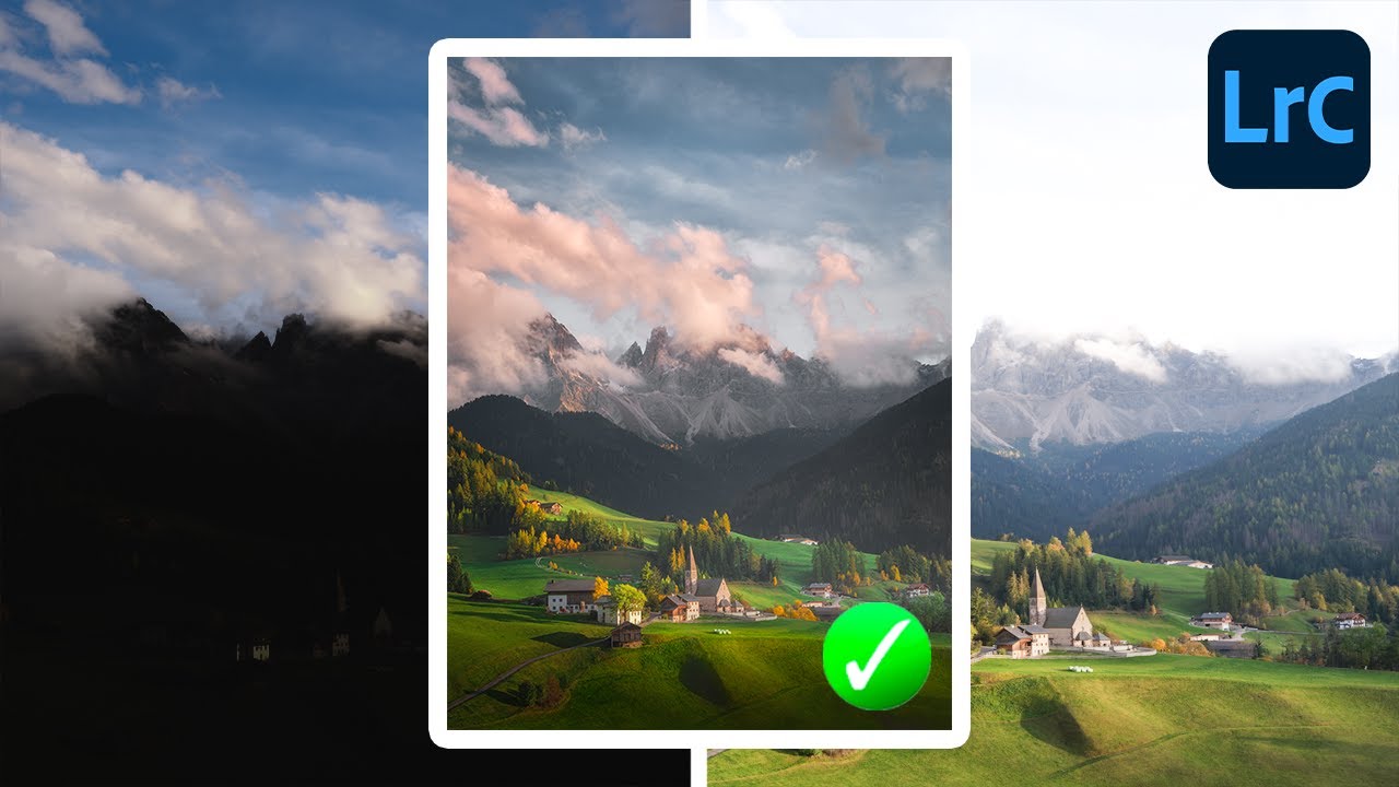
There’s a specific kind of editing problem that used to eat my lunch every time: a landscape shot where the sky is blowing out, the foreground is too dark, but the foreground also has bright spots that make a single global exposure adjustment completely useless. You bring the sky down and the boats (or rocks, or buildings) go muddy. You lift the shadows and the sky turns white. Classic trap. I’ve been editing landscape photos for years and this balancing act still requires a real strategy, not just a drag of the Exposure slider.

Split-Tone Any Photo in Photoshop Using Fill Layers (It's Faster Than You Think)

Split-Tone Any Photo in Photoshop Using Fill Layers (It's Faster Than You Think)

Most of my color work happens in Lightroom. That’s my home turf. But every so often a technique shows up in Photoshop that’s so clean, so flexible, that I have to stop and pay attention. This is one of those techniques. In this Aaron Nace (PHLEARN) tutorial, the concept is deceptively simple: drop a solid color fill layer on your image, change the blend mode, and suddenly you’re color grading like you’ve been doing it for years.