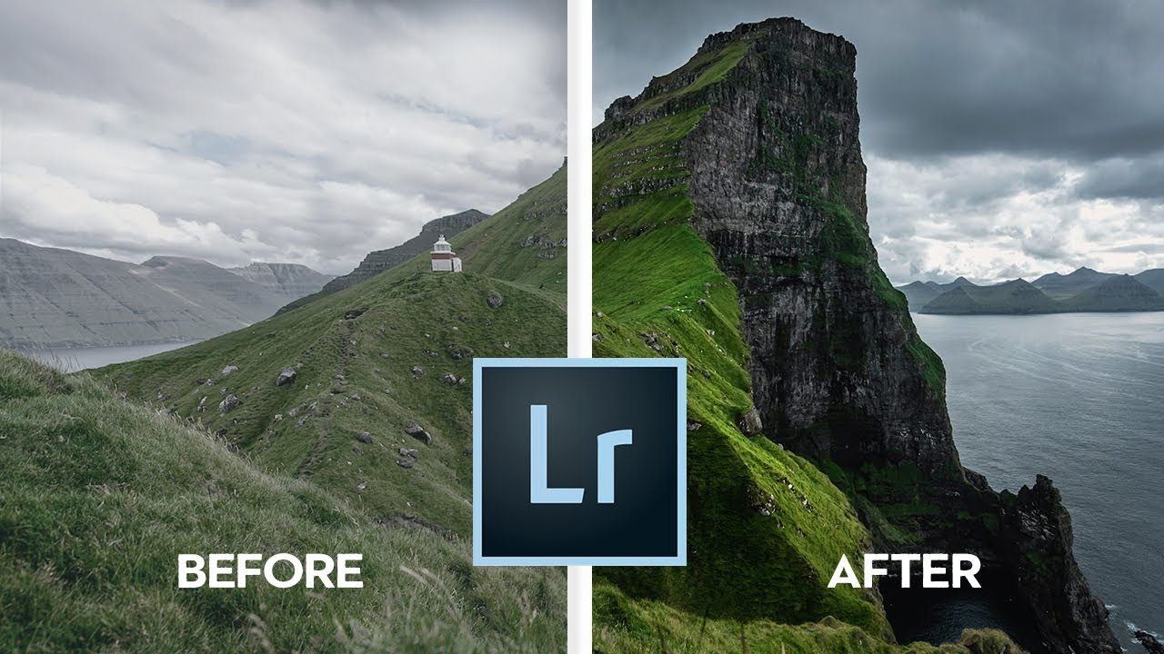
7 Lightroom Habits That Actually Stick (Broken Down From a Nigel Danson Tutorial)

7 Lightroom Habits That Actually Stick (Broken Down From a Nigel Danson Tutorial)

Every photographer eventually lands on a workflow they trust. Mine took longer than I’d like to admit. I learned Lightroom out of necessity - my band couldn’t afford a photographer, so someone had to figure out how to make our press shots look like we had our act together. That someone was me, armed with a cracked laptop and a lot of YouTube rabbit holes. Which is exactly why this Nigel Danson tutorial caught my attention.
Stop Guessing at Your Histogram: What Julieanne Kost Taught Me About Reading Light

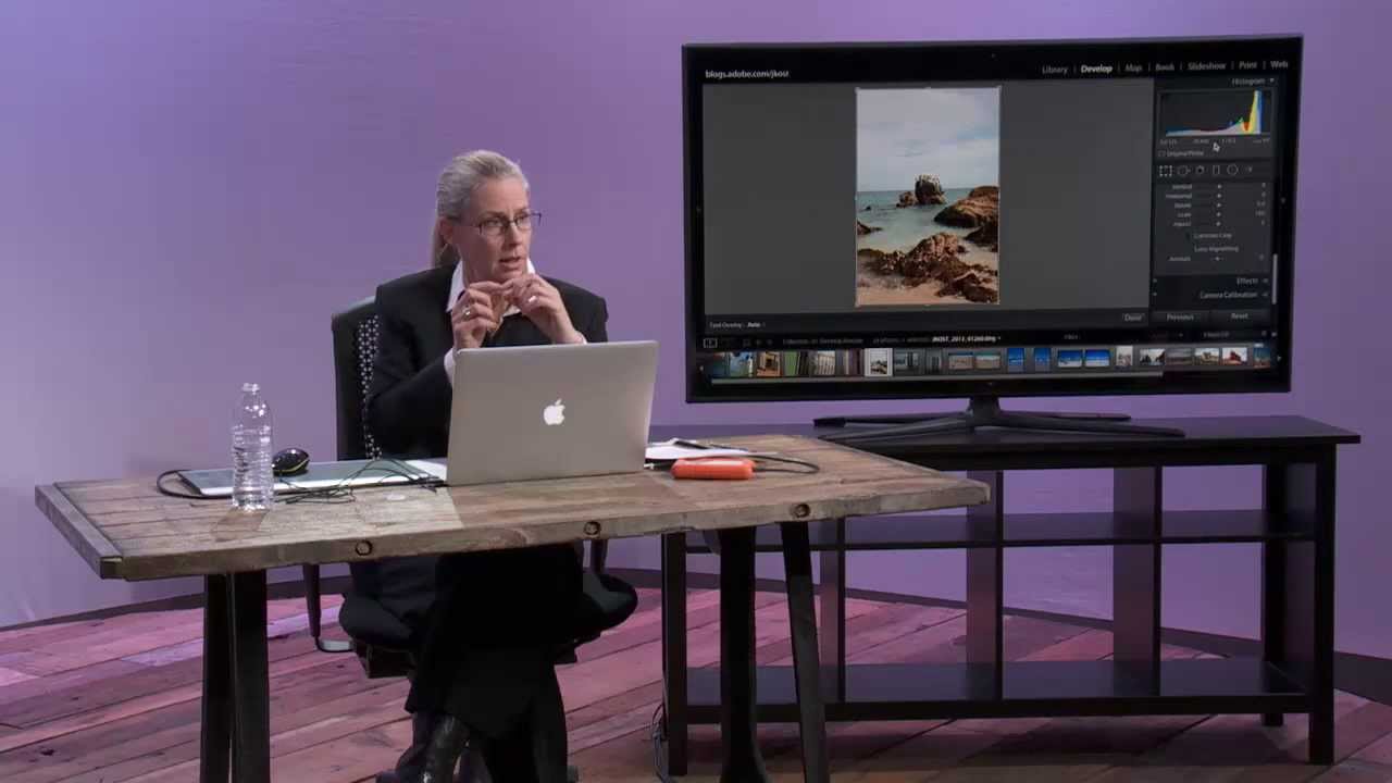
Stop Guessing at Your Histogram: What Julieanne Kost Taught Me About Reading Light

Every time I sit down with a client’s RAW files, the histogram is the first place I look before I touch a single slider. Not because I’m a data nerd (though, fair), but because the histogram tells me instantly whether I’m working with a file that has room to breathe or one that’s already fighting against me. I learned to think about it this way after years of trial and error, but honestly, I wish I’d watched this CreativeLive tutorial by Julieanne Kost a lot earlier in my editing life.

How to Actually Use Color in Lightroom (A Breakdown of Nigel Danson's Best Techniques)

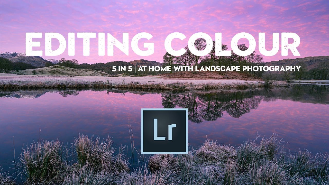
How to Actually Use Color in Lightroom (A Breakdown of Nigel Danson's Best Techniques)

Color is the part of editing where most people either overdo it or give up and call it “done” too early. I’ve been on both sides of that. When I first started editing seriously, I treated the color sliders like a dare instead of a tool, and the results looked like a fever dream. It took years of working through other people’s workflows to develop a framework that actually holds up across different images and lighting conditions.

Lens Blur, Point Color, and HDR Editing: What Actually Changed in the Latest Lightroom Update

Lens Blur, Point Color, and HDR Editing: What Actually Changed in the Latest Lightroom Update

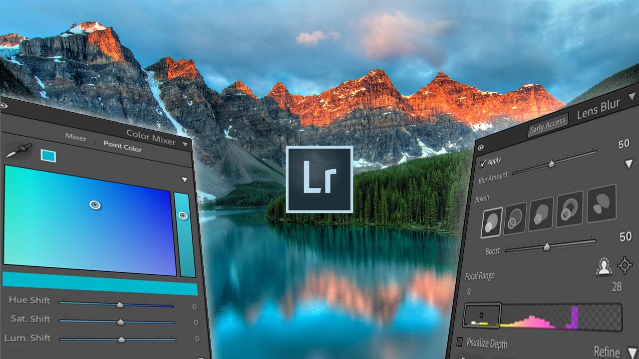
Every few months, Adobe drops an update and I spend the better part of an afternoon figuring out which features are genuinely useful and which ones exist mostly to fill a press release. This one, though, is different. The October Lightroom update landed with three additions that actually change how I work: a simulated lens blur tool, a point color panel, and native HDR editing support. I ran through all of them after watching Watch the full tutorial on YouTube from Mango Street, and I want to walk you through each feature in enough detail that you can follow along without having the video open beside you.

Stop Bracketing Your Shots and Hoping for the Best — Here's How to Build a Proper HDR in Lightroom

Stop Bracketing Your Shots and Hoping for the Best — Here's How to Build a Proper HDR in Lightroom

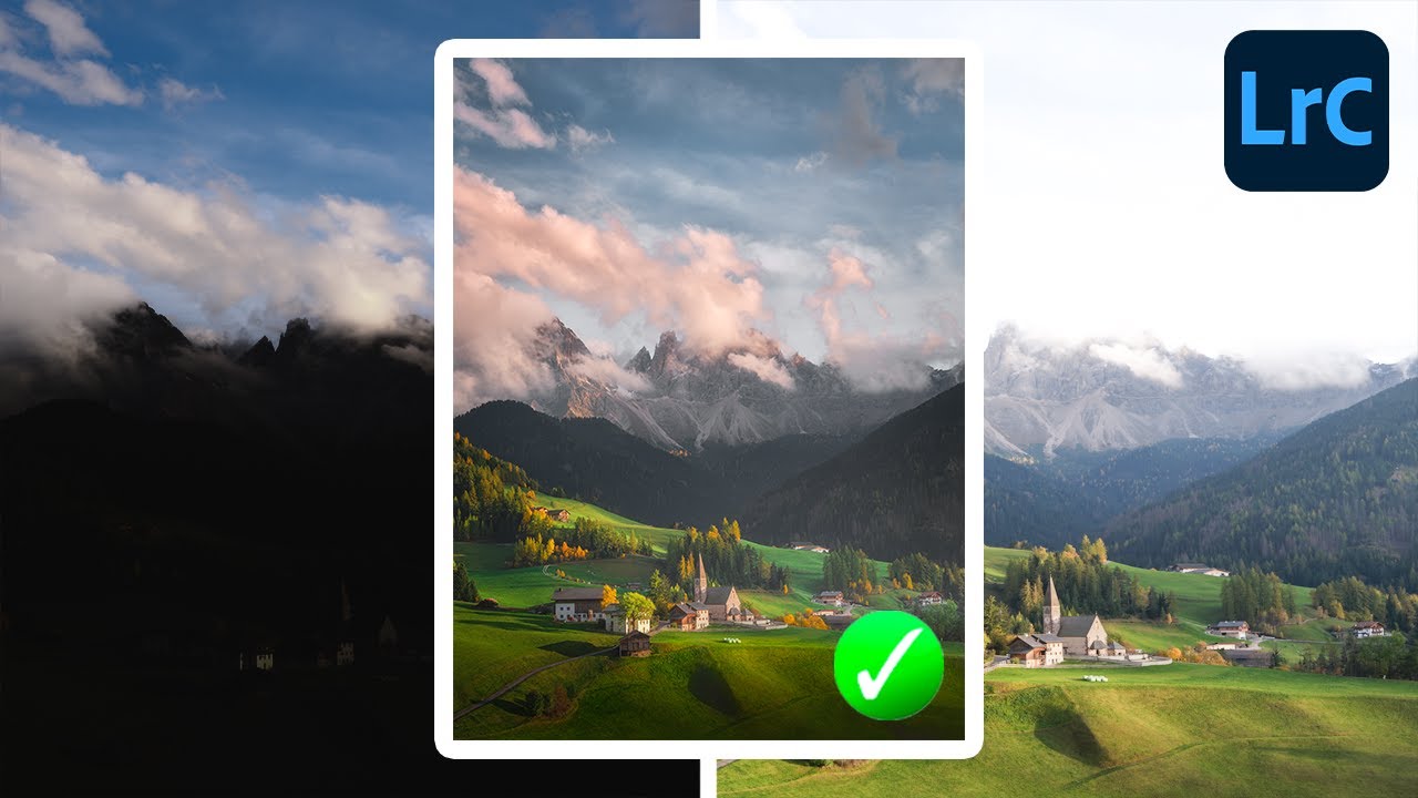
There’s a specific kind of frustration that comes from shooting a scene your eyes can see perfectly and your camera absolutely cannot. You know the one. Golden hour, gorgeous window light, a landscape where the sky is electric and the shadows are still full of detail. You look at the RAW file later and half of it is blown out or buried in noise. For years, the workaround was clunky: export to Photomatix, fight with tone mapping sliders, end up with something that looked like a painting of a sunset rather than a photograph of one.

Lightroom Can Actually Blend Exposures - Here's the Hidden Feature That Makes It Work

Lightroom Can Actually Blend Exposures - Here's the Hidden Feature That Makes It Work

There’s a conversation I end up having at least once a week, usually in the comments or over email: “Should I switch to Photoshop just to blend exposures?” And honestly, for a long time, my answer was a reluctant “kind of, yeah.” Lightroom has always been the better tool for the actual editing workflow, but the moment someone needs to combine a bright sky shot with a properly exposed foreground, the conversation usually detours into Photoshop, luminosity masks, and about three hours of frustration.

Texture vs. Clarity vs. Sharpening: What Lightroom's Texture Slider Actually Does (And When to Use It)

Texture vs. Clarity vs. Sharpening: What Lightroom's Texture Slider Actually Does (And When to Use It)

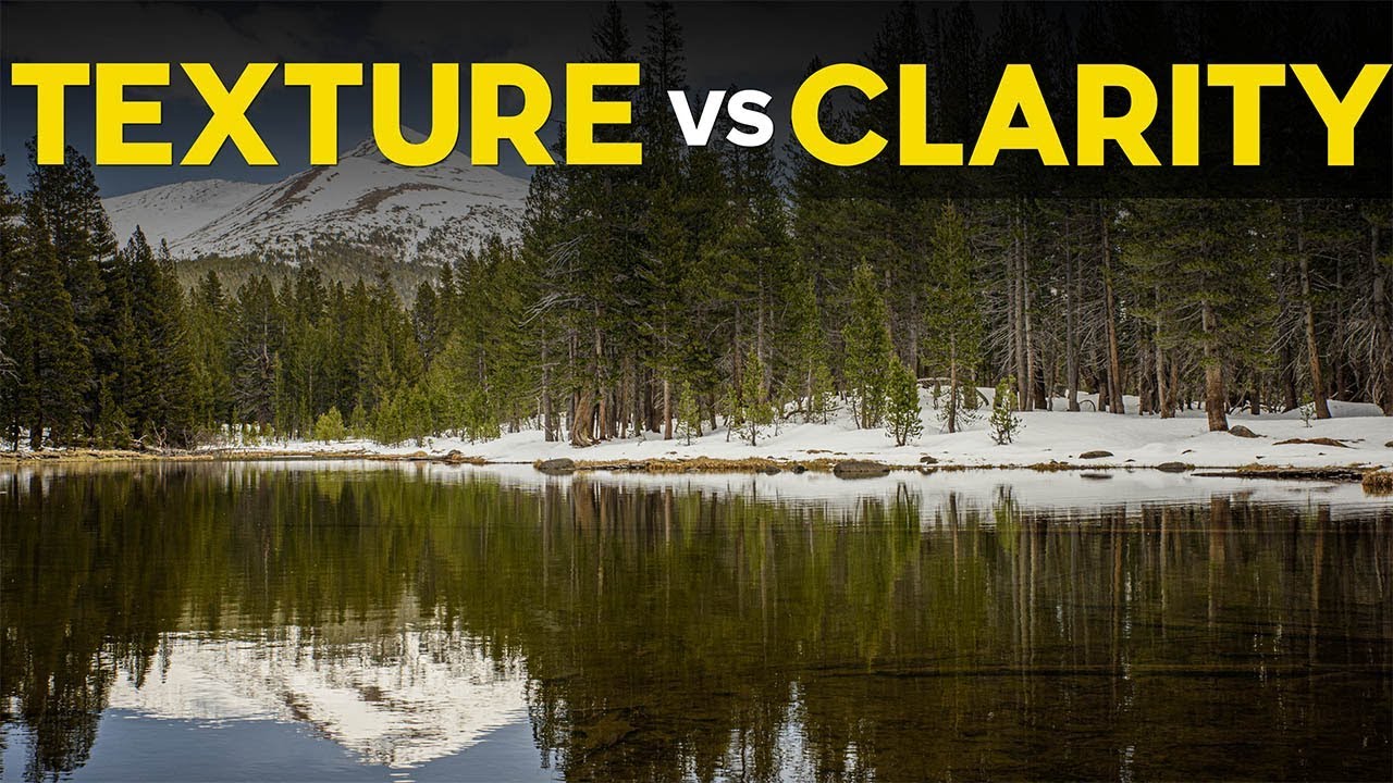
For a long time, my go-to move for adding detail to a photo was clarity. Crank it up, things look punchier. Pull it down, skin looks smoother. It worked well enough that I never questioned it. Then Lightroom dropped the Texture slider and I realized I had been using a sledgehammer when sometimes a scalpel was exactly what the job needed. The difference between these two tools is subtle in name and dramatic in practice, and once you understand what each one is actually doing to your pixels, you will not mix them up again.

Lightroom Won't Auto-Watermark by Year — But Here's the Workaround That Actually Works

Lightroom Won't Auto-Watermark by Year — But Here's the Workaround That Actually Works

Every few months I get a version of the same question: “Can Lightroom automatically put the year a photo was taken into the watermark when I export?” It sounds like such a reasonable ask. You’ve got thousands of images from multiple years, you want that copyright line to be accurate, and surely Lightroom – the software with all that beautiful metadata baked in – can just… connect those dots automatically.

Lightroom's Number Keys Are Doing More Than You Think — Here's the Full Map

Lightroom's Number Keys Are Doing More Than You Think — Here's the Full Map

I have a bad habit of clicking things I don’t need to click. I’ll mouse all the way up to the module tabs to switch from Library to Develop, or hunt around for the star rating buttons in the toolbar, when the keyboard has been sitting there the whole time with faster answers built right in. Keyboard shortcuts in Lightroom aren’t exactly hidden, but the number-based ones specifically tend to get overlooked because they don’t show up in obvious places.

Work Smarter in Lightroom: 8 Speed Tricks I Wish I Knew Earlier

Work Smarter in Lightroom: 8 Speed Tricks I Wish I Knew Earlier

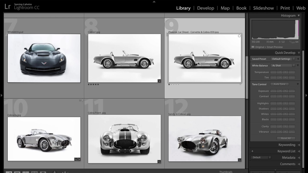
There’s a specific kind of frustration that hits when you’re sitting in front of a catalog of 800 wedding photos and Lightroom is chugging along like it’s running on a calculator. I’ve been there more times than I’d like to admit. Over the years I’ve picked up habits that help, but a recent tutorial from Mango Street pulled together eight of the most practical speed techniques I’ve seen organized in one place, and a couple of them genuinely changed how I approach a heavy editing session.

Soft Proofing in Lightroom 4: Stop Guessing What Your Prints Will Actually Look Like

Soft Proofing in Lightroom 4: Stop Guessing What Your Prints Will Actually Look Like

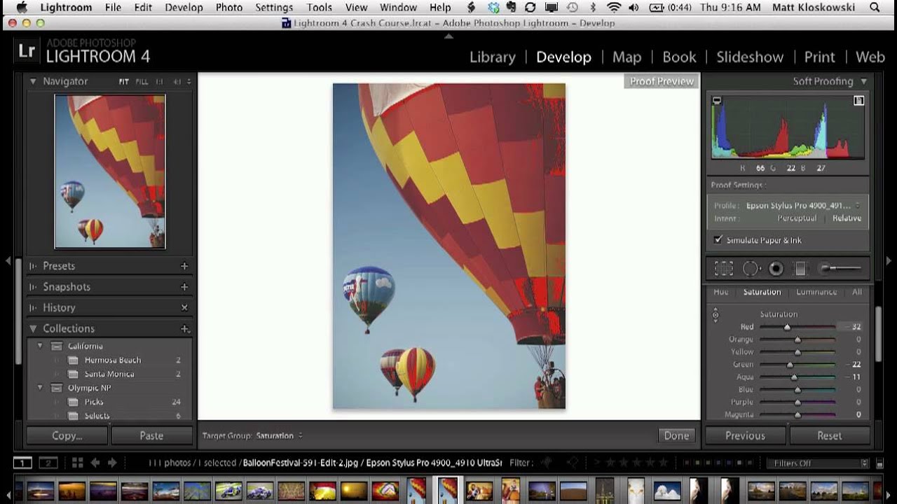
There is a specific kind of frustration that only photographers who print their work truly understand. You spend an hour getting a photo looking exactly right on screen, you send it to the printer, and what comes out looks like a different photo entirely. The colors are duller, the reds have gone muddy, and the whole thing feels flat. I have been there more times than I want to admit, usually around midnight with a deadline the next morning.

Why Your RAW Photos Look Dull on Import (And the Lightroom Fix That Takes 5 Minutes)

Why Your RAW Photos Look Dull on Import (And the Lightroom Fix That Takes 5 Minutes)

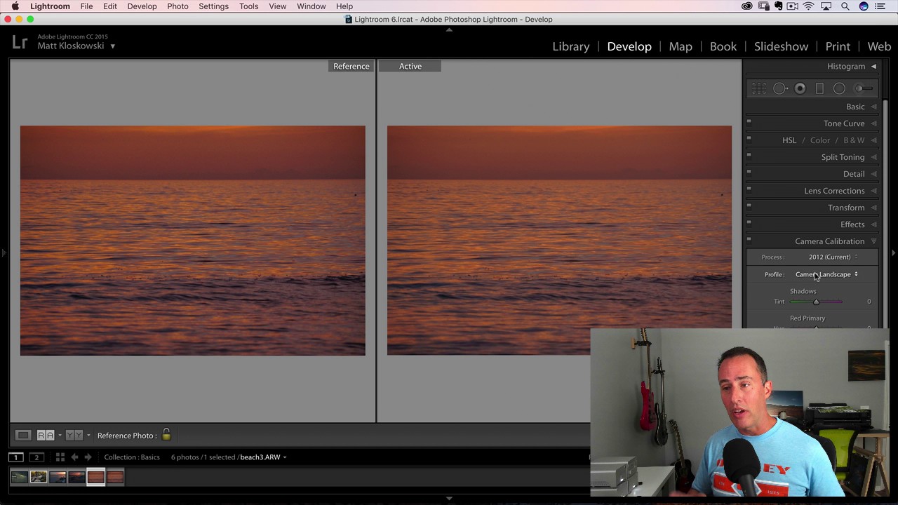
Every photographer I know has had the same deflating moment. You’re on location, chimping your shots on the back of the camera, thinking yes, this is the one — rich shadows, punchy colors, exactly the mood you were going for. Then you import into Lightroom and watch the life drain out of the image in real time. That vivid preview collapses into something flat and gray, and you spend the next twenty minutes chasing a look you already had on a two-inch LCD screen.